No, for node editors I just need fit to frame. Which currently adds this major border of empty space around everything and makes it smaller that actually would fit, but whatever…
if youre going with that, then maybe slighly different icons would be better/clearer?
anything that can tell us that we are dealing with the backdrop
3 Likes
 I had this in mind when I mentioned it before.
1 Like
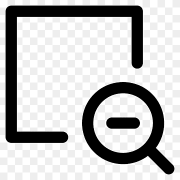
Agree. In the video above I was just reusing existing icons for demonstration purposes. I would also need new icons for
- Fit to view
- 100% or 1:1 zoom
- Pan backdrop
- Zoom backdrop
Any suggestions?
1 Like
heres some random stuff for inspiration
for pan and zoom, if you go with something like in the image above (zoom), all you have to do is swap the magnifying glass with a hand, and thats the pan.
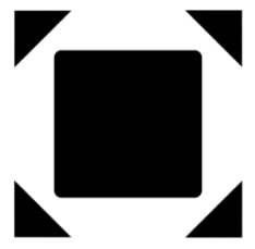
fit to view is always something around those lines:
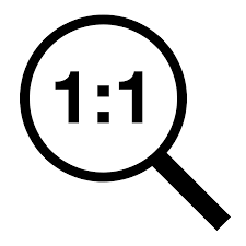
for 1:1 zoom i was thinking on something like this, but idk how it will look in a very small size:
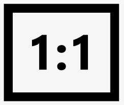
perhaps a simple button like this would work too:
5 Likes
Excellent progress. This fit to view button could be used in the shader editor as well. It would be a great improvement in the quality of life: it is incredible how much time it takes every time you are editing materials and you have to look for the home key every time you change materials because the nodes are not centered in the view.
Is there a possibility that these great changes will come into the 4.2 release?
4 Likes
Thank you for the feedback so far! I talked with the UI team and did some changes. So here are some updates:
Fast Viewing:
- Now the viewer node is added to favorites, and not the node before it.
- Image editor shows the name of the current viewer node being viewed
- The preview button is removed for the viewer node. Instead a number was added there to indicate this viewer node is being marked as favorite.
- Note: the patch is written in Python as an add-on for now. So drawing a fancy icon instead of number to show the node has been favored is not an option, but will be once we move feature to C++ if the prototype gets accepted.
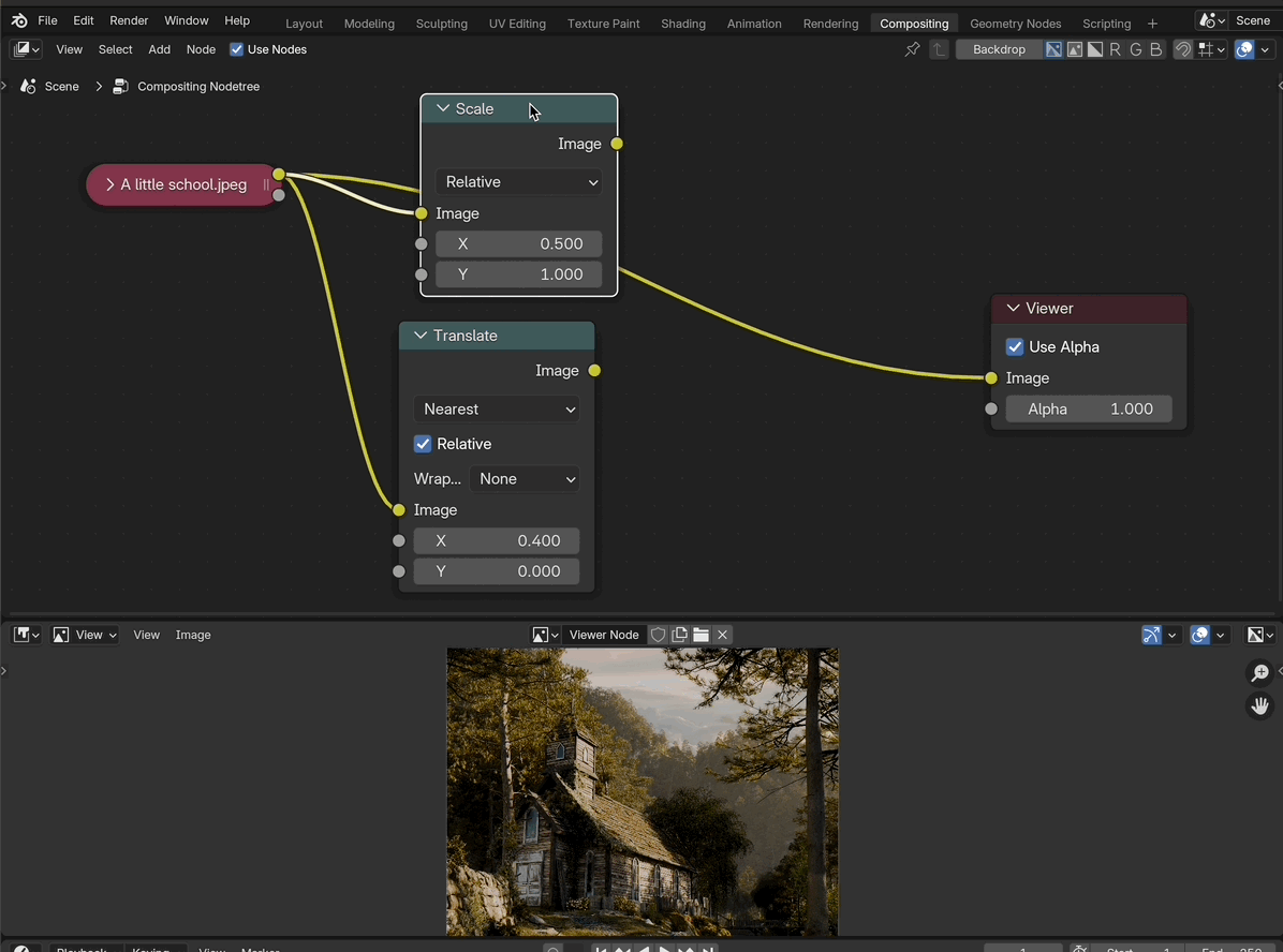
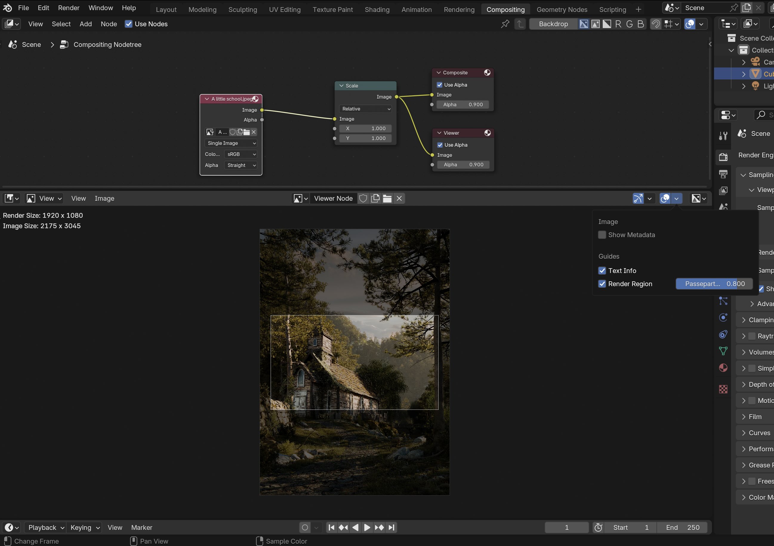
Image size visualization
I agreed with the UI team to simplify the solution, by removing the overlay of domain size (It was not obvious what it meant) and put the information as a text in the upper left corner, similar to the info text in the 3D view. The current patch looks like this:
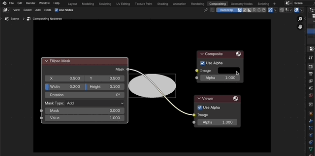
Pan and zoom:
Although the UI team agreed we should solve the problem of backdrop navigation, the idea of having a new set gizmos didn’t get accepted. Especially the fit to background gizmo didn’t fit into the current design of gizmos, where they should be interactive and not just buttons to call operators. So the current patch only implements pan and zoom for nodes for all node editors:
I will try to come up with a better solution that doesn’t break the current design. Ideas of a mini map for navigation was discussed. I will look into that next, and see if it’s feasible.
No, unfortunately all the features above won’t make it to 4.2 since 4.2 is in bcon3 (bug fixing only). Also, they might change depending on the feedback from users and the UI team.
12 Likes