The goal of this thread is to get user feedback on the following proposed compositor UI/UX features:
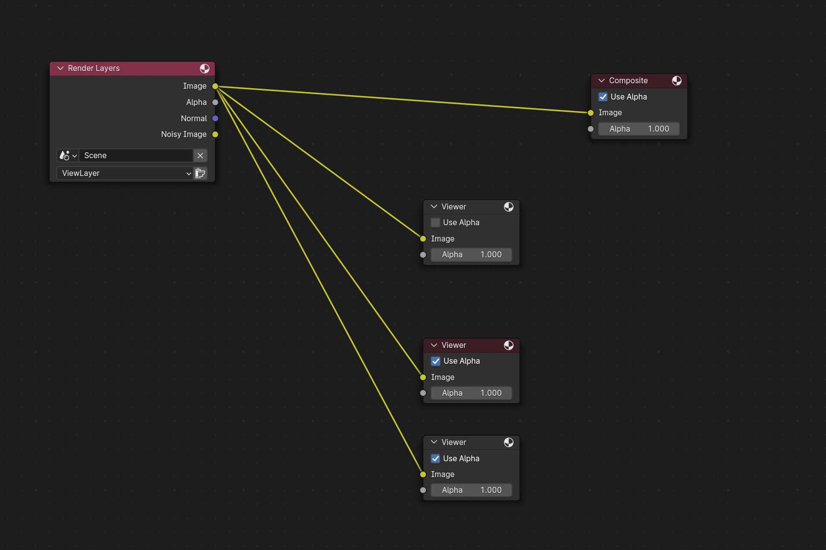
Fast node viewing
Save a node to for fast viewing by pressing Ctrl+1 and view it by pressing 1 (same for numbers from 1 to 5):
For now, this is implemented as an add-on and is available as part of the existing Node Wrangler addon. You can try it here: node_wrangler.zip - Google Drive
Image size visualization
Show the render region and compositor domain region as overlay in the image viewer:
Hey!
I am always happy to see the compositor getting love.
In a way the shortcut is very confusing, all blender users use node wrangler addon which makes it “ctrl + shift + click”. What would make more sense is to preview multiple viewers at the same time, like viewer 1,2,3. However at the same time, the viewer node is a weird idea, it could be removed and instead, we would see on the node some indication or a highlight telling us that we are viewing it. It would do the job and make everything more clutter-free.
I only briefly tested the fast node viewing option, and it’s the general idea I was talking about in the post I did a couple of hours before. It’s really neat, thanks!
The main things missing in my view are:
performance-wise: caching (but that’s outside the scope of this feedback)
and UI-wise:
a way of pinning one to avoid remaping one of the connections to another node by accident;
would it be good to draw all noodles connecting to the viewer, give the user a way to know which number is it mapped to? I’m on the fence about that one. There would be more visual clutter, but it would give the user a clue about what is being used.
But even if it’s just a proof of concept, it’s great!
I don’t think it’s confusing, because it doesn’t get in the way of the current behaviour. Ctrl+Shift+Click still works the same. But now you can “store” random points of you composition and go to them directly if you want to. It’s an addition, not a substitution, and if I’m correct, the numbers aren’t in use anyway.
Oh please no. It would be so messy to work with…and I think to implement also.Suddenly there would be the need to decide which viewer has preference, and if you CtrlShiftClick, to which one it goes, which node gets unconnected…to me that would be a no no.
You’re maybe right. In fact, there’s a comment in here in which Jeroen says:
Just some clarification.
Tree without viewer node → active composite
Tree without enabled viewer node → active composite
which is a weird idea, because it implies that there is a viewer node connected to the composite (or at least the same functionality as if it were), just hidden from the user.
So, being that…why not hidden it completely, and expose the functionality some other way without the node, as you say?
Hi @izo, I like the fast node viewing! Just a question: will it also work if I have different node setups for each view? In view 1, I have a colored image, and in view 2, I have an image blur, posterize, and glare effect. or is my idea/understanding being way too far from your current implementation?
It works from any random points of your composition. If you can Ctrl+Shift+Click on it, you can assign it to a number and later toggle them. So yes, your example does work.
About render size display, it’s nice but it bothers me that text is different size for two displays, and one is displayed inside the box, an one outside. Its giving me OCD. Both should look same and be above the box. Just a nitpick.
Also, for more customizability, maybe text color and size should be added in theme
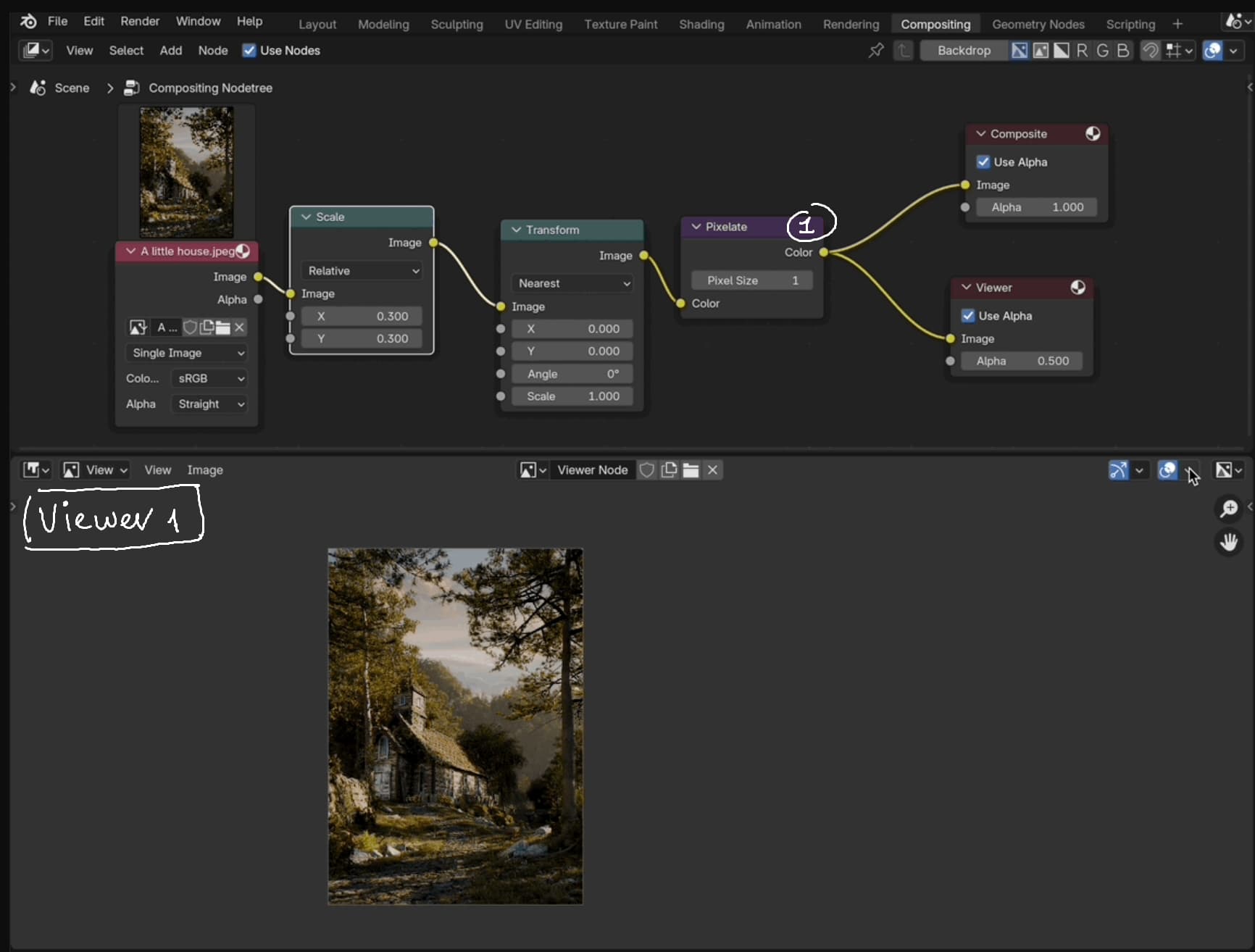
The operator already shows an info about which node was saved:
But I can see this is different from what you suggest because it’s not permanent. I will try to implement a similar indicator to the preview symbol.
I’m not sure I understand. Do you mean pressing 1 connects to viewer node 1 which is shown in a separate image editor 1, pressing 2 connects to viewer node 2 in image editor 2 etc…?
Actually this is a good question I was not sure how to solve. The problem is both domain size and render size can be the same, so the text becomes unreadable if they are both at the same place. Currently the text size is the same for both, maybe they only look different because they are at different positions relative the bounding box.
I was thinking of 2 different ways moving forward:
Text always have the same size regardless of zoom (similar to gizmos)
Text has a fixed size based on heuristics like render size or domain size
I think this is a reasonable request, it shouldn’t be too difficult to implement.
It would be similar to the idea @costavojik was proposing, then. Right?
What Fusion does (correct me if I’m remembering it wrong) is to add a couple of permanent buttons represented as small dots in the node UI, so you can link them to the viewer by pressing either of them.
When I tried it I liked the clutter free approach, it was very elegant. But I didn’t like that it only provided a maximum of 2 possible pinned connections, it felt short to me for no real good reason (coming from N…)
I guess an alternative approach could be to display a number in the header of the node that tells you which connection it is, as well as a distinctive visual clue that lets you know, even when zoomed out hey! that node, and that one, and that other one are viewer connected!…something like a colored border overlay or something similar.
I was talking about what you literally show in the image (that I’m pretty sure it’s not allowed here, btw)…there’s two dots at the bottom of each node that indicate which viewer it’s connected to. They provide a good visual feedback of what’s being feeded into the viewer, but at the same time, just 2 inputs feels too low a limit (I imagine it arises from the node UI design, and not wanting to clutter the node with a whole row of dots at the bottom).
This is exactly what I was thinking about on the other thread, it looks great! The viewer node IMO is a weird concept, so an overlay for the render size makes more sense, to me at least hehe. I hope this gets added to master
It seems useful…At the same time to me it’s a bit confusing, being just a line overlayed on top. I think an option to make it behave like a passepartout would be nice, to really get an idea of what’s going to be visible.
There are still differences to the final render (e.g. background is gray instead of grid and viewer node still shows non translated background after translation), I plan to address these issues later in a separate patch.
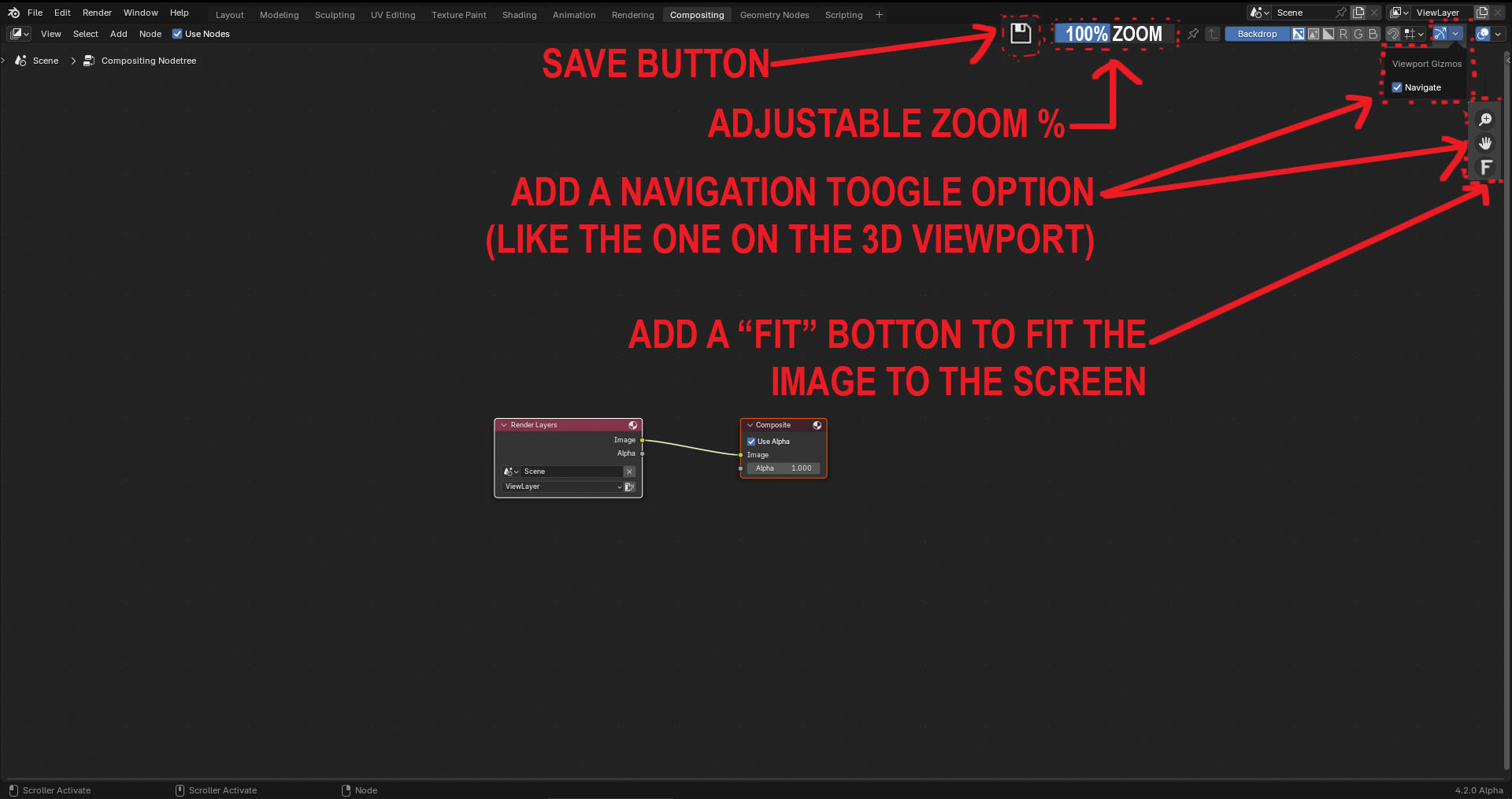
I would like to know if it’s possible to add some basic buttons and basic information within easy reach to the Compositor UI, without the need to go to a submenu. I’m referring to the image zoom percentage, a fit button within easy reach, and a save button. Many times, it’s frustrating not to have basic tools at hand. The same ideas goes for the image editor.