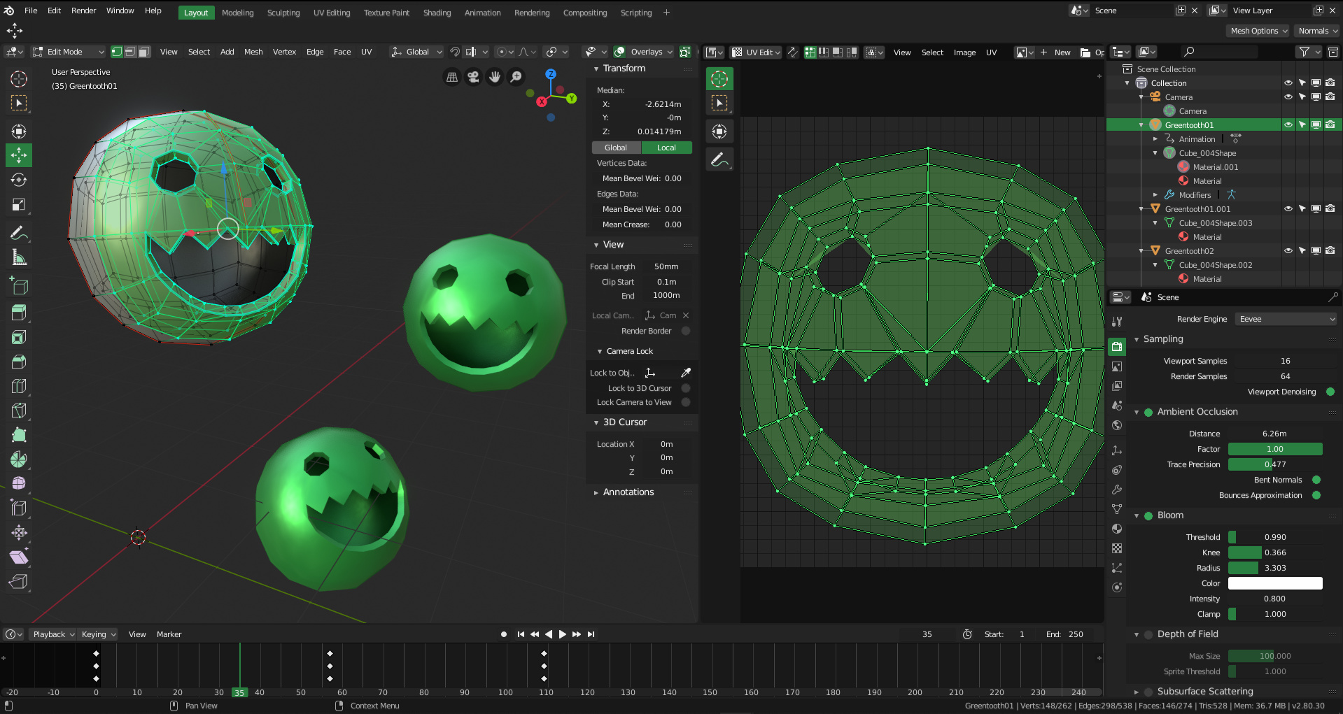
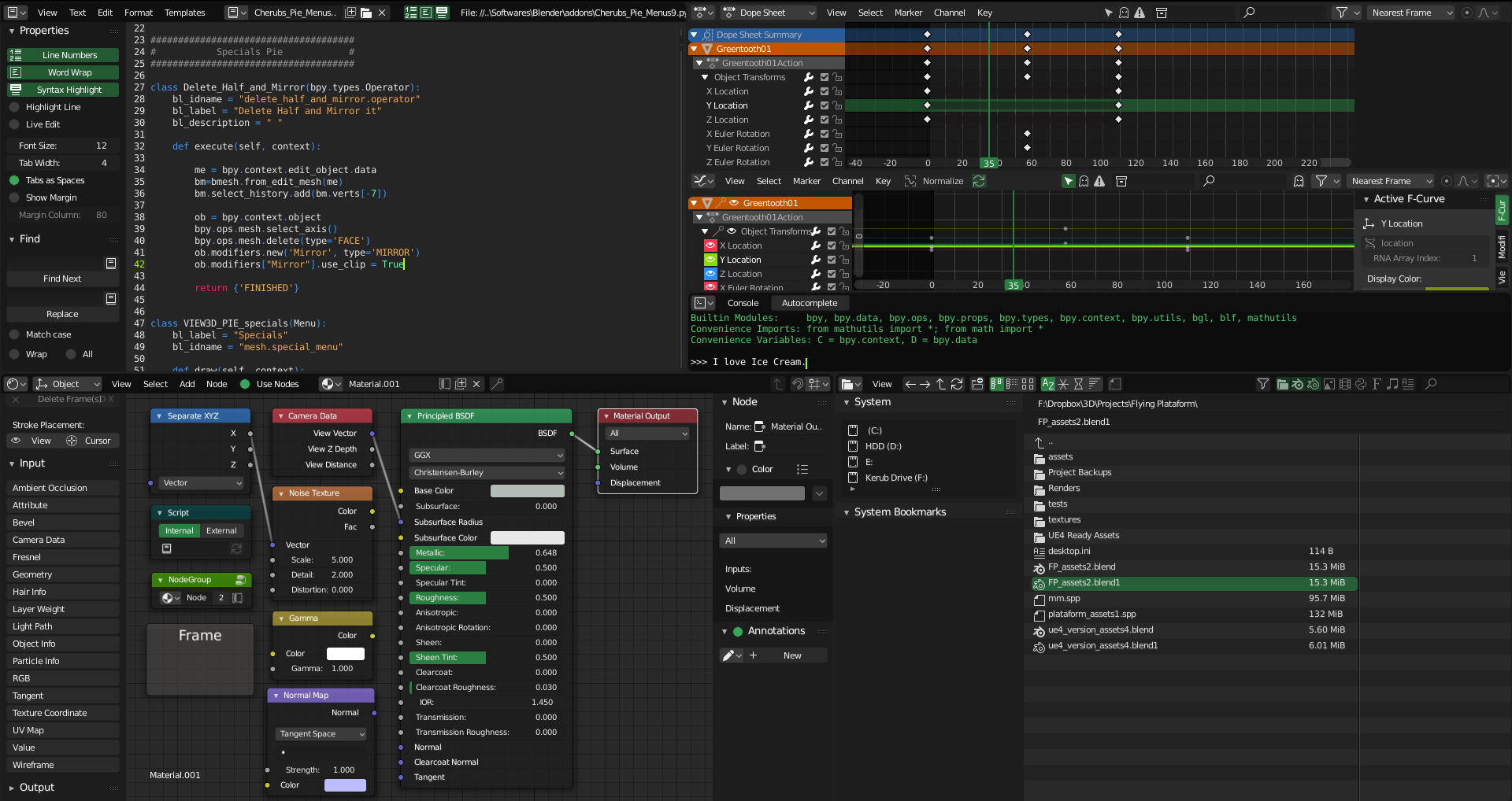
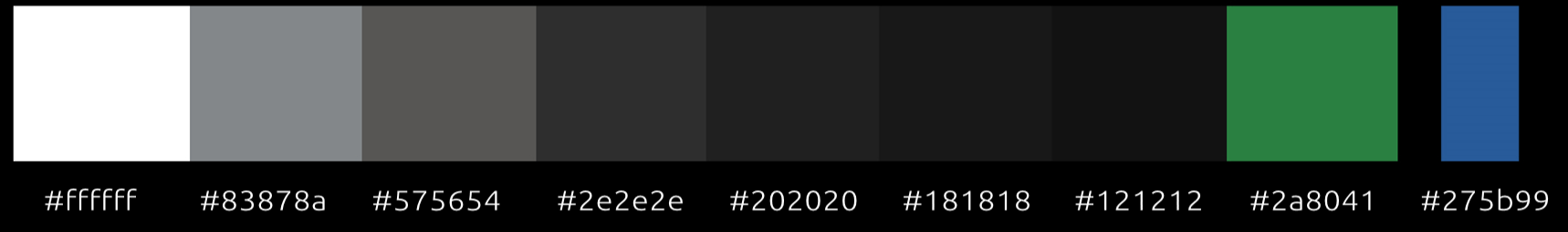
I think 99% of themes a will be dark. But I think, at least one theme must be white, in order for the user to choose light theme, not only darks. So, i’m going to make one. Inspired by default theme in gravit and some cases in material design. It’s work in progress, but I think you can see my idea.
Based as closely as possible on the new Mac OS dark theme.
I’m too new to post anything, but I’ve created and maintained one of the most downloaded themes on Blendswap for years. I’ve now fully updated it for 2.8. Here’s the link.
+1 for a Greenthooth theme! I would totally use this while working on game stuff. The way you’ve used the values of grey feel a bit inconsistent though. I think it would look perfect if you used the polycount forum theme as a template, color pick the three main greys, and use those to show depth in the UI. Things will look more unified if you think of brightness as the third dimension.
I have always had a feeling that people who are very much into customised stuff have an enormous bias toward dark themes with respect to casual users that, I believe, are more likely 50/50, or even leaning towards light! I have no idea why that is the case: more hours on the computer correlate with less love for light tones?
I like the concept of your white one, and I think there’s still a need for a light-grey one (thinking on something like Ubuntu Unity’s Ambiance) – because yes, people also use light themes – for which at the moment there is zero competition in here! I might give it a try later but I’m definitely not good at this
Working for hours with a theme with heavy contrasts or excessively dark tires the eyes excessively. Also if it is nuclear white it burns your pupil in the long time, especially in rooms with little light.
Guys, I really don’t see the point of posting slightly modified themes from other users here, you guys should keep those for yourselves. It just increases the clutter here, making hard to choose.
We need more diversity to choose from.