My personal theme that was updated for 2.8 just 3 days ago…
obsidian.xml (52.5 KB)
Energy_v20
energy_v20.xml (52.5 KB)
i want report a bug with active selection element, i cant setup it with edges and polygons in 2.80 , it just the same color like regular selection
I was working on a theme using the Dracula colour palette a bit ago so might have a crack at updating it if anyone actually likes it
I would like to touch on the issue of creating themes for Blender. This is a rather long process, so I offer my idea. How can you simplify the interface, leaving only the most necessary. Leaving only the primary colors, you can simplify the process of setting the theme for the user.
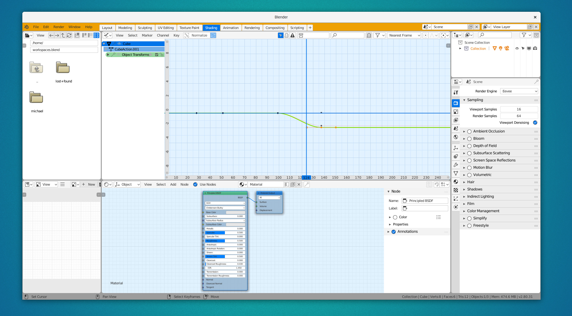
I think 99% of themes a will be dark. But I think, at least one theme must be white, in order for the user to choose light theme, not only darks. So, i’m going to make one. Inspired by default theme in gravit and some cases in material design. It’s work in progress, but I think you can see my idea.
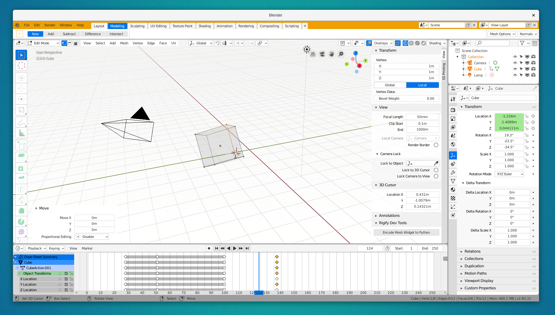
It has blueprint-style of node editor and animation graph:
white.xml (51.4 KB)
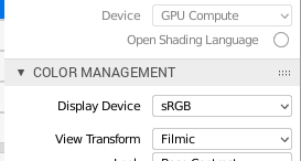
I have a several suggestions about theming engine:
make ability to set headers to uppercase (Photoshop and Gravit style):
set color of shadow (black text white shadow will be nice for light theme):
and also I cant find color of tools:
Toolbar icons cannot currently be themed yet, sorry. It’s on the todo list.
My Maya2018 like theme, still in progress
Download from OneDrive https://1drv.ms/u/s!An0p8_0qiDpchrIaa1-qNFpMqPcq1Q
An update to the cleanest of themes, Minimal Dark.
minimal_dark.xml (52.5 KB)
There are a few subtle things that make it stand out from the default:
Greentooh theme
For all the Game Developers / Polycount community out there.
Update 18/11/18
Update 20/11/18
Download Link:
PS: This is still a WIP, please, give some feedback I’ll be sure to update the theme and fix future inconsistencies.
Greentooth.xml (52.5 KB)
Greenty theme
this is my own theme, i always use this theme in my work with 2.79, i tweak it a bit for 2.8
Modern V 4.1
Based as closely as possible on the new Mac OS dark theme.
I’m too new to post anything, but I’ve created and maintained one of the most downloaded themes on Blendswap for years. I’ve now fully updated it for 2.8. Here’s the link.
Thanks
Edit: had the wrong theme uploaded to Blendswap, fixed. Also uploaded XML now.
modern_v_4_1.xml (40.0 KB)
+1 for a Greenthooth theme! I would totally use this while working on game stuff. The way you’ve used the values of grey feel a bit inconsistent though. I think it would look perfect if you used the polycount forum theme as a template, color pick the three main greys, and use those to show depth in the UI. Things will look more unified if you think of brightness as the third dimension.
I have always had a feeling that people who are very much into customised stuff have an enormous bias toward dark themes with respect to casual users that, I believe, are more likely 50/50, or even leaning towards light! I have no idea why that is the case: more hours on the computer correlate with less love for light tones?
I like the concept of your white one, and I think there’s still a need for a light-grey one (thinking on something like Ubuntu Unity’s Ambiance) – because yes, people also use light themes – for which at the moment there is zero competition in here! I might give it a try later but I’m definitely not good at this
Working for hours with a theme with heavy contrasts or excessively dark tires the eyes excessively. Also if it is nuclear white it burns your pupil in the long time, especially in rooms with little light.
Base Coat
base_coat.xml (41.4 KB)
Edit 2:
Edit:
It is not entirely polished, but it is quite advanced. I upload it to give me your opinion.
I hope you don’t mind but I’ve made some small changes to your theme because I liked it a lot but I preferred to change a couple of things.
Pro3_modified.xml (51.3 KB)
Fresh snow