The UI of Blender can be improved. There have been many complaints regarding the problem of having tool settings in multiple places. There is in fact a lot of redundancy in Blender’s UI.
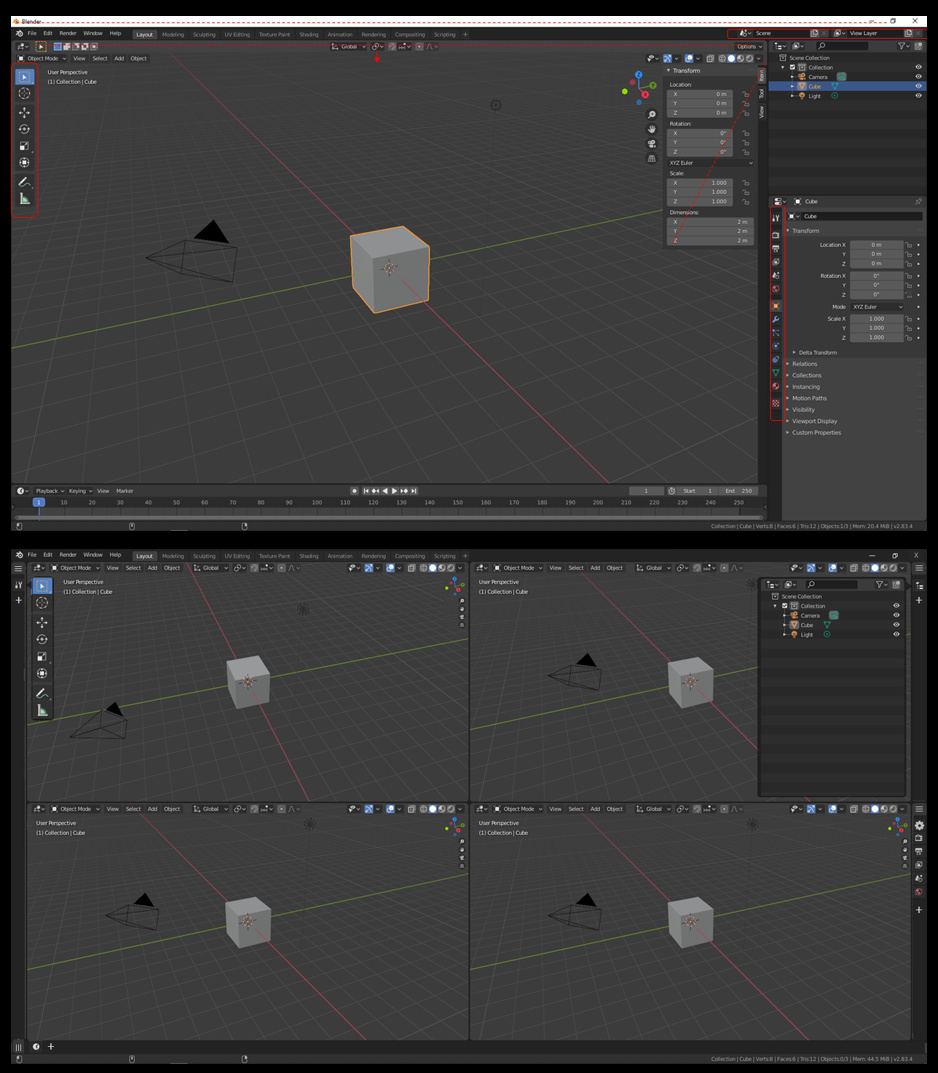
Looking at the top image…
*First, I think it would be nice if we can get rid of the top white application header. We should be able to merge the menus and workspaces header into the application header and free up some space.
*Second, in the top right we have Scene and View Layer. These should be moved into the Scene and View Layer Properties Tabs.
*Third, Get rid of the N-Panel and the Tool Shelf. The 3D Viewport should only have things specific to the viewport not tool shelves and panels.
*Fourth, using the same philosophy as above we should decouple the Tools from the 3D Viewport as well.and make them they’re own context based editor. Tools Editor.
*Fifth, I also suggest we decouple each tab from the Properties Editor. I’m not saying that the Properties Editor should be dismantled and discarded but that each tab should be included as is in a Properties Editor and also be available individually.
The bottom image is a suggested solution to some of the UI problems and the reasons for my above suggestions… (please forgive the crude design)
I propose that we create a new Editor Type called Shelf.
As you can see I’ve merged the top Application Header with the Menus and Workspaces Header.
With the introduction of popovers in 2.8 we can use these to our advantage and allow the Shelf Editor(s) to shine.
Users can still split and organize the workspace just as before. All current editors will still be there. I’m just suggesting we include a new Editor Type called Shelf that can be used to further organize the workspace.
With each tab of the Properties Editor decoupled into their own independent editor types and the Tools put into their own Editor, we can then use the Shelf Editor to organize editors anyway we want. Giving us the option for example to put the tool setting anywhere.
The Tools editor would be context based, showing only the tools available based on which viewport is active and which mode the viewport is in.
Think of it as being able to add and remove “Tabs” to the shelf editor. The tabs being any of the other editor types. The Shelf Editor being just like any other editor we have now, in that it can be organized in any location you want. I should mention too though that we will need to be able to choose the orientation of the Shelf horizontal or vertical to maximize its usefulness.
Lastly I’d like to suggest that the Navigation controls can scale with the viewport so it doesn’t get in the way when the viewport is shrunk.
Looking forward to a good clean discussion on this idea.