Bevel modifier less organized in 2.90+

Hi there,
would like to chime in here to say something about the beloved bevel modifier.

It is probably the most common modifier right beside solidify, subdivision surface and mirror.
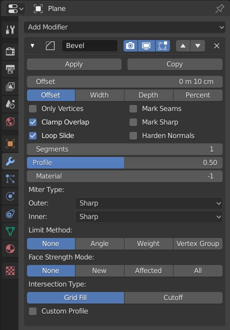
2.79 for reference:
Screen Shot 10-09-20 at 10.34 AM
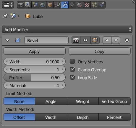
This is how it looked in 2.83:


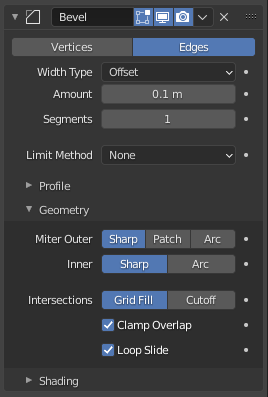
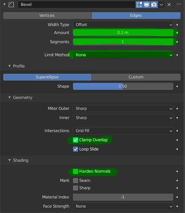
When everything is unrolled, more space is taken in 2.90+

Make sense since usually it’s hidden like this:

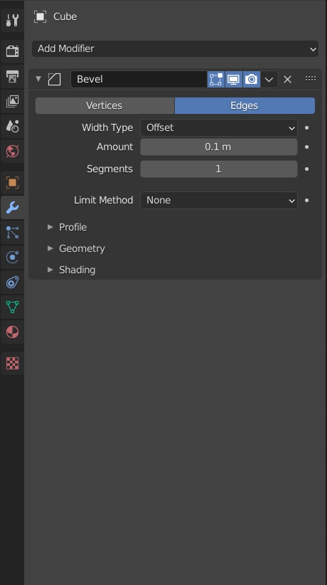
However that’s the problem…

Suddenly I can’t reach Angle, Clamp Overlap and Harden Normals fast from the main menu.
Angle is only through dropdown (2 clicks)
Clamp Overlap is in Geometry (2 clicks)
Harden Normals is in Shading (2 clicks)

Used to be 3 clicks and that’s not half the time because you need to always find the option again inside the newly appearing menu.

And honestly when doing hard surface that’s often what you’d like to do.

Clamp Overlap for meshes where certain geometry makes the entire Bevel disappear. Harden Normals for those great smooth bevels without much geometry and Angle because you don’t want every flat edge to get bevelled.

Seems like a small niche issue but I’m sure lots of people use that on daily basis and it just gets dull.

I think I wouldn’t even have a problem with that, if we could somehow
define DEFAULT modifier settings
for each modifier. I would definitely define Subdivision Surface to show all mesh, Bevel to use the settings I wrote and solidify to use “Even Width”…

Don’t really remember how many times I ticked that "Offset Even, Harden Normals,
or uncheck the “Clamp Overlap” which often works well anyway just apart from one vertex having like 0.010 wrong bevel or slightly overlapping faces.

Thanks for considering.

2 Likes

Dropdown button are over used in the interface and they weigh down the workflow by introducing more clicks here and there. An other example is the very unnecessary dropdown menu for switching object/world in shader editor🙄

2 Likes

I’m not really a fan of the drop-down controls either. Especially when they (like in the above bevel case) don’t even take less space than the row of (radio-)buttons.

It would be nice if if this sort of choices would display as a row of radiobuttons when the space permits it, and gracefully switch to a dropdown if there’s not enough space/width. That way you could just make the panel wider to get the buttons, but everything is still reachable when you make the panel narrower.

I really liked the way of showing the choices ‘at a glance’ next to each other, which is something I though blender did very cleverly. And I’m a bit sad to see everything move into dropdowns.

Same with the top row of buttons in the modifier panels. I find myself clicking a lot more. I know I could use the hotkeys, but still… sometimes you just have your mouse closer to the button in brain-space than the hotkey, especially if you are clicking around in modifier settings anyway.

1 Like

The problem with not using dropdown buttons is that often the text can’t fit on a single row if you expand the options and make them all visible.

For example, we could do this:
image
But I don’t really think it works much better.

So I agree with you that modifier default presets are the solution here. Hopefully that will make sense to do as part of the asset manager project.

Just so you know, you can ctrl - click on the header of a panel and it will collapse / expand all the children panels.

I think it does. It’s maybe ‘uglier’ (subjective) and more cluttered, but it’s faster. And though clutter is bad in itself (I do remember the old ‘bag full of random buttons’ panels) In this case I don’t think the decrease in clutter outweighs the decrease in speed.

That’s good to know definitely… Unfortunately it doesn’t really solve the problem :confused:

Would like to get some more feedback from the UI team.

Still waiting for someone from the UI team. This is a real pain for me as before I just clicked 3 times without having to open any additional options (and remember which ones those are).

Problem with these UI choices is they don’t really help. That doesn’t even touch the surface of how bad the default Bevel modifier settings are. I think 1cm, Angle, No Clamping is the way to go.

New users I teach are often baffled by clamping even though it does not make much of a difference most times. Angle is a no brainer, think like 90% of my Bevels are determined by Angle.

@pablovazquez? not sure whose attention to call here. I checked in 2.92 and it’s still done the same way.

Here I highlighted important settings that change the look the most:


Harden normals is quite an advanced one, but still I turn it on for all my bevels because it’s really powerful.

My problem is those are now hidden under extra clicks… I don’t think it’s necessary. Also Limit Method was pretty nice as radio box, now it also needs 2 clicks to change.

Why specifically are these changes done? Are they tested with real users? I use bevel on almost every object because I do lots of architecture and hard surface modelling and this is just such a pain.

Sorry to disappoint, but I am from the UI team.

This might help: you can ctrl click on any panel header to open all of its subpanels.

I agree that the defaults of the bevel modifier should change, and I actually agree with everything you propose there. I started that process here a while ago: https://developer.blender.org/D8961

Consistency, organization, saving space, etc. There is a trade-off between speed interaction for power users and clear, consistent organization. Yes, the modifier moved a bit to the latter side, but not that much really.

You worked on the Bevel profiles didn’t you:) We chatted at the BC19.

It does help a bit, but then the Bevel modifier effectively takes most of my Properties Window.

Well if you could bring those settings I mentioned so they are visible from the outside that would be welcome. I find them quite useful. In fact I use them on most of my Bevels.

Problem with this “clear, consistent organization” is that new users might never even find it.

I teach Blender occasionally and believe me, students are very surprised why their Bevels don’t do anything and then I explain to them what Clamp Overlap is (well it’s nice they found out) and so they uncheck it and suddenly the mesh goes through itself because it’s 10cm instead of like 3mm which would be more realistic. Not even touching the issue with how Scale interferes with modifiers like Bevel but that’s a very important CG concept to learn.

All in all I am looking forward to the modifier defaults:)

The 2.9 bevel modifier is more readable and less scary to a beginner, which is nice.

However, it’s bad that experts don’t have the option of choosing an “advancd” view mode.

Quite a lot of software have a beginner/advanced UI options, and I believe Ton Roosendaal called for something similar in Blender one or two years ago now…