PROBLEM
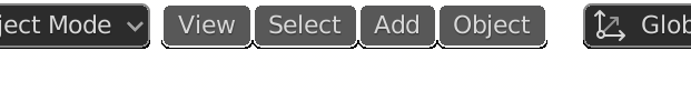
A gap exists between the viewport dropdown menus and their emboss effect:
-
The gap is especially noticeable with a light 3DView background, such as in the “2D Animation” startup file, where the bright background shines through.
-
It looks OK with a large UI scale, as in the image, but with a standard scale, the anti-aliasing makes the buttons look sloppy.
SOLUTION
-
Give the four dropdown buttons an outline, like the surrounding buttons, so that there is no gap between the emboss effect and the buttons themselves.
-
If a theme option already exists for their outline (I could not find one), it would look better not have it transparent by default.
That’s an interesting problem. Can’t think of an easy solution off the top of my head.
Basically we need the option for those to look like regular OS-like drop down menus, so just plain text when not selected. But widget embossing is global. And we want to be able to use them on a transparent background.
The different needs and option can conflict here. Having them ignore widget emboss and add ability to select outline color (including fully transparent) might be give the most options.
Is this a bug or intended: The theme option: User Interface → Pulldown → Outline isn’t used for the afore mentioned menus (their outline instead is transparent). All other User Interface → Pulldown options do affect these menus. 