There are just 3 properties for ‘Options’ for select tools. Why are they hidden under menu anyway? Just expose them in a toolbar like other settings are. They’re not gonna take any space, might even reduce it.
Like these, but with Origin, Locations, Parents icons
2 Likes
Best way is to ask @pablovazquez on stream on Monday when he does the Q&A part to review this patch, he is very busy otherwise and he can’t really see all the patches he has to review.
Mirroring settings aren’t for the active tool either, nor is auto-merge, so they shouldn’t be there.
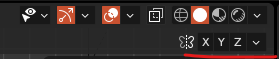
These are global transform settings (In the same theme as orientation, proportional, snap, pivot, etc).
All of those settings logically belong on the header, exposed, in the middle, on the same row as Orientation, pivot, snap, etc.
There aren’t that many of them so they can still easily fit on a HD display. But if the 3D view is made narrow, they could collapse and be hidden under a “more transformation options” button (Three horizontal lines icon).
Here’s an idea: Maybe give power to the user to select which of these settings are exposed, and which are collapsed into “more transformation options”?
As an example, if anyone is familiar with AutoCAD, it has an equivalent row of Icons on the bottom right of the GUI. And there’s a menu to toggle the display of each individual icon there.