personally not a fan, seems like a solution looking for a problem to me.
@Harleya , patch D 8706 looks good to improve discoverability of items in menu.
That is really logical, more consensual.
So, I have hard time to understand why you want to go into the opposite direction with Topbar menus, only made of icons.
Many people are already complaining about buttons with hidden names in toolbar, in header of 3DVIew and Properties Editor.
Although icons of mock-ups seems to have an explicit sense, easy to figure out ; I am pretty sure that pure newbies will have problems to understand,remember Render Image / Render Animation / View Animation icons. And New Window button will probably be confused with Screen icon used in Outliner.
I don’t like the idea of the one dropdown menu by default, either. That is making access to most of items in menus, slower by adding one click step to it.
So, to allow quickest access to some operations, most of operations have to become slower.
That does not sound like a benefit.
APEC made a very valid point. Most of operators, you choose as button icons already have shortcuts.
So, such change will impact readability for no gain, for most of users.
I think that if icons are added to Topbar : that should be the choice of user.
Nobody should have to suffer display of icon buttons, he don’t use.
That is why Tool Settings bar and Header can be hidden.
Topbar is the only bar that can not be hidden. That is because it is indicating main info like current workspace and scene.
Workspaces are taking the most part of Topbar.
Some people only use one workspace. Some are only keeping default ones. Some are using custom ones. But probably only a few are using more workspaces than default ones.
Anyways, 18 icons. that is probably too much for most of people.
Since introduction of Topbar (that initially was containing Adjust Redo panel as a line, replaced by tool settings bar content before being reduced to one line) ; people are requesting customization of Topbar.
Such imposed change will not be welcomed, if there was no way to undo it or if Topbar stays as static as it is now.
I think the only way to avoid this to annoy most of people is to have a dynamic Topbar, by default.
You keep only 3 or 5 first icon buttons visible. When mouse is hovering them, workspace tabs are collapsed and all buttons are revealed. They stay visible until mouse is hovering workspaces.
But about a fixed Topbar …
- User should have ability to choose what button to display or hide by workspace.
I am pretty sure that some users would like to have buttons for rendering limited to their Rendering workspace or in Render Properties Tab.
That would also make sense to limit buttons to link,append,import to Layout workspace.
(But sincerely, many people will prefer to use Asset Browser. And will not use those buttons.) - Groups of buttons should be movable to Toolbar or Status Bar for people using many workspaces.
- Menus are already providing access to features on left of UI. People would better accept icons if they were placed at the right of screen. Current UI is really annoying for right-handed people.
Personally, I would prefer distributed icons like that.
That still looks ugly, compared to a proper header for render window proposed by Karim Joseph.
I will try another mock-up.
Yeah, restructured menus looks good but I’m not sure about icon only topbar.
Same. The only software I have to use that is trying to be more accessible by hiding the top bar text is MS Office and it’s not my favorite. Top bars are for me simply the area where I expect text to search through. They are like the register in the back of a book to go and find my way around the core of any program.
I like the idea of the quick access functionality vey much.
I am not entirely convinced by the small arrow to access the full menu, though. Seems a little fumbly. And I don’t know if the space gained is significant enough to justify it. Blender already has a super small menu selection compared to the other end of the spectrum (Maya).
for a tablet mode it’s a good solution indeed.
If so, then add to topic title this, to not mislead users.
But it need to be in choice mode also, someone like clean interface even if tablet used.
The title of the thread seems honest to me: they are experiments. Nothing set in stone, nothing that will surely land in Blender tomorrow or even next year. What is the problem?
Now my opinion about the design: not very fan of icons too, as @SpookyDoom wrote, I expect to search text menus above there.
Also the repetition of the down arrow (8 in a few hundred pixels) is a little ugly/annoying to my eyes.
I think that we can get rid of Render Menu by using buttons in Render tab.
I think that popover is acceptable for windows menu.
But imho, help menu should stay readable as text.
I succeeded to free some space that way.
If we expect linking, appending to be done by using asset browser, less icons are needed.
So, maybe something like that could be acceptable.
It is weird to clutter Topbar, when, obviously, there is space in toolbar.
That is not the case for all modes. But for most of them, half of the column is free.
I also think that my mock-ups are clearly showing that what is an obstacle to icons in Topbar are not really menus but rather Workspaces Tabs.
I actually could see this as the opposite of the intial intention, actually.
Keep the restructured menus but add the quick access icons to the left of each menu.
There is one thing that would need to be figured out, though. These can’t be the regulat dropdown menues, any more, in that case. The functionality probably should remain close to what the menu bar always does: Open the whole list on mouse over.
Maybe (and this is really just spitballing here):
Keep the large hit area as Text besides the quick access icons. As soon as one large text hit area has been clicked make the whole menu behave like a regular text-based top menu. Immeadiately open a pulldown as soon as the cursor is over the text area.
As soon as focus is lost (windows is switched) the user has to click one of the text menus again.
Otherwise just highlight the icons as expected and perform the quick functionality.
So basically a mixture between what we already have and the Icon idea.
As mentioned already, thogh: I really dig the new structure. 
I don’t know how this proposition will will be seen by long time Blender users, but when I stared using Blender the place you put buttons in your mockup was where I expected render button to be.
In fact I discovered top bar render menu long after learning about F12 shortcut.
Maybe some will complain.
But for the vast majority, that would just correspond to a comeback to 2.79 situation.
Those buttons were removed to satisfy desire to have a properties editor with less buttons.
But in fact, the effort stopped to only affect those buttons.
The Bake button was not moved to Render menu.
We have buttons to manage each list (AOVs, Keying Sets, Modifiers, Particle Systems, Constraints, Vertex Groups, Shape Keys, Vertex Colors, Face Maps, etc…), to add physics, to bake caches…
They were not moved to menus or toolbar.
One column layout, new looks of boolean, presets and radio buttons are making difference with 2.7x UI. But buttons are still there. We naturally prefer to have them close to properties they are related to.
Because, most of time, we are pressing them, just before or after, tweaking related properties.
I don’t think that recreating a row of 4 buttons would have a significant impact on readability of properties.
I have to strongly disagree with OP on this.
Not only has Blender already lots of inconsistencies in the UI/workflow compared to other applications, this will be getting back to 2.7 levels of oddness.
There’s a reason why Blender got more traction after 2.8, and the more unified UI & workflow is a large part of it.
So please stop trying to fix things that are not broken, but fix inconsistencies that are still there in the UI & workflow.
If you read this thread you will see this is just me making an experiment public, for giggles and to get some feedback. I’m not going to stop experimenting, so I guess I could just not make them public so as to not bother you. Or you could ignore threads that somehow offend you.
No thanks, I will continue to work on whatever I want to work on. LOL
I like the idea of having some operations as buttons to access them more quickly (create new file, save, open, undo and redo, render) but I personally wouldn’t put them as substitutions but as additions. The various menus (File, Edit, etc.) would remain, with the possibility of having also the buttons, either to the right (I personally don’t use a lot of workspaces so there is quite some space to fill) or below as a separate bar. Having it as bar editable by the user, who can choose the operations that he wants to have to quickly access them, customizing it as he wants, would be truly amazing.
Another reason why I wouldn’t follow exactly your mockup is that there are some entries, like Preferences being in the Edit menu, that are known locations across many other softwares. Already with 2.8 the location of Preferences changed from file to edit (rightfully in my opinion), so I wouldn’t change it another time, breaking the users’ memory again. This said, I think it would be a very nice addition, if it comes in the form of a customizable header.
Yes, this idea was definitely “breaking”, which can be a fun exercise - especially since it involved every menu item.
The move of Preferences here is more Mac-standard and sort of came about from trying to make the “app” (blender logo) menu more of a first-class citizen. I don’t like it now - I think it is quite undiscoverable.
There following is a more serious attempt to make the menus more Windows-consistent and leaves that app menu to have only less-used items that new users never need. https://developer.blender.org/D8706
@Harleya
Your efforts were quite understandable already here
I like this “radical” proposal, with roughly one dropdown arrow for each of old menus. I’d like to see one feature for the save icon - hotkey combos.
Simple click on save button - just save the file.
Shift+LeftClick - open “save as” dialogue.
Ctrl+LeftClick - save an increment version. For example, I work with file stool_1.blend. I click on save with Ctrl key held, and the in the same directory stool_2.blend appears, with me continuing working on the stool_2.blend. And so on.
Funny is that part of the reason I keep thinking about these menus is to get “File” shorter so we can add a “Save Incremental” to it. Its a bit long now.
“Save incremental” is one of those weird pretty small quality of live improvements I came to love in software. It’s not really vital because it’s at least present in the pie menues addon (official) already but damn, if all that comes from this experiment is that “save incremental” gets its own menu entry and I can assign [Ctrl] + [Alt] + [S] as a shortcut to it then at least I am already happy. 

I really dislike the proposed direction. As is this area is fine. Those menus are mostly passive area where you would go initially when learning Blender or occasionally to rediscover something. It does it job well to organize possible actions / functions in related groups which is again good for learning.
Once you’re a less of a beginner you’ll enevitebly use shortcuts and what is proposed to expose is mostly available with shortcuts which are easier to use.
Placing icons there will also make this area compositionally more active which will be stealing attention from the user with no value gained.
I like how menu is where it is when you need it sometime but it doesn’t demand your attention.
My opinion that the proposed direction is a bad idea and I hope it won’t get implemented.
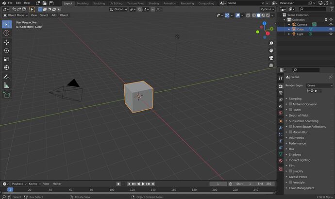
i was using a lot of topbar buttons for some addons and the main issue i see is that the Workspace tabs take to much real estate to have more than a couple icons, so with your proposal one would most likely end up in the same situation than in the image that only 4 workspaces are visible and scrolling is needed to see the other workspaces which makes switching very slow and i dont think that was intended when the dropdown for workspaces was switched to the current flat layout.
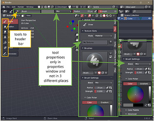
Maybe this is a bit out of this topic but i think that the tool space is not optimally used, maybe if the tool layout would be changed so the tools are in the header instead of the strange concept that is currently implemented there might be enough space for other tools and menus.
This seems to be one of the main UI issues that remain after the ui overhaul.


