I’m not sure what @pembem22 ended up doing but from previous comments the spectral sky did look less bright than the RGB version, which may or may not be an error in the spectral conversion. (Seeing as how the original sky had such an error at first I’m inclined to believe that is what’s going on)
The D8285 patch is applied to both sky versions in the current build. The difference exists without the patch as well, so that’s probably not about updated values.
The integration of the spectrum is happening inside the sky code on master so there might be a discrepancy there. I haven’t seen any rigorous tests to see whether either the one in master or the spectral one are actually correct, though, so it’s hard to say where the issue is.
I’ve been following your venture and congrats for the hard work!
I’m not sure if you have seen this already, there is a database of spectral materials measured by a setup explained in the paper released by Dupuy and Jakob (An Adaptive Parameterization for Efficient Material Acquisition and Rendering | RGL). Btw, W. Jakob is the professor behind mitsuba and other great stuff like instant meshes (similar to quadriflow in Blender).
Would it make sense to use that database and integrate it with your work?
Of course this database is only for surfaces, not for volumes.
Here’s an image from the above link for a quick overview of their work.

There’s even a BRDF loader in C++ (GitHub - rgl-epfl/brdf-loader) to parse their custom data into something usable for rendering if that helps.
10 Likes
I have looked into that before, very interesting stuff, and certainly worth checking out. Jakob never ceases to amaze me with all the stuff he puts out.
I don’t think I’d be a great person to implement a BSDF loader but it would be an interesting concept. Even something like a spectrum database would be a really interesting thing to have - of course with my background I’m thinking of how such repositories could simply be web services that Blender talks to, and you could add as many as you like, allowing for simple viewing and usage of BSDFs or Spectra, but that would really be becoming an asset management system at that point.
3 Likes
@polyrhythm: I always do a clean build starting from scratch.
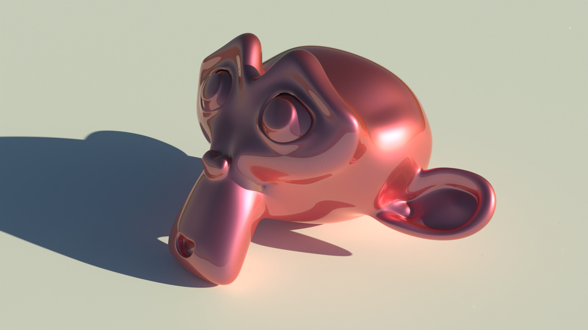
Now that spectral stuff works (especially once Importance Sampling is in), getting new BSDFs and material libraries that actually make use of it would be really great. This looks amazing. I really love the materials like that bottle and the bunny with iridescence.
1 Like
Hey there!
For everyone using a Mac: I have compiled the latest version of the spectral-cycles branch for macOS and uploaded it to GraphicAll. So far, everything seems to be working fine.
5 Likes
That’s awesome, thank you @johjakob. And welcome! I think we will have some interesting developments in the branch in the coming months.
4 Likes
Thank you! I am going to keep the build up to date.
Do you have a test scene I can use to find out if everything works? I don’t know (yet) how to properly use the spectral features 
For the most part, if it looks right, it’s working 
I haven’t created a single test file which covers everything but testing saturated lights on materials of different colours is one thing that should always be working, then coloured volumes etc. These are about making sure we don’t break existing features, but the new spectral colours should ‘just work’, and you can use them wherever you would use a normal colour before.
There’s still a lot which isn’t working like branched path tracing and baking, but they’re lower priority for now.
1 Like
Any insights? Please please? ![]()
1 Like
For the most part, the effects of spectral rendering show up in very high saturation areas, especially concerning stuff that’s close to “purely” red, green, or blue. In regular Cycles, a green light would not illuminate a red surface at all.
In Spectral Cycles, green and red has overlap (as it would irl unless we’re talking super coherent laser light or something)
Therefore, a red object under a green light will not look black. It’ll instead look brown.
Because lots of bounces cause extra saturation*, for most scenes in practice, if there is a noticeable effect at all, it’s gonna be in regions that are indirectly lit.
The easiest way to make effects visible for colors that aren’t extremely saturated RGB colors is probably to use Volume Absorption.
You’ll notice two basic effects:
- Saturation may increase* even out of gamut if there are enough light bounces (Unless you do something crazy like “negative colors”, the three lights model of classic Cycles can only ever yield stuff that’s in gamut)
- Hue doesn’t shift as much (if you use the colors that are upsampled from RGB.) Normally, if you have a color that’s quite a bit more red than green, say, it’ll eventually go even redder. Because of the way this upsampling works, spectrally, the hue will stay nearly identical, even at deep bounces.
Additionally, and perhaps a bit contradictorily, Spectral materials allow you to generate effects where the hue does shift as you go to deeper bounces. The difference is, that it’s not an unplanned hue shift towards the extremes of the sRGB color space, but rather a very intentional and more arbitrary shift, replicating real world materials. For instance, water will look more cyan when fairly shallow, but becomes bluer as you go deeper. You could fake this with some sort of gradient node, but with Spectral rendering, you can get the exact right look under wildly different lighting conditions.
(That being said, setting up these things, imo, isn’t yet ideal. Really you’ll eventually want some robust material library to get things done in a more practical manner)
The reason this kind of “correct Hue shift” doesn’t happen with RGB input is, that the spectra that represent these colors are chosen to be “as boring as possible” while adhering to physical and performance constraints.
So in summary, Spectral rendering will matter most in scenes that:
- are highly saturated
- feature specific real world materials
- feature materials where lots of bonces matter to the look
The last point also includes stuff like, say, subsurface scattering. For instance, highly saturated natural light sources (say, torch light) interacts with skin in ways that are extremely challenging to replicate in a non-spectral renderer.
In most situations though, to be clear, it won’t actually matter all that much. 99% of renders will not have an appreciable difference.
If you want a few examples of differences, check out demonstrations in this thread.
For instance, here is a test showing off how pronounced the effect is given different saturation levels (note especially scenes involving green light where, spectrally, there is the biggest overlap with both red and blue):
And here is a test for how spectral blackbody materials make a difference in a scene (note the two Suzannes):
And here is an example of planned hue shift, as well as, if you look carefully, multi-bounce saturation (you can see in the shadows how concave regions are more saturated to the point of a hue shift. For instance, check out the inside of the ear rim. The material on this Suzanne is the same everywhere, except that the material’s “thickness”, effectively its saturation increases as you move up. And yet it starts out yellow and then goes red)
* Why Saturation is expected to increase: Every bounce, the current light is multiplied with the reflectance spectrum of the material you’re looking at. If it hits the same object several times, it will be multiplied multiple times too.
So let’s say at a particular wavelength, the material reflects 90% of that light. After two bounces:
0.9² = 0.81.
Relative brightness between one or two bounces is therefore 0.9, or 90%. Almost the same!
But if you take a wavelength where the material reflects just 10%, you get
0.1² = 0.01 = 1%, with a relative brightness of 10% (It’s no coincidence that the percentages here come out the same as the initial factor)
So stuff that’s dark gets darker at a faster rate, which means small contributions slowly fall away and the spectrum becomes sharper and sharper, i.e. more saturated.
12 Likes
Thank you for the detailed insight, @kram1032!
The spectrum CSV importer add-on seems to be missing on macOS. I will look into it. Where should I create an issue? There are multiple GitHub repos for Spectral Cycles.
Don’t take my word for it but as far as I gathered, @troy_s’s branch is usually the one that’s more up to date?
1 Like
More Sky Model testing. Weirdly there are pretty big differences here:
RGB Sky (Master):

RGB Sky (Spectral):
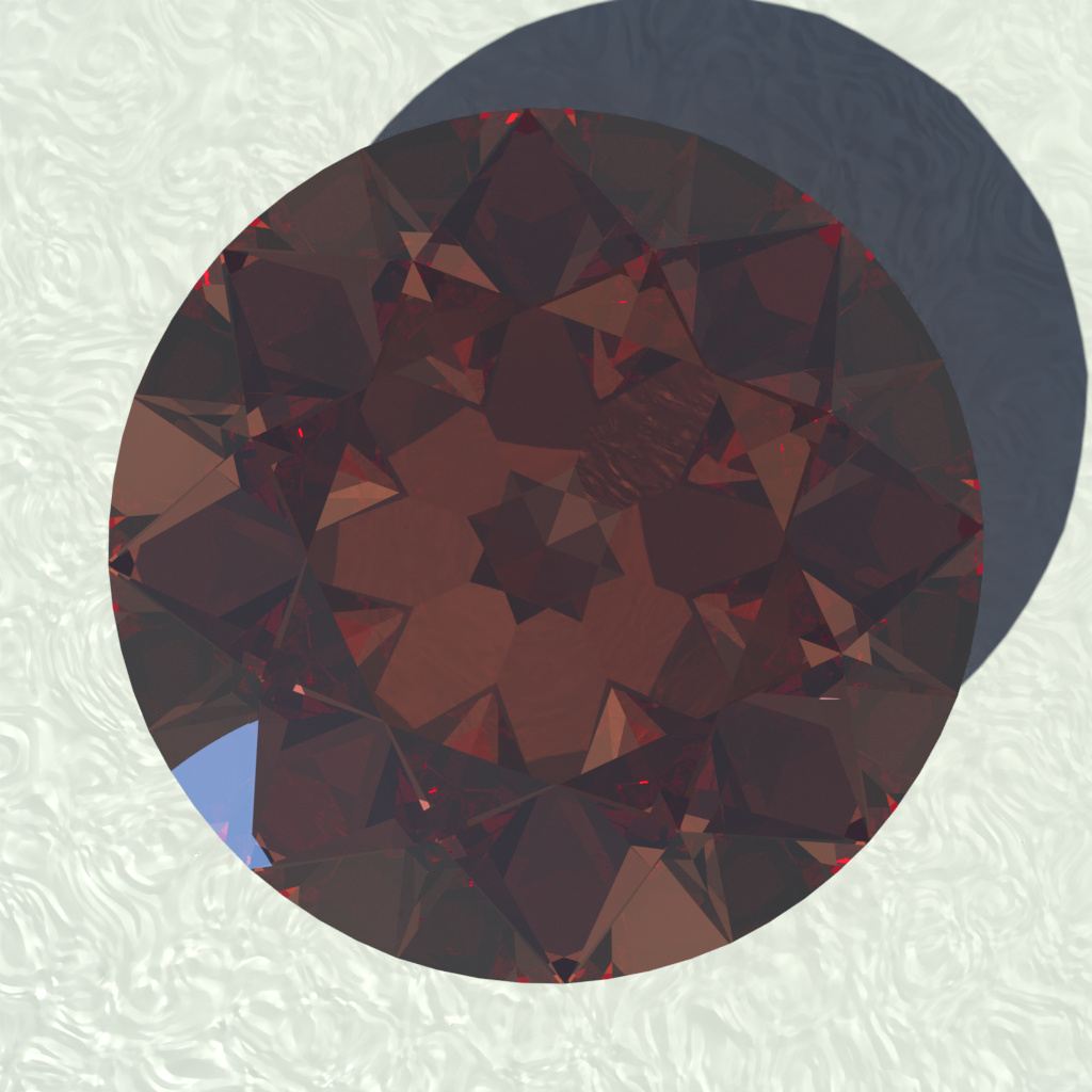
Spectral Sky (2.5EV brighter):

Master renders very reddish with these settings (the sun angle is 60°)
1 Like
I saw the bug where colors suddenly change happen this time. I can’t reliably reproduce it, but it’s definitely something about the spectral math nodes. It might also involve copying nodes.
There’s also currently perhaps a bug involving Vector nodes:
Commonly, Vector Math nodes are used to do arithmetics on color. It should behave identically to equivalent arithmetics using the color mix node, right? It doesn’t though. It behaves like my weird glitchy float conversion problems from earlier.
I encountered these bugs while working on this:
Here are two different ways to interpolate between two colors. One is “correct” for light source, the other for pigments:

Lights - From top to bottom, linearly interpolating between RGB Values
[0.999 0.5 0.001] and [0.001 0.5 0.999]:
- Master
- Spectral (using an RGB Gradient)
- Spectral (using Spectral Math)
You can see that Spectral (using Gradient) is slightly darker, and Spectral (using Spectral Math) features a smoother gradient (the “grey” area looks wider)

Pigments - From top to bottom, geometrically interpolating between RGB Values
[0.999 0.5 0.001] and [0.001 0.5 0.999]:
- Master
- Spectral (using RGB operations)
- Spectral (using Spectral Math)
Here the darker appearance and smoother gradient in case of the Spectral Branch are far more pronounced.
Just to be clear what’s going on here:
Say:
- Y is the yellow color on the left.
- C is the cyan color on the right.
- x is the position along the image from 0 to 1.
For the “lights” version, the interpolation formula is classic linear interpolation:
Y( 1-x) + C x
For the “pigments” version, I instead interpolate “geometrically”:
Y¹⁻ˣ Cˣ
In the Spectral version, the overlap between spectra allows for that kind of interpolation to smoothly step through all colors.
In the RGB version (and if you do RGB operations in Spectral Cycles), the three lights do not overlap at all so instead, since for the above colors, either Red or Blue is almost 0 for each value, in the center, those two colors go to 0 so only pure green remains.
The Spectral version behaves more or less as if you had water colors and mixed them such that the total amount of pigment stays the same, but as C linearly increases, Y linearly decreases.
3 Likes
Well, I’m hoping to get wavelength importance sampling working, and I heard that @pembem22 might look into creating a spectral ‘wavelength’ node which will be a really interesting tool for procedural materials.
3 Likes
This is probably not accurate (I didn’t do any research on how these colors actually work), but using the pigment blending technique and a simple dot product to yield the (cosine of the) angle of incidence, you can get something that looks quite nicely like car paint.
Render:
Material:

Alternatively one could probably use some spectrum that shifts hue with depth in separation.
@pembem22 I’m using this combination so often, and I suspect it’s gonna be useful to lots of people, do you think you could build a node that does what I do to the spectra here? Maybe combining it into one would also allow for some mild optimizations.
Basically, Inputs:
Factor
Color 1
Color 1 Depth (or Saturation)
Color 2
Color 2 Depth
And those get processed like so:
- Each color spectrum is raised to the power of its depth
- The two colors are processed as C₁¹⁻ˣ C₂ˣ where x is the Factor
It could be called “pigment combine” or something.
The reason to call it “Depth” is that, if it were an absorption material, the Depth-parameter scales what 1 BU means for the material.
“Saturation”, meanwhile, makes vague sense in that spectra are sharpened as you increase this parameter. Though it also affects lightness, going perfectly white at 0 (although 0^0 seems to default to 0 rather than 1) and near monochromatic at high values. So I think I prefer Depth.
EDIT: Did a second one with a much more pronounced effect:

11 Likes