You probably could just set the output to flat 0 for anything below like, Iunno, 100°C (boiling water) and even that is way more than you need. Really stuff basically only starts to glow around 798K or so. Much cooler than that and it’ll look black even in like otherwise complete darkness.
1 Like
I’m creating a quick test scene to test 1. that the spectral branch is rendering as expected and 2. the differences to master in performance and visuals.
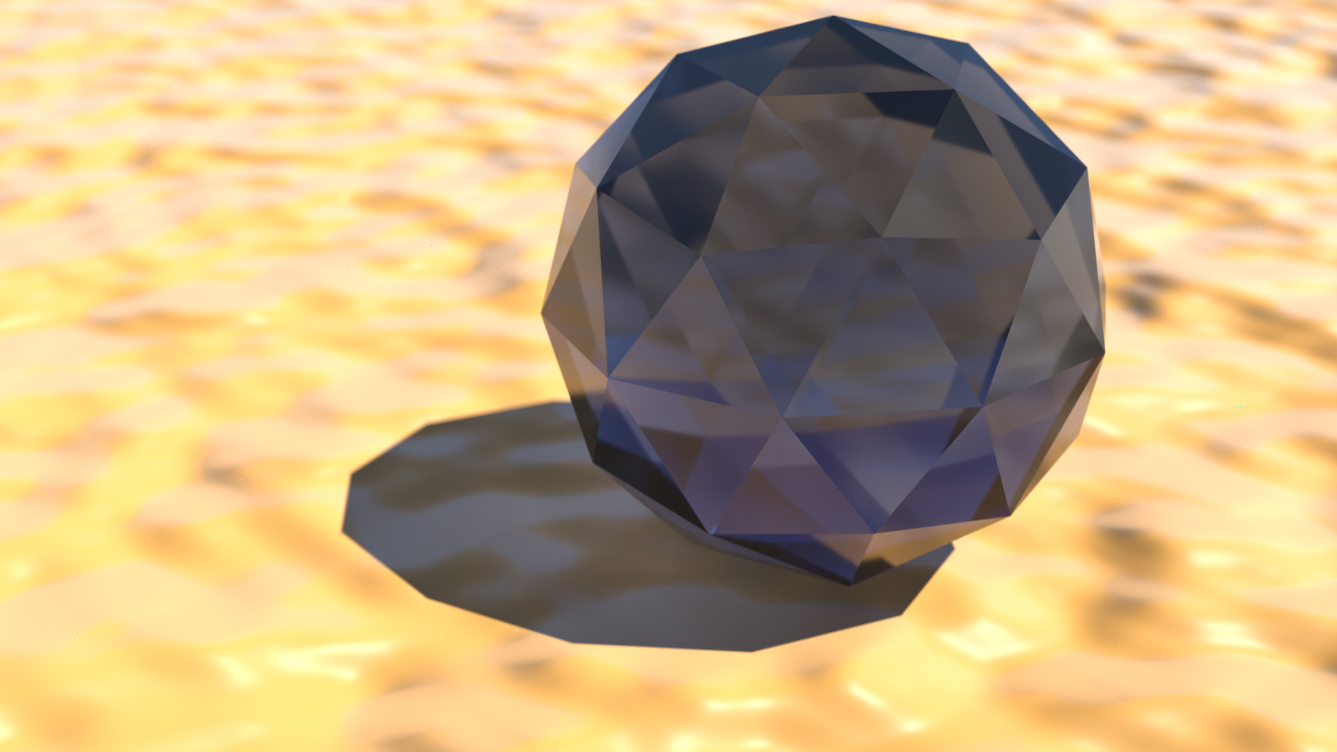
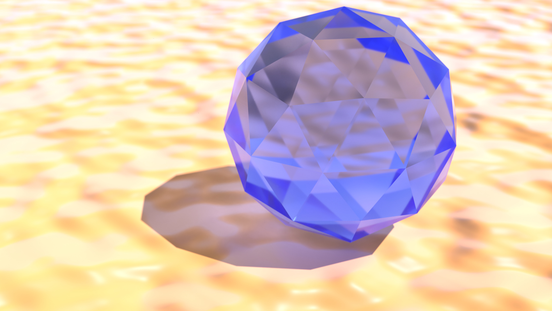
From an initial test, it seems like there’s quite a dramatic difference in how the blackbody node works. On master it seems to be ‘normalised’, being a very bright red even with low numbers. I suspect the spectral implementation is more physically correct.
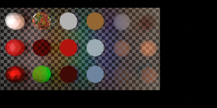
This test is mostly pointless apart from observing the obvious difference in brightness of the blackbody, both the emitters in the middle of the image and a light source from camera right. Will add some more soon.
4 Likes
As said, really I’d want a normalized spectrum output plus a factor I can use to make it physically accurate. For some applications you wouldn’t actually want the physically accurate brightness of literally looking into a 22000K hot star or something.
1 Like
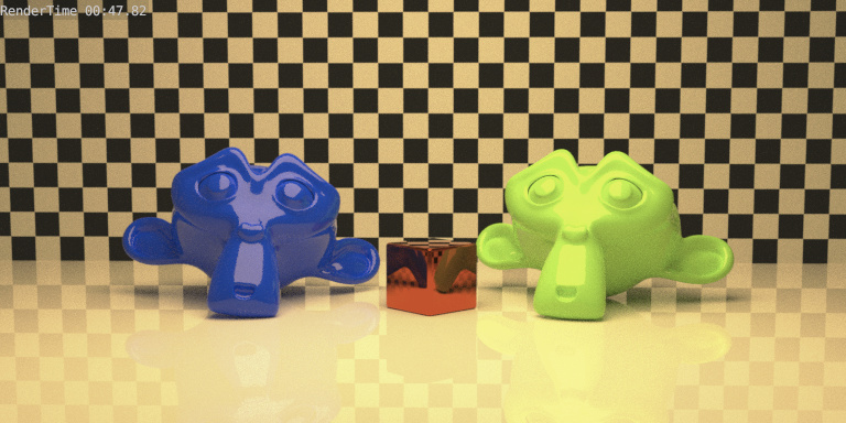
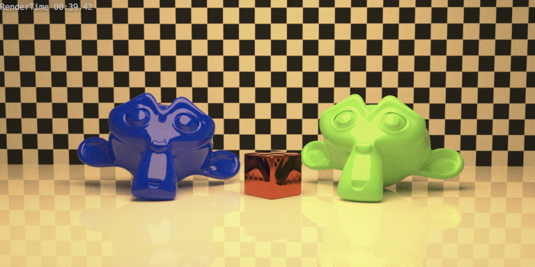
This shows the same scene with the blackbody lightsource removed so that the comparison is more fair, and also adaptive sampling turned off, so that render times can be compared. Evidently there’s still something else causing the spectral version to be significantly slower than master.
spectral: 4m16s
2.83 2m45s
The good news is that volume scatter is working! Meaning that it should now render most scenes reasonably predictably. I think there might still be some issues in individual light passes, but for the most part they look okay too.
I’ve saved the renders as multilayer EXR if anyone is interested in looking at the render passes.
10 Likes
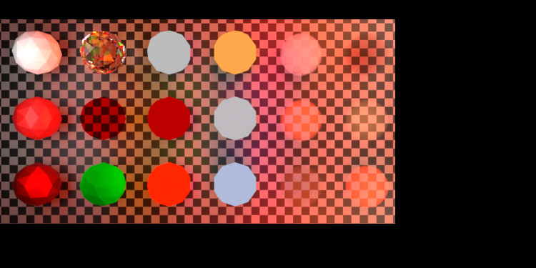
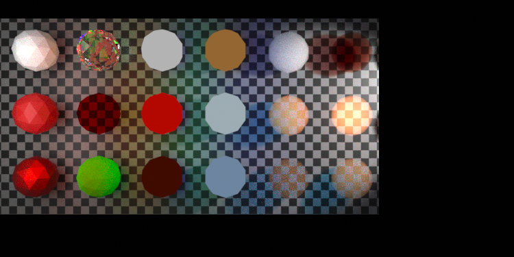
Ok as we have already established, this totally is unfair: Blackbody node in RGB just looks really off and I’d have to know how exactly to tone down the color to actually make it work. And also, this obviously isn’t exactly how that node is supposed to be used in the first place.
However, with that out of the way, I tried using it for a bunch of different materials.
RGB:

Spectral:
The RGB version actually is at exposure -3 whereas the Spectral version is at 0.
All the materials in this scene other than the glass material on the sphere and the glossy material on the ground (which are just 1 1 1 white) have a blackbody material on them:
- the sky is just uniform lighting background with 22000K blackbody
- the sun lamp has a 5777K blackbody
- the floor’s diffuse portion has 2500K
- and the absorption material has a ridiculously high 100,000,000K making it kinda purplish.
That last part appears to also be why the RGB version goes so horribly wrong. The sphere ends up “absorbing” light negatively, i.e. stuff passing through actually gets brighter.
I actually really enjoy the colors I’m getting this way in Spectral branch even if it’s pretty much nonsense physically speaking.
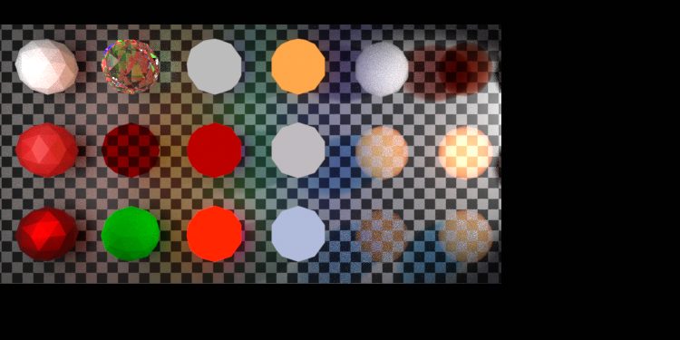
EDIT: I found a simple way to keep RGB spectral at least somewhat in check but it’s obviously still not a perfect match. Rendering right now but all I did was normalize the color such that the maximum color channel is exactly 1. It ends up looking a lot closer to the spectral version here for the most part. At least I can keep it at Exposure 0. I’ll update once that’s done.
EDIT:
RGB normalized colors:
2 Likes
Another massive change thanks to @pembem22!
- The next build will have much better colour noise performance thanks to 8-channel hero-wavelength sampling, it is very hard to see any colour noise now.
- Render time has been reduced due to improvements in float8 math.
- Some fixes to the blackbody node have been added, and it seems like the code that’s there now will enable much more flexible/varied applications of blackbody (normalised vs radiometrically correct etc) when the time comes.
- It has been updated to include the latest changes from master.
Check out the PR here. @pembem22 is truly an amazing person. Huge thanks to all his contributions.
New Spectral:
Master:
13 Likes
This is a really interesting test, thank you! It’ll be interesting to see the same sort of thing with the updated build (should be within the next 24h) as I think the behaviour of the blackbody node is now in line with master again.
Using an extremely hot object’s emission spectrum as an absorption spectrum is not physically meaningful but it’s the only way of getting a non rgb-derived spectrum in the system today, so that’s something! I’m not sure if any custom spectrum input will make it into this build but hopefully it can, that way we can experiment with much more varied spectra.
(Looks like this is about to be outdated but here it is anyway)
Here’s something fun I’ve always wanted to do. And also the self-multiplication for telling apart metamers at least somewhat in action:

When multiplying the spectrum of the sun* with itself**, you can see, that the sun is actually green!
Moreover, you can nicely see that there also is a regime where it looks turquoise.
Note, this isn’t necessarily accurate: Pretty early on, the red portion of the produced colors already takes on negative values, suggesting this is quite a bit out of gamut.
Also, sun light is actually rather white. Surprising, I know.
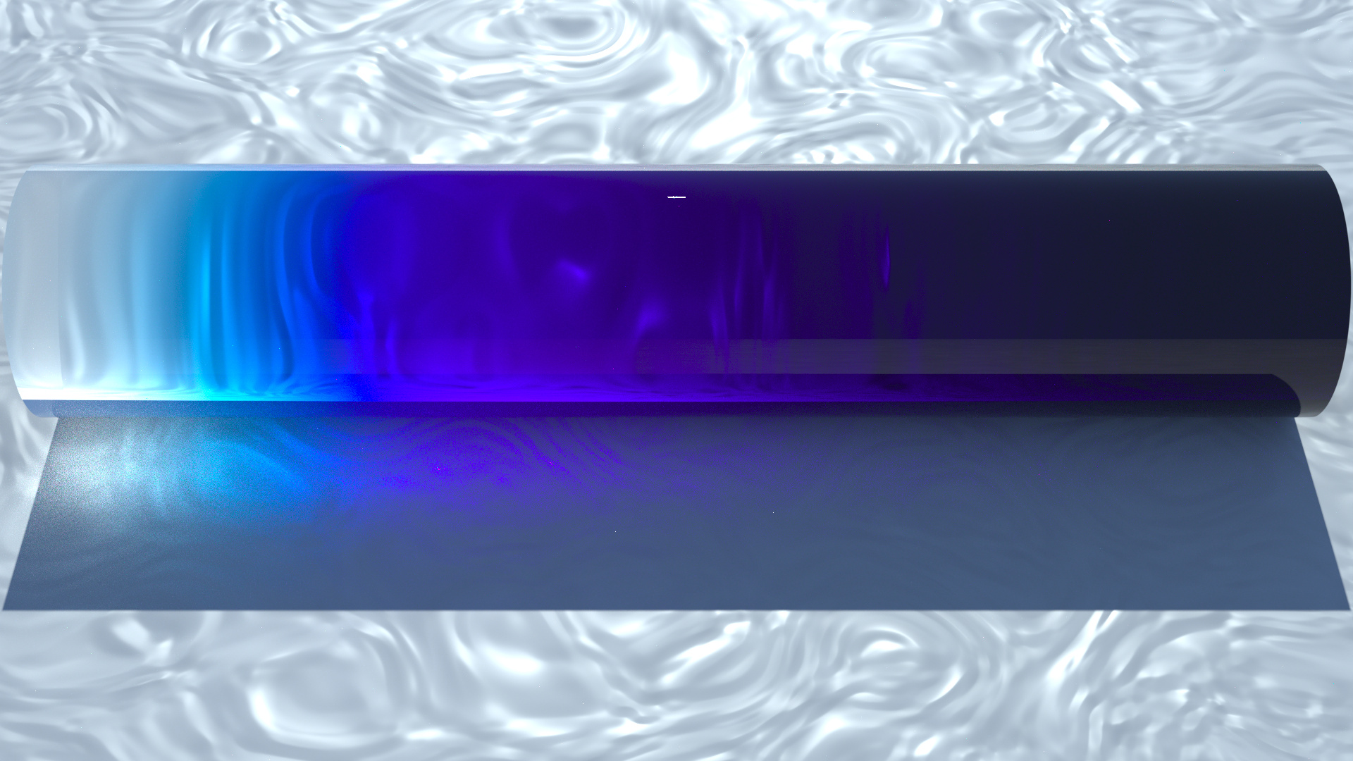
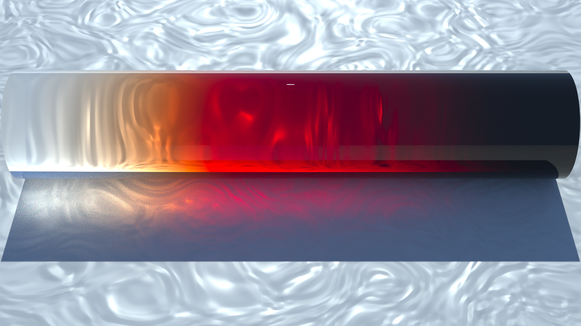
But what I mean by that is, that it actually takes insane amounts of absorption to achieve the darkness to the right:
What you’re looking at is a 1BU radius rod where the density varies from 0 to 999999 exponentially from left to right. The rod is 10 BU long, and each BU the absorption goes up by a factor of 10 (minus 1 so it starts at 0)
In the center it therefore has a density of 999.
Of course, saying the sun is green in that sense is kind of shady. It actually kinda works with that particular spectrum, but compare, for instance, 6500K in the same vain:
It clearly goes through at least three different colors! It starts cyan, then goes blue and eventually ends up purple. In some sense any of those colors would be reasonable to assign.
By comparison, here is a supposed RGB approximation of 5777K***
This (RGB 1 0.96 .92) goes up to absorption 99999 at the right end. VERY different from what sunlight does. It looks closer to something like a 3750K spectrum (going to absorption 99 because even as a baseline this is far darker than the other ones I did above.)
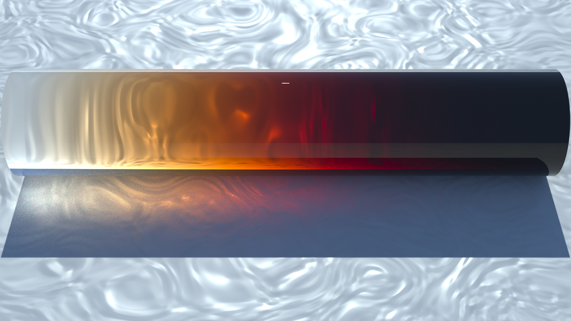
It looks like that’s too yellow (judging by how long it takes to reach the red region). However, going for something more reddish ends up being way darker than the RGB version.
* approximated as a 5777K blackbody radiator.
** this is, at least after normalizing, equivalent to looking through a material with that absorption spectrum with increasing thickness or, for practical purposes, increasing density.
*** I’m sure there is a better way to do this. What I did was to simply use what this tells me 5777K - Wolfram|Alpha - I am not sure how they decide white point and what not so there’s a lot of caveats here, obviously
13 Likes
Man they look beautiful. I love that you can start seeing some purple in the deep blue one. I wish I had a machine powerful enough to join in with all this experimenting 
1 Like
honestly, if I don’t care about the caustics which aren’t gonna be accurate anyways, this actually renders fairly quickly. Like, this is without denoising and 512 samples but at least to get the gist of it, really low sample rates easily suffice. Even the viewport default 32 look decent. Except for the caustic.
These took about half an hour on my machine each - I really wish I had a GPU that likes Cycles. I thought I got one now but it turned out that this was literally the best possible GPU not yet good enough to allow GPU accellerated rendering.
But anyways, if I had been happy with higher noise levels, 2 minutes per image would have been possible. And probably even then the denoiser could have done a somewhat decent job
And yeah, agreed, I love how these came out
As soon as we have a custom spectrum node, I want to see what renders look like a few tens of meters under the water. In real life the colour shift can be quite drastic and I wonder if the difference between RGB and spectral is significant for that case.
Well I guess I have no excuse then ![]()
1 Like
Oh I’d love physically accurate under water scenes. Also, ocean water vs. drinking water can behave quite differently, as far as I know.
1 Like
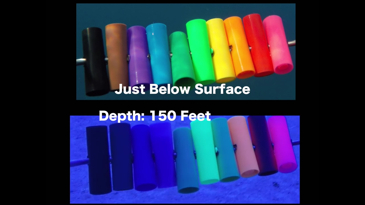
Yep, the particles and chemical makeup of salt water most likely behaves quite different from pure water. Here’s an example of the sort of strangeness that can occur. Note this is captured on a gopro so can’t be trusted for accuracy, but the phenomenon is clearly there.

5 Likes
that is so cool. I love how pink never stops being bright, and so does bright green (I strongly suspect they have some flourescent colors in those?) whereas red goes as black as actual black and only makes it clear that it’s red by strongly reflecting the orange and pink.
But yeah, from what I saw, gopros are particularly bad at capturing spectra well. Like, if you take a pic of a refraction spectrum, it’ll look quanizied into a couple very clear bars. It’s weird. Even so, yeah, nice showcase
2 Likes
(this is still on the build before the blackbody change)

This chart essentially shows the same thing as the rods before, except all in one glance.
- On the y-axis, the blackbody temperature varies from 3000K - 8000K (each bar spans 500K)
- On the x-axis, the absorption density varies from 0 - 99999 exponentially (every two bars the density grows by a factor of 10 - each bar represents a jump of about 3.166, and once again I subtrated 1 so it starts at 0)
What you’re looking at is a 1BU thick block of a Volume Absorption material (and nothing else) backlit by a mesh light source emitting white (1 1 1) light of strength 1, 1BU below the block.
Perhaps less exciting looking than the rods before but much more informative and also faster to render.
I noticed that, if absorptions go higher than on the order of 10^6, absorption suddenly starts brightening again. I can only assume that’s some sort of floating point error.
6 Likes
It’s amazing how long green light persists in that model. I wonder whether that’s physically accurate or if it’s introduced by the normalisation process. Very cool test.
I’m working on a ‘spectrum curve’ node at the moment. Hopefully it’ll be relatively straightforward.
2 Likes
Oh looking forward to that! I assume that you could basically reuse a curve editor for these purposes. Maybe (eventually) with some fancy additions such as a backdrop of the spectrum, so as to make it easier to visually see which region to boost.
Another neat thing would be a list input of sorts. Maybe you could reuse the scripting node for that, or see how add-ons like Animation Nodes have solved that.
Either way, exciting times!
Yes this is just a temporary stop-gap measure to be able to create spectra in some way. The end goal is to have various spectrum creation/import methods such as a file loader, maybe a preset selector (if that’s useful), and eventually, maybe a spectral colour-picker/maker. This will be a lot harder as it involves some significant UI development which I know nothing about.
1 Like

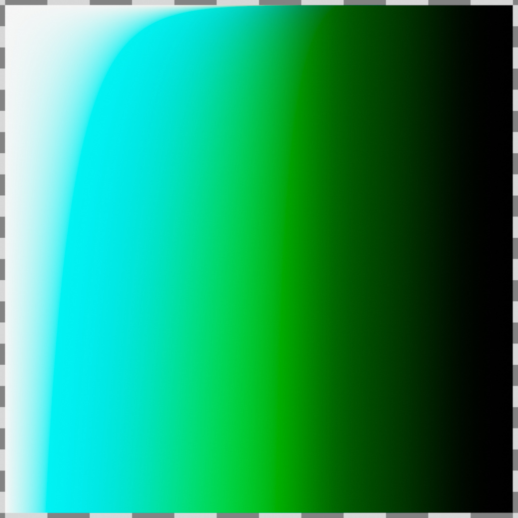
Same idea as with the blackbody absorption chart before but this time for the current RGB colors.
Each vertical bar corresponds to a 15° hue shift.
Absorption is as before, every two bars represents an absoprtion density increase of a factor 10 (and then -1 so it starts at 0).
For this chart, I set saturation to a constant 0.1 and value to a constant 0.9995
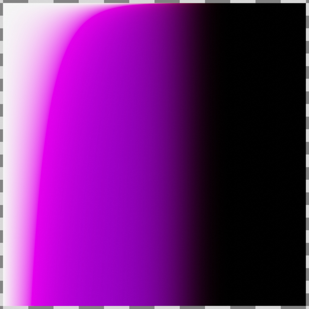
Trying this with a value higher than that leads to a lot of weirdness, at least some of which probably is a result of floating point errors at very high densities. You can still see a little bit of weirndess in that very long spike at a hue of exactly 0.5. Here’s this exact same chart with a constant value of 1 instead:
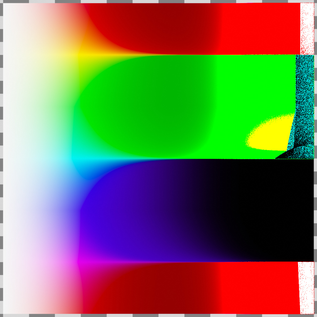
The noisy region has colors drift towards infinity or negative infinity depending on the channel.
Of course this is only for insanely high absorptions. Looks like up to around 10^5 things still work out at least somewhat reasonably, but really between 1000 and 10000 depending on hue is where things start to go wrong.
2 Likes
One last batch in this series. The six most extreme colors (as per both intuition and inspection of the Hue chart) with the vertical direction instead determining saturation. Hue increments by 1/6 across these charts, and Value, in order to avoid this unstable behavior as seen in the second Hue chart, is constant at 0.9995.
The horizontal direction is the same 0-10^6 density as in the other charts.
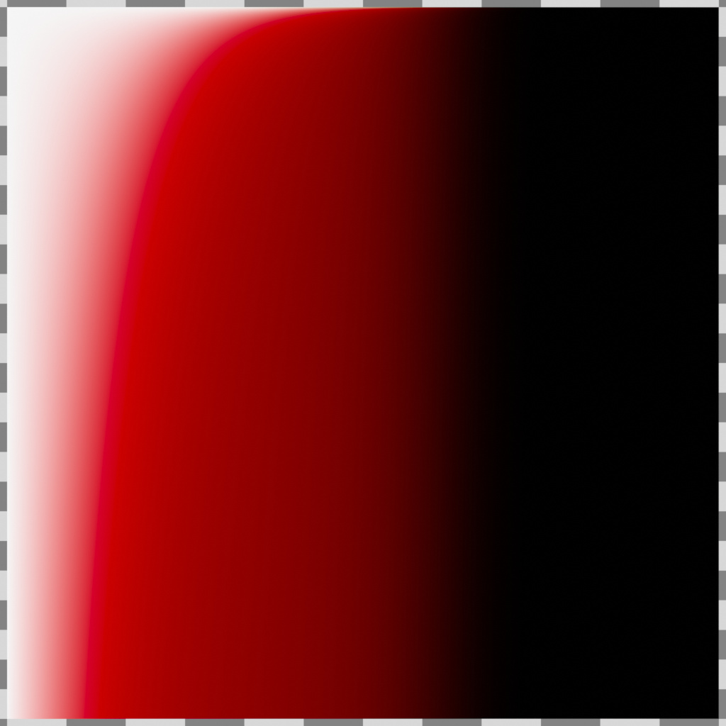
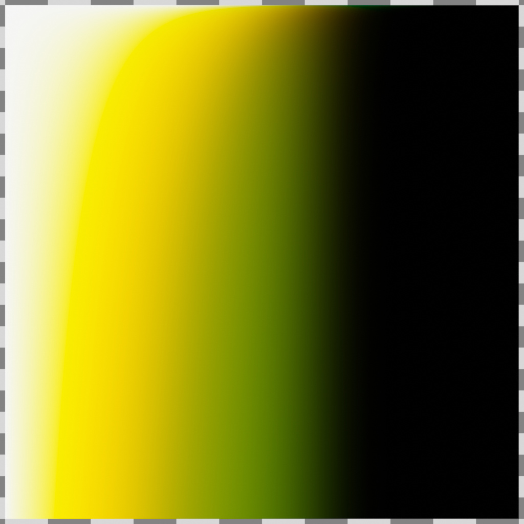
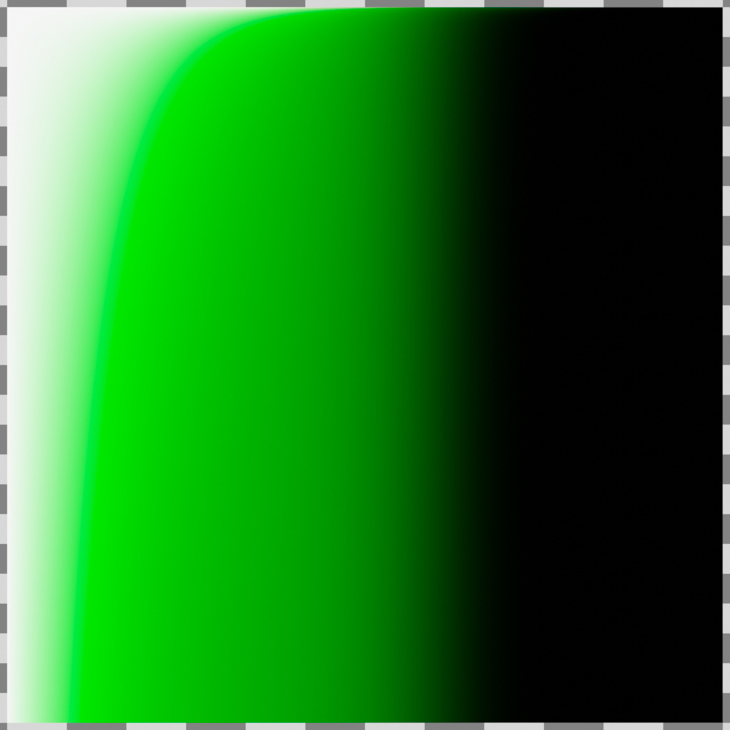

One thing that’s curious to me is that somehow the Cyan version is somehow the brightest color when these are all based on linear combinations of a red, green, and blue response respectively (right?), and blue (looking very purple here) is by far the darkest. Shouldn’t yellow look much brighter?
1 Like