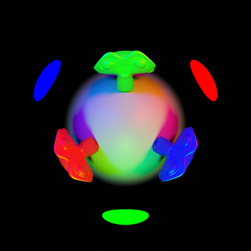
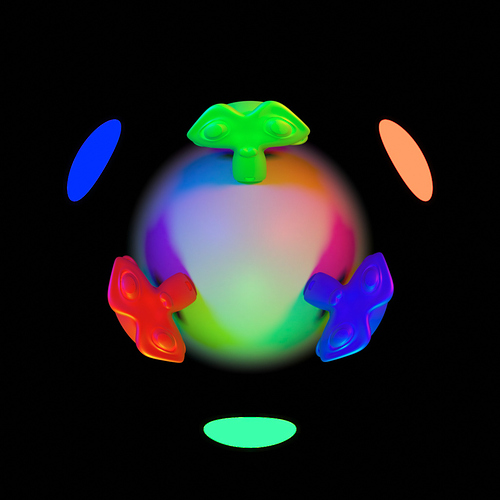
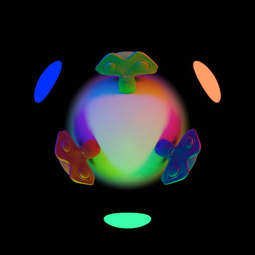
in this one, at first glance, other than the light sources, there’s not much of a difference, but if you directly compare them (flip back and forth between them), you’ll find that the spectral render shows vastly more detail on the Suzannes. It really shows the range of differences to expect: Basically none in gray areas, very little in even saturated areas that aren’t just pure red, green, or blue, but quite substantial improvements in those extremes.
Also it’s not quite so simple as RGB being brighter than Spectral. If you look closely, you’ll find that the light on the bottom plane actually reaches farther in the Spectral version (the outer edge of the part of the image that isn’t black goes farther), despite being darker in the center. - I just can’t ever be sure in how far that’s simply a tone mapping difference. (This seems to be a pure brightness thing after all, so that could be due to tone mapping, right?) (there’s no tonemapping yet so this is nonsense)
RGB:
Spectral:
GIF comparison:

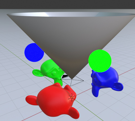
EDIT: I modified the scene to get rid of much of the direct same-color light by adding this cone:
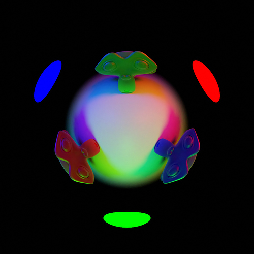
That pronounced the effects quite a bit. Interestingly, perhaps due to relative darkness, the denoiser struggled more to denoise the RGB version of Green Suzanne’s eyes. You can also see how, on the Suzannes, the colors look quite different, as the diffuse portion of the shader is no longer entirely black for other light sources, and so mixes into the highlights. And the improved overall contrast is also still very much visible.
RGB:
Spectral:
