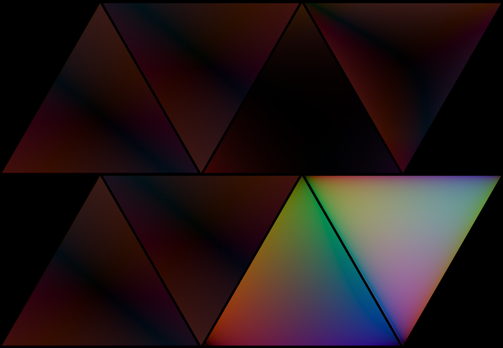
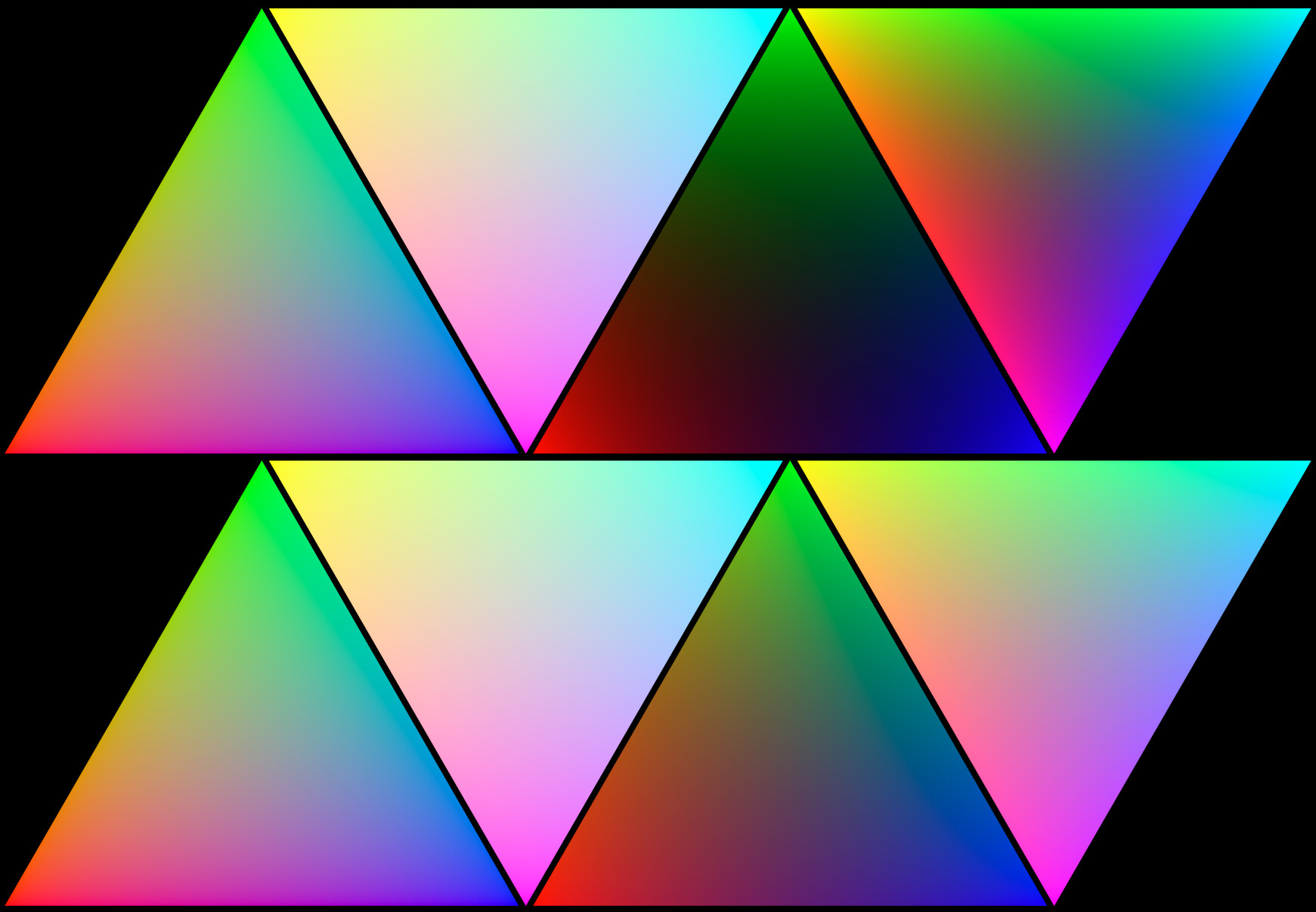
Here is a complete comparison using stable master and the latest Spectral Build:
Master:
(bottom row requires Spectral branch to work)
-
Standard:
-
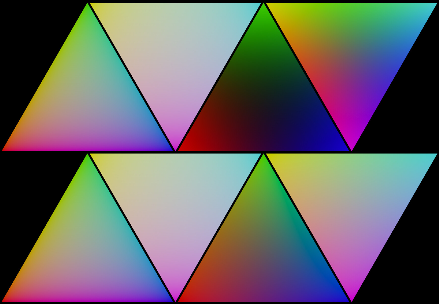
Filmic:
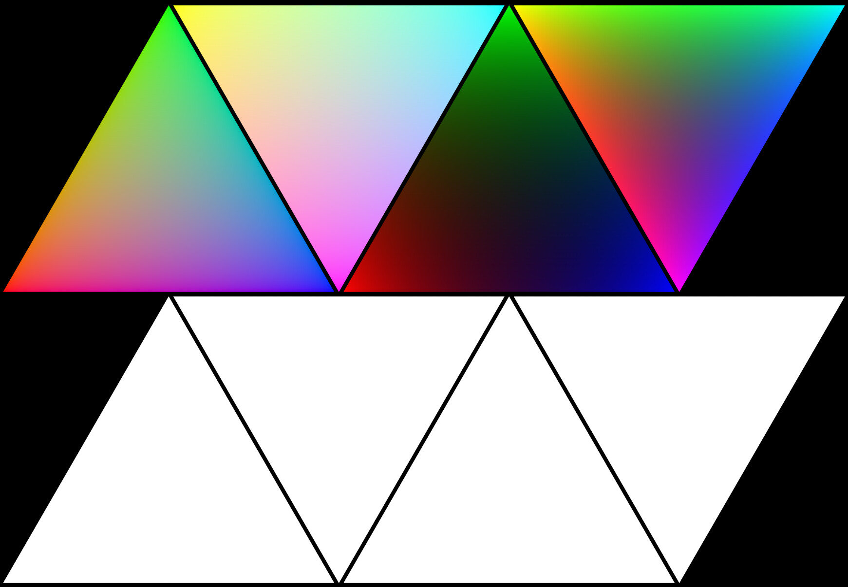
Spectral Branch:
- RGB:
-
Display Native:
-
Filmic:
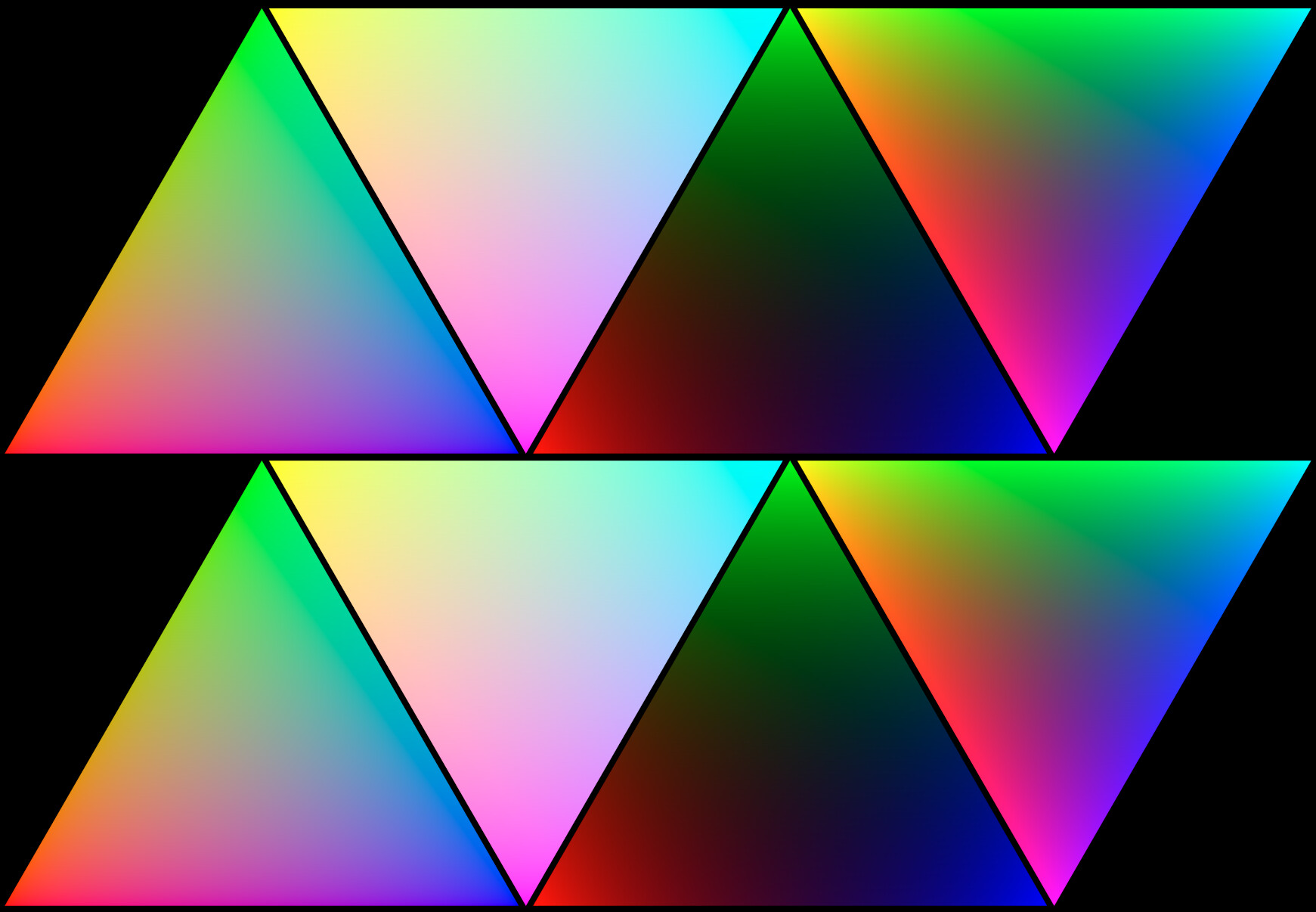
- Spectral:
-
Display Native:
-
Filmic:
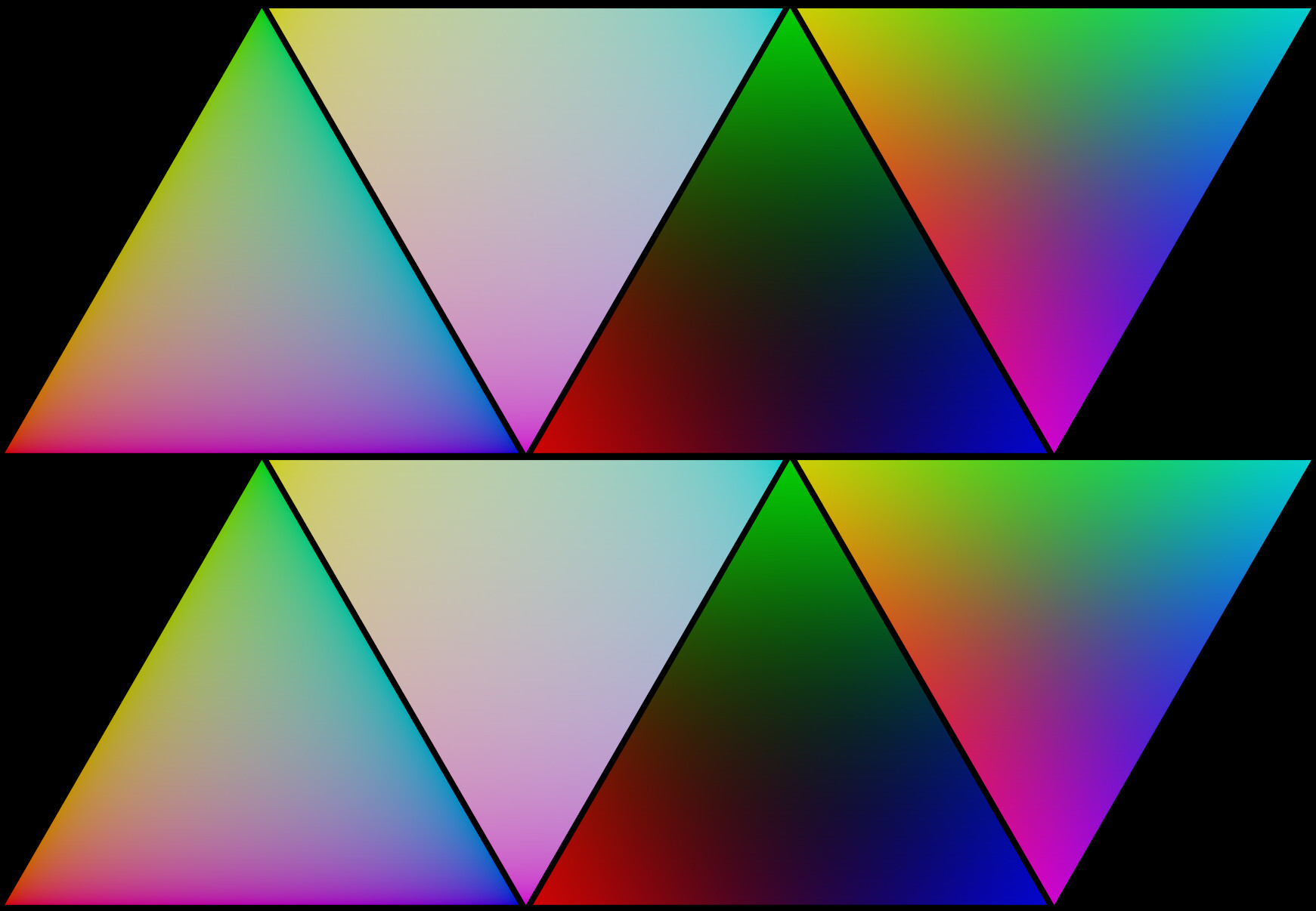
Diffs:
(Diffs performed in Master)
- Master vs. Spectral Branch (RGB):

- Master vs. Spectral Branch (Spectral):
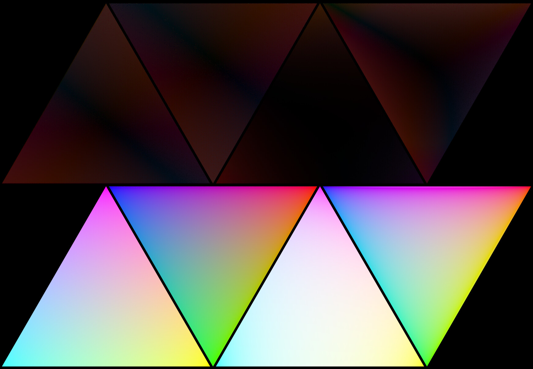
- Spectral Branch RGB vs. Spectral: