Thoughts on making Cycles into a spectral renderer

yeah certainly, regular scenes that don’t actively try to stretch colors to their very limit are gonna work much better

1 Like

I tried the weird gradient spectrum that goes from pink to teal in a different setting.

I think the way the shadow goes kinda teal relative to the rest of the scene is a result of this being a region where indirect lighting matters more, and the spectrum goes teal there, when, under direct light, it actually looks rather coppery.
So this material will directly affect the precise color of shadows.

Additionally, if you check the deepest self-reflections on Suzanne, which occur either in the corners of her mouth, or where the eyes meet the face - her eye lids, basically - you can also see how there is quite a bit of teal there.

It might be interesting to see what filmic does to this, but as that’s not available in the build, I don’t know how to easily check that.

So here’s the exr in case somebody wants to check that. (I did, however, use a denoiser on this image, so if things were out of gamut, they got forced back into gamut by it. I don’t think that’s a problem here though.)

EDIT: so the light source has the same spectral properties as the material, just interpreted as an emissive material. I just tried to also add Spectral Nishita to get a more natural light source and wow does it appear different. I don’t have time today to do a full render but I’ll add that tomorrow. In the meantime, have a preview:

image

Under what amounts to “self-light” it barely appears pink at all. But under natural outdoor light, it goes extremely pink.

4 Likes

There’s definitely something unusual about the self-reflections hey. Cool test!

You can load an EXR in the image editor in regular Blender and check ‘as render’ in the right-hand side panel (exact text might be different, I’m AFK right now) then the image should be displayed with your render colour management settings. If you switch them to Filmic it’ll apply to the EXR

2 Likes

I know this is not going to immediately happen, but I just had an idea for finer control over the gradients that a spectrum goes through. It’d be a completely new concept not currently in Blender in this form though.

This is the idea:

  • you have the usual curve widget
  • to the right of it, you have, like a brightness bar, the gradient that you’d get for deeper and deeper absorption given the current spectrum (probably normalized so the effective amount of leftover light is nearly constant)
  • this bar is clickable: if you click on a specific spot, you see the curve as it appears at that depth. (This is, I’d imagine, the trickiest part: Obviously it’s a bezier curve. But after taking the spectrum to a power, the result may no longer correspond to bezier curves at all. I’m guessing that’d actually require new drawing code to pull off)
  • in that transformed view you may still alter the position of handles, but because you see the transformed version, you can see more clearly what’s still relevant and what’s practically gone by now, and you can also more finely adjust stuff that’s close to the edges.

The main issue, aside from the novel interface additions, is going to be the nature of floating point numbers. No idea how that might affect an idea like this. But presumably, once those issues become noticeable in such an interface, they’ll also be a problem in the render.

I actually had this idea as you were mentioning how such subtle changes to the spectrum can have huge effects on volume absorption. I might try to mock something up in the browser if I get the chance, but I do think this would be a useful tool for developing absorption spectra.

starting to get real Programmer Art Vibes, hah
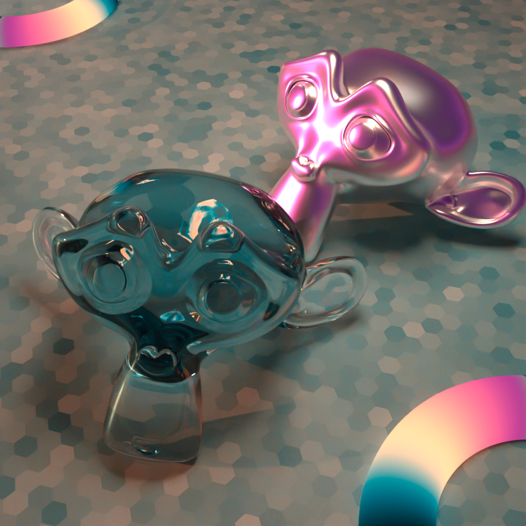
Same material in basically the same scene except with natural lighting. It goes aggressively pink in sunlight.
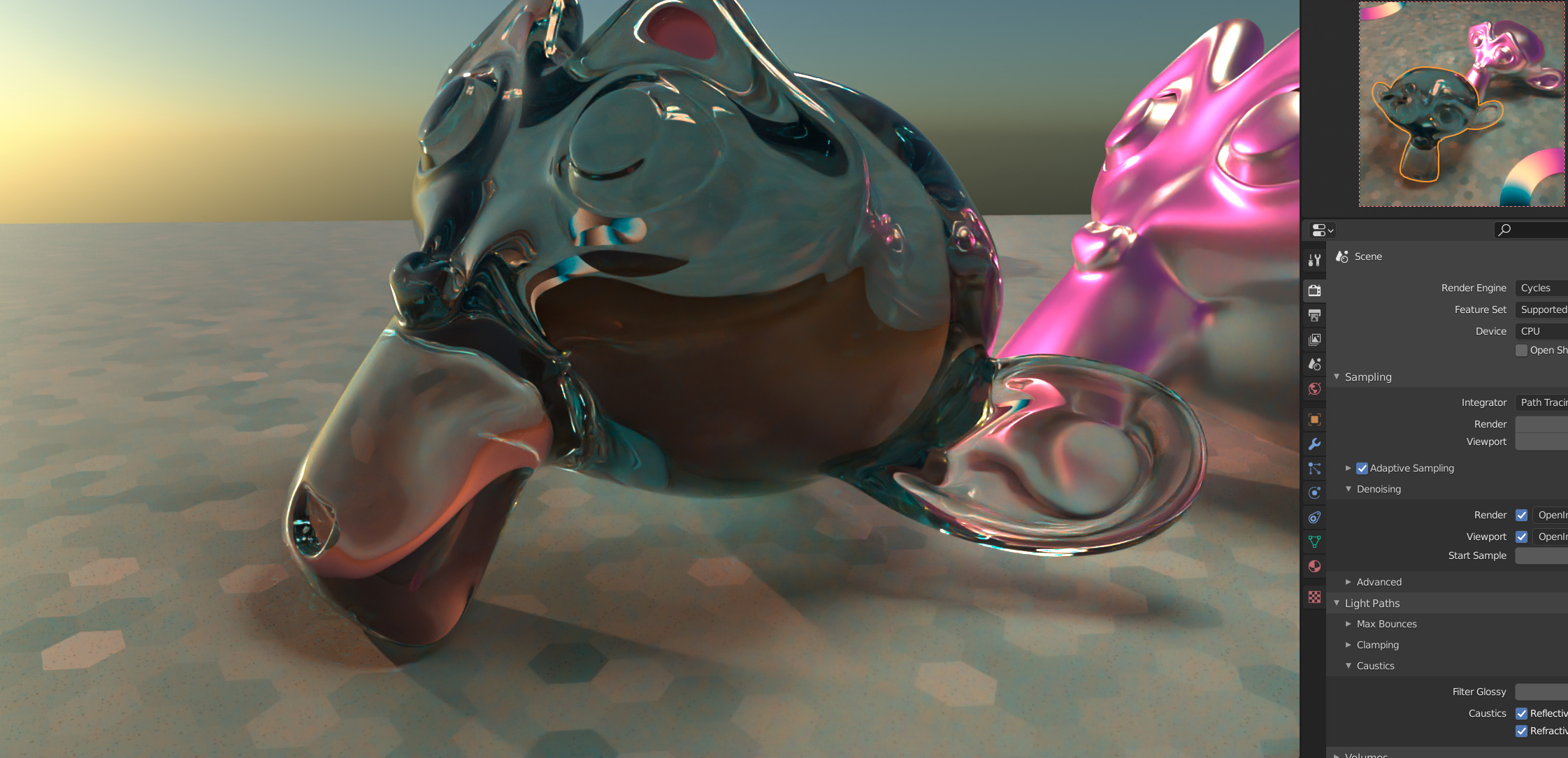
Additionally, there’s now absorptive glass with the same spectrum, and not one, but two toroidal emitters that show off the full extent of colors possible with this spectrum.

Additionally I did a Filmic version too.

sRGB


Filmic

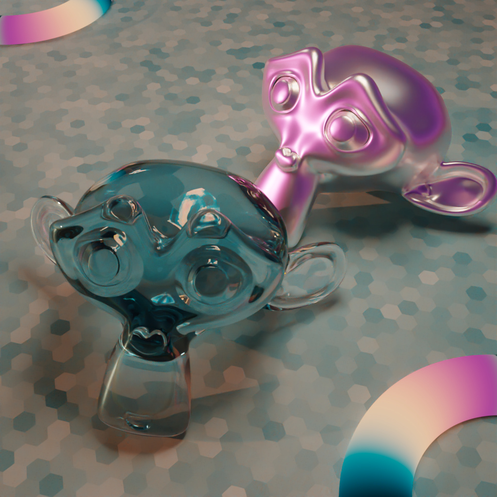
In scenes like this, Filmic is naturally an advantage. Not surprising, of course.
Most interesting, I think, still is the metallic Suzanne and how extremely differently it looks on the front side which is reflecting the sky vs the backside which is reflecting the floor (which also works with the same spectrum) or itself.

Note: the refractive Suzanne features suspiciously little pink. However, I think that happens because so much of the pink light is already gone by the time it goes through the glass to hit the camera from that direction, that effectively, none of it is visible anymore.

Viewed from a different direction it ends up looking like this:

10 Likes

That glass Suzanne looks so cool :grinning_face_with_smiling_eyes: definitely programmer art, but programmer art can look cool too. Interesting to see how much the materials react to the environment.

Could it be that the fact that the barbershop scene looks slightly too low on red is directly related to all the parts of red that are currently never sampled?
I just did another test RGB vs. Spectral vs. Spectral with Spectral Nishita Sky Model:

RGB:

Spectral:

Spectral Sky:

Additionally here are the differences between these (with contrast boosting - especially for RGB vs. Spectral the difference isn’t nearly as large as depicted here. The main thing about it is, that it’s very red.)

RGB vs. Spectral:

RGB vs. Spectral (with spectral sky):

Spectral vs. Spectral (with spectral sky):

So as said before, the spectral sky currently is far darker than if you use RGB values. Something is definitely wrong there. So that’s why the difference is a mildly darker version of the original image there. (Note, this is already after setting exposure a whole two stops brighter than the other two cases. That’s apparently still quite a bit too dark)

Though even with this brightness discrepancy being the largest contributor to a mismatch between the images, in the case of RGB vs. Spectral (with spectral sky) the strong red tinge is also very visible regardless.

Finally, in the most direct comparison, where brightness is appropriately matched up, and the sky is an RGB texture rather than spectral, very nearly all the discrepancy is red, with a little bit in the blue. Both of which the current sampling currently cuts off at the far ends.

(This was originally intended to test volume rendering and to see if I could get an appreciable difference in the cavities where light would mostly be indirect. Alas, the missing red effect is far more significant)

1 Like

Thanks for the test. I wonder if this could be caused by the lack of environment importance sampling. An initial test seems to suggest my idea to solve the wavelength sampling problem has worked so hopefully I can get a new build up soon.

Looking forward to retest this.
Importance sampling ought not to influence the outcome at all except in terms of noise/variance. The closer the sampling distribution is to the true distribution, the faster the results converge. But whether you importance-sample or not, the mean distribution should be accurate. So I don’t see how importance sampling would end up tingeing the result a completely different color.

So I suspect the fact that extreme wavelengths are undersampled, or possibly completely unsampled, is gonna have a larger impact. That would actually affect the average which is supposed to be the ultimate outcome of the algorithm.

With that in mind, if this actually solves it, we’re gonna have to retest colors all over again. I’ll try to rerun some older tests if this change fixes that scene.

I mean I said before how those extreme colors don’t have much of an impact on the scene. Which is true of course: Currently they have literally 0 impact. Because they never get picked. Maybe the influence is actually appreciable once sampling works as intended.

The reason that importance sampling can appear to shift the average result in a case like this is that a large majority of the light coming from the sky comes from a very small region, meaning with uniform samples, you might need multiple hundred samples before you can expect to even get 1 sample which actually hits the sun. The ground truth could be the same but would need 10s of thousands of samples to actually resolve. Either way, we should be able to relatively simply uncover the issue and solve it, so it was a very helpful test. Thank you for your consistent contributions to this work :slightly_smiling_face:

Considering it resolved the near-single-wavelength texture on a plane just fine (extreme-end artifacts aside), I’d think it’d work just as well on the sky. But maybe that’s what you mean by the sky not being importance-sampled yet.
Technically, I guess, both of those issues are importance-sampling issues, although one of them is really a floating-point / underflow thing where the actual floating-point-represented sampling distribution has almost-holes that the real-valued sampling distribution wouldn’t have.

But in theory, as long as the distribution you sample from spans the space of values the distribution you are targeting might produce, the mean should be found.

And if it’s an undersampling issue in the sense that the sun’s color just isn’t found, I’d think the result would look far more noisy than it does, and less consistently, clearly greenish.

But yeah, either way, it’s gonna be easy enough to verify :slight_smile:

And no issue, I’m gladly contributing. I think this will be quite a valuable change once properly implemented.

A new build is available on GraphicAll. Changes:

  • Fixed spectral curves widget sometimes having a black background
  • Added offset to the wavelength importance curve thus improving sampling of the ends of the spectrum
  • Updated Blender

NOTE: Due to the added offset, the renders are a bit darker than they are supposed to be. This will be addressed in future builds.

Comparison of spectrum sampling:


6 Likes

Thanks for the new build. Glad the importance sampling offset has smoothed out the spectrum but as you say we’ll address the brightness difference later - still unsure of why it’s happening. @kram1032if you’re interested in running any tests against this. Sky importance sampling still isn’t fixed yet though.

2 Likes

So you already said, that the spectral version renders darker for some reason. I checked out a bunch of passes and found differences as well. In particular, in handling volumes. (Note, I used non-spectral Nishita so some of the differences here could be due to the afore-mentioned importance sampling)

In the following, each time I’ll compare a pass as it appears in regular Cycles, in spectral Cycles, and what the difference looks like. This scene only contains Diffuse and Volume materials.
I suspect some of the Volume differences are correct/expected. But not all of them.


Combined:


DiffDir:


DiffInd:


VolumeDir:


VolumeInd:


Shadow:


Both the combined pass, and the direct diffuse pass feature very different colors between the two, in particular in the red and blue channels. That part might be the importance sampling problem.
However, both DiffDir and DiffInd feature pretty large differences in terms of color-spill as caused by the volumetric material.
And the Shadow pass looks significantly desaturated in the spectral version.

With the Volume passes I’m less sure about whether they are significantly different in the sense of a mistake: In particular the green material looks quite different. But this may in fact be spectral rendering in action.

Other channels I looked at (such as AO or DiffCol) didn’t look significantly different. The only noticeable difference there was the noise and the known difference in brightness…

1 Like

A new build is available on GraphicAll. Changes:

  • Fixed background MIS (HDRIs now work perfectly)
  • Fixed custom wavelength importance sampling changing render brightness
  • Added new custom wavelength importance UI
  • Updated Blender

The new custom wavelength importance curve can be used to specify which wavelengths to sample more often. For example, this can be useful if the scene is lit with a sharp spectrum:


Background MIS before/after:


19 Likes

Absolutely awesome work on this one, these are massive features. Can’t wait to play around with it.

2 Likes

That’s a huge change especially on the background MIS. Excellent!
I’ll see if I get time to rerun some of the tests.

Should this mean spectral Nishita is the same brightness as regular Nishita too or is that still an issue?

1 Like

I did a quick test with a very narrow-band light source (and the spectral Nishita sky) to see how much of an impact the sampling would have. As you can see it drastically reduced the noise of the narrow-band green light source without visibly impacting the noise in the rest of the image. Tweaking the ratio between the average importance and the high importance wavelengths could potentially improve this further but it’s quite obvious it can make a significant improvement to noise performance with scenes lit with a narrow spectrum.

With custom wavelength importance sampling
With

Without custom wavelength importance sampling
Without

image

5 Likes

I’m curious: what’s the regular procedure of bug reporting for Blender branches?

I assume the bug report page at blender.org is meant for the main Blender builds only, or not?