I made a quick edit of a screenshot from my Blender setup which I think would improve the current state of the menus. It’s not perfect by any means, but I feel like this would help unify the different mode designs by having the same small mid bar with some of the core features for sculpting. I think it’s much easier for the eye to find them here, which I think is important considering how essential they are to sculpting. Plus, I always forget that the Options menu even exists because it was stuck in a distant corner, so I moved it there too (the current toolbar is too crowded for some tools anyway and moving Options here in all modes would be desirable).
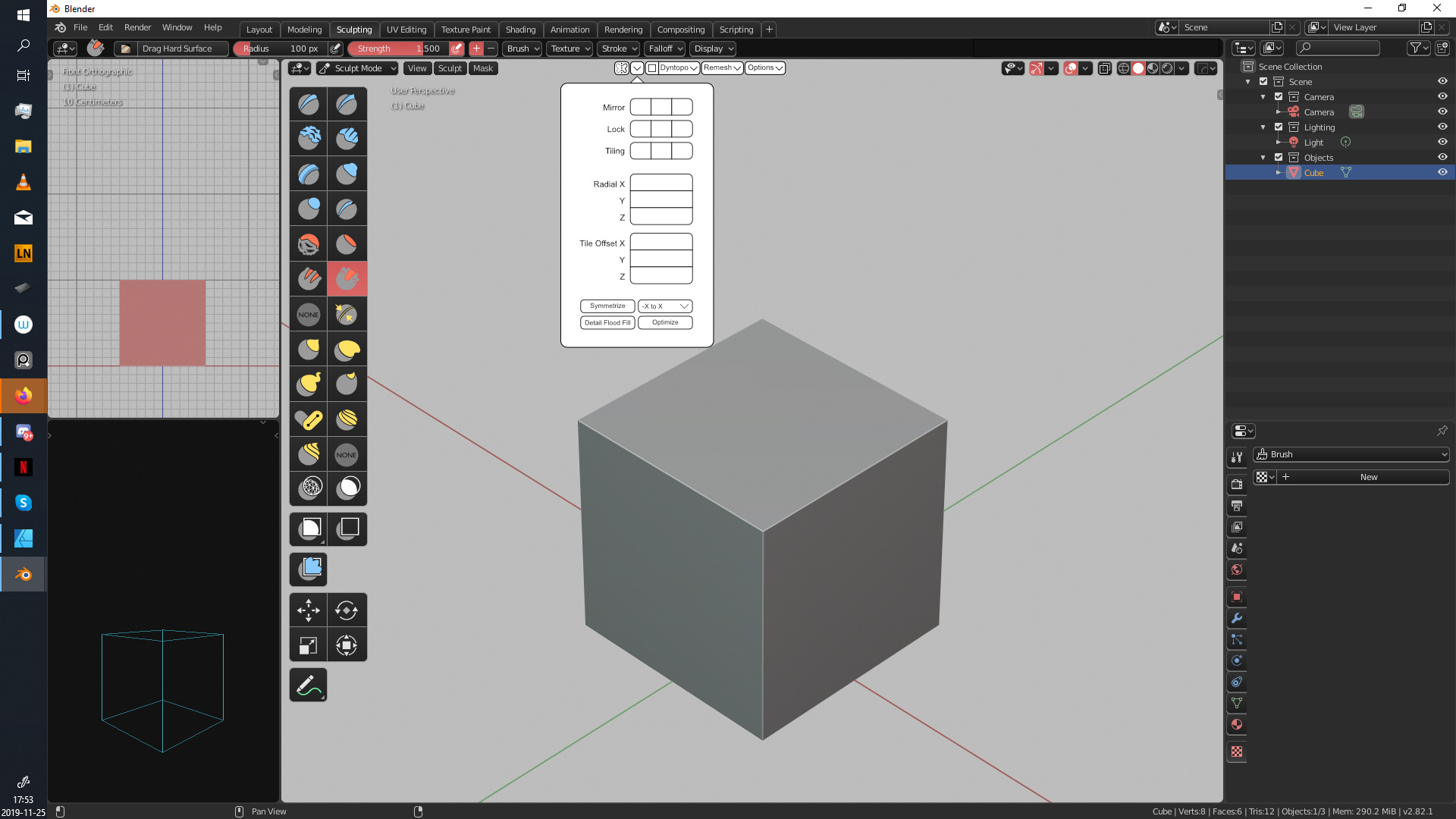
I also moved the symmetry mirror options and put it under the Mirror category. I think this makes a lot more sense than having it under Dyntopo (its current placement).
Some new icons for Remesh, Dyntopo, and more could help reduce the amount of text visible in the mid bar, but I left that out for now since I didn’t have time to think of a design yet.