Since most, if not all, screenshots for the 2.79 manual are made by me:
the second image, in most cases this style is used,
yellow with outer shadow for greater contrast,
something like this style would be correct
the first image is left from the old wiki, just has not been updated,
this is the wrong style
the third, unique case, dimmed and a white box because a yellow highlight
on an orange background would be unnoticeable
in the fourth image, the pixel text was just copied (for some reason)
from an old screenshot from the wiki
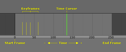
the last image is a SVG, so here are some web safe fonts
Yes, all 2.79 screenshots are in low resolution. It looks blurred on the high resolution display, but on the other hand, high-res screenshots will look bad on low resolution screens and have a larger file size. This needs to be discussed.
I think the biggest problem here is that those who write the docs are not able or don’t have time to create neat screenshots.
The main guidelines - default theme and UI scale. And try to match to other images for consistency.