Very good; thank you!
Apart from this, is it going in 2.92 as-is ?
It will either be reverted to the 2.91 and targeted for 2.93, or updated for the common feedback in this thread and other places. As far as I know it’s just a matter of time.
1 Like
Ok thanks. I was asking because some of the things pointed out by others feel a bit like regressions (notably the loss of user count).
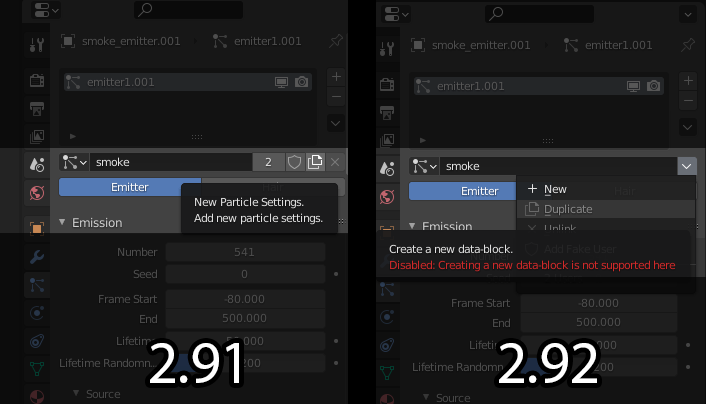
UI design aside, I just wanted to point out that as of the Jan 11th 2.92 build I cannot duplicate particle systems using the new menu, but I can if I open the file in 2.91 and use the new particle settings button, so whichever system is used I could like to retain that functionality.
As for the menu redesign I do like the ability to have discoverable and readable explanations for the icons and their uses, but I also would like quick buttons for common tasks so as not to slow down workflow.
2 Likes
I just tried a daily build of 2.92 beta, and the redesign has been reverted. 
Hopefully, the redesign of the redesign can now proceed smoothly with all the feedback here and we’ll end up with something really great for 2.93
7 Likes
With this site’s new rules about not posting screenshots from other apps, all I can say is that I’m currently using a really expensive CAD package that uses menus which look similar.
However, at the very bottom of many of their menus is an option called “Show Shortcuts”.
When you click that option, the entire menu collapses into a small toolbar showing only the icons!
It’s the best of both worlds, because beginners can have reduced visual clutter and get familiar with the different menu options, while expert users can just throw everything they want on the screen for quick access.
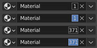
Clicking on Copy icon and clicking on the Numbers (of users count) do the same job as I see.
First design by developers
![]()
What if number count will be permanent and starting from 1 user and we can remove or relocate Copy icon under the popup menu:
box around the numbers can be anything that can emphasize numbers and its fake user
or with simple separator
![]()
![]()
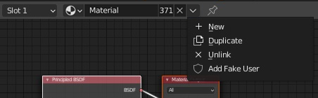
By clicking on the number we get usual copy operation, by RMB clicking we get menu with ‘Copy’ and make ‘Fake User’ operations or just Ctrl+Click to make Fake User and other options under popup menu:
Number of users is critical and we should see them constantly.
Number of users is only critical because Blender automatically deletes anything with zero users. If not for that “feature” we would probably only occassionally need a way to indicate that an item is “used by more than 1 user”
1 Like
I disagree, at my studio one of the issues I used to run across frequently was artists who would have trouble with performance, then they hand me a .blend that is like 2GB. And each time, I look into the file view for the outliner it’s immediately obvious to me why- they were duplicating objects and data like crazy and didn’t know that the data was not linked. As soon as I taught everybody to pay attention to the user count those complaints disappeared almost immediately. IMO it’s not enough to just know that your object has data linked to something, you need to easy see how often it has been linked, and the number of users is currently the only way to do that.
All that is to say, I think user count is important information. I don’t necessarily agree that it needs to occupy the same space as the fake-user button like has been proposed here, I don’t actually have any problems with the current implementation of users and how they are displayed.
6 Likes
I also agree that the “use count” should be show somewhere, very important in managing scene’s and troubleshooting the working process.
We all want nice and clean files and the count helps with that 
1 Like