Hello,
I am new to Blender but have 30 years of experience in 3D.
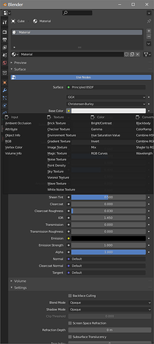
I am experiencing a limitation in the Blender UI. It concerns the context menu available when I click the colored dot to make or break a connection in the Property Editor. I don’t know what that colored dot is called and could not find any reference to it in the documentation.
The context menu pops up to give the user options for connecting nodes of the appropriate data type. The context menu also has items to Remove or Disconnect the node attached to the current Property socket.
The problem is that the context menu is constrained by the size of the window. Most of the time I do not see all of the items in the context menu. The critical Remove and Disconnect items are usually not visible. This led me to falsely believe that these items did not consistently exist.
This is not usually a problem when the Property panel is docked as an Area in the main Blender window. But if the Property panel is in a floating window, it’s a big problem.
There is a reason why I need the Property panel to be in a floating window. The viewport layout navigation in Blender is very unorthodox. The Quad View is extremely limited and doesn’t allow basic functions such as viewing a User Perspective and a Camera view at the same time, or different display modes in different views. There’s no way to maximize an arbitrary view, e.g. I want to hover the mouse over the Top view and then maximize it. It just can’t be done.
My solution to the viewport layout problems was to create four different Areas, each with its own 3D view. I can then maximize an arbitrary 3D view with CTRL+SPACEBAR. But if I do that, the Area under the mouse cursor takes over the entire Blender window, including things I need to see, such as the Property panel.
So to have any semblance of productivity I am forced to float the Property panel in its own window. Then the window is small and narrow and the Property connection context menu will not fit in the available area.
It would be very nice if the 3D views worked like every other 3D program, with separate display modes per panel, and a dedicated viewport area. Maximizing a viewport only maximizes within that dedicated viewport area, and does not take over the entire interface.
Absent that, I would ask that some way is found to make the context menu more functional. Ideally, the context menu should be able to take up whatever space it needs, spilling out over the edge of the current window. Or, the context menu should resize itself to fit in the available area. Or, at the very least, promote the Remove and Disconnect items so they are at the beginning of the list, not at the end. These are actually the MOST important items, and they are the first ones to get chopped off.
Now, I can find another sort of hackish solution to this whole nest of problems, which is to not float the Property area in its own window. I can create a very large secondary window with many area items in it, e.g. Shader Editor, Image Editor, etc. If the Property editor is docked to this very large secondary window, then there is usually enough space to show the entire context menu. But I really wish I didn’t have all of these problems. I just want to work efficiently, and the unorthodox window management in Blender is a huge stumbling block. It requires me to invest a large amount of time up front in order to merely get the bare minimum of utility.
In the short term, please promote the Remove and Disconnect context menu items.
Then, if possible, allow the context menu to extend beyond the extents of the current window.
Then, if possible, automatically resize the context menu to always display all items.
Then – and this is the big one – create a much more flexible, robust system for managing viewports in the 3D View. I can’t work with a single Perspective view all the time. This is like tying both of my hands behind my back.
Thank you
