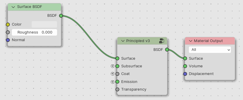
@lukasstockner97 I hope you can consider my suggestion for the design of collapsible panels for the nodes.
Please ignore the naming and placement of parameters. I am not following the development too closely, so I might have put some things somewhat randomly. Which shouldn’t affect the general design idea.
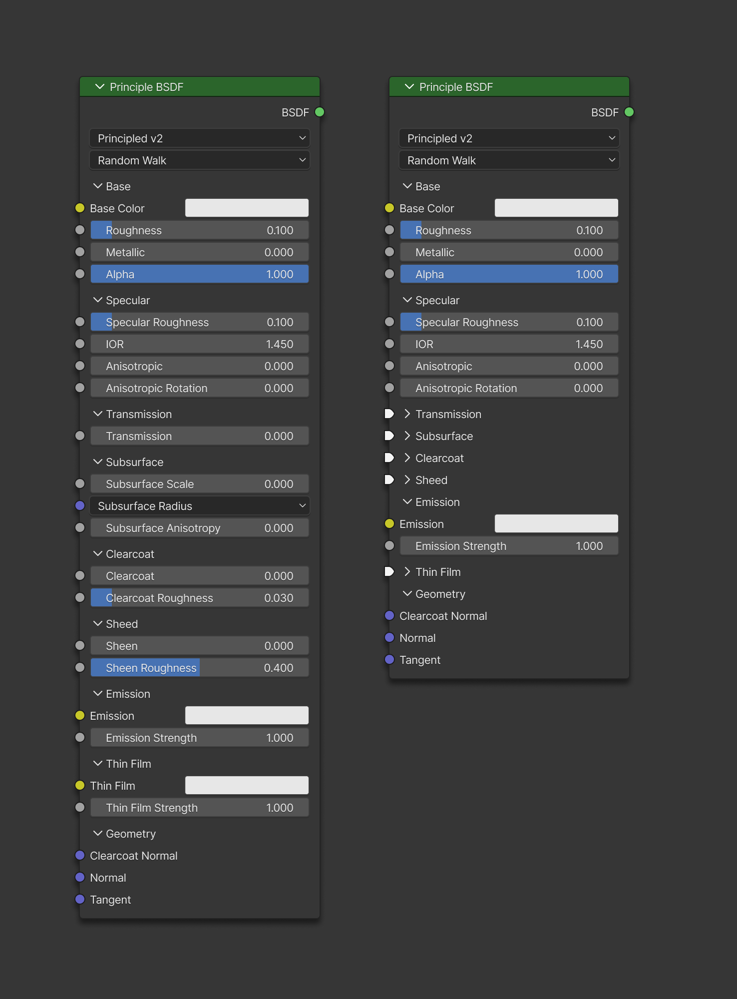
Let’s not make any color separation for the panels. It’s not needed. The icon left to the title of the panel already indicating the visual group.
And add 4px padding or spacer at the end of the group to visually separate panel blocks.
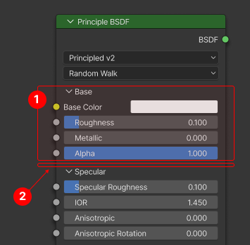
Let’s have the default state for the collapsible panels, so some panels can be set to collapsed when the new node is added. Saving on space for the parameters which are not used often.
We already have circle and diamond shapes. Let’s introduce “funnel” socket for special use case with collapsible panels to indicate that other socket types are available behind this socket.
I am using the last on the right socket design, but in my tests simpler shape that is next to the diamond shape works as well.
The socket would only appear when the panel is collapsed:
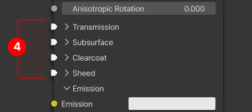
When you connect a node to the socket in a collapsible panel the menu will appear with the choice where exactly you want to connect it to.
The same would happen if you’d like to get the noodle from the collapsible panel socket. You would click on the socket and then choose the channel from the menu.
The channels have icons indicating which parameters have connected noodles and which don’t.
I also hope the new nodes UI design element will be available as a standard feature, so other render engines could benefit from this to create better and more compact nodes.
I agree that if we go the collapsed section route, then we should display some sockets. otherwise it looks like the node wires go into another node that’s hidden under the principled BSDF node.
But Blender has already introduced a visual language for multi-input sockets:
So let’s just reuse that one, instead of reinventing the wheel again. A white color is a good idea though.
That being said, I am still not convinced collapsible categories for nodes are a good idea. The fact we have so monolithic nodes they require category collapsing should be alarming. And we should not just shrug our shoulders and add new UI features to hide the complexity, instead of figuring out how to manage the complexity better.
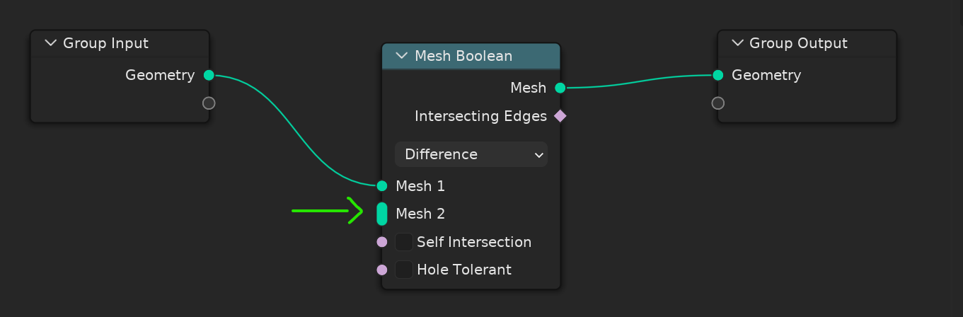
The Round square thats present in Mesh Bool is an Additive icon, meaning every additional input will add to the result, that would not really work in the case of the collapse icon case, as the collapsed icon represents a “collection of inputs” and it does not add anything beyond the visual simplification of inputs, if that make’s sense
Edit___
I also personally like the LuxCore of Toggle button for any additional function you want, downside is is if you toggle a function that’s connected it would cut the link, unless you add a function that preserves the connection in a greyed out state that go to a “collection input” kind of a thing
The panel design is not that big of an issue, every other software that has a “Uber” shader ends up with 1 all inclusive node that has all the PBR options, and honestly that is what i prefer.
Anything else would just confuse beginners and those that want an efficient design, ala pre 2.8 style.
However, i do think that there could be an Uber shader as a input window as shown in your example in addition to the Default Uber shader.
Cause why not, this is Blender and Blender should have options for different work styles
I FULLY agree we shouldnt add new UI thing just for this that will mess things up, there is really a simple way to adress issue but noone really listen that,
Collapsable panel make it longer when someone want to have all the inputs uncollapsed because of extra headers and uncollapsed appereance is also problematic when inputs are connected
So there is a better way to do it without changing UI
Just adding a new ENUM on top of principled shader, that contains all the possible combinations of different categories (that can be further tweaked by user from properties N PANEL if there is a combination that is missing + So it also gives us the material presets to make materials faster )
Full (Base+ Specular+ Anisotrophy+ Transmision+ SS+ Clearcoat+ Sheen+ Emission+ ThinFilm+Geometry)
Metal
Dielectric
4.Car Paint (Base Specular ClearCoat)
Fabric ( Base Sepcular Sheen)
Plant (Base Specular Subsurface Transmission )
Glass (Base Specular Transmission )
Bubble (…Thin Film)
…
…
…
So all possible materials will be added so if someone doesnt wanna use all the menus for specific material, it will already be a choice on list and if that person later change it into ‘‘1.Full’’ it will preserve all inputs when changing enum but the sockets pluggeed wont be lost
Also as I previously mentioned, there will be functionality to add new combinations from N-Panel to select and add new material presets
The alternative proposals don’t address the bigger picture:
We also need a system for organizing inputs in the properties editor, for geometry nodes in the modifier stack, materials and future texture nodes. Panels are then consistent with the rest of the UI.
Realistically users will create big node groups for generating buildings, texture patterns, particle effects, procedural hair styles, etc. And that needs a solution one way or the other, solving both with the same system simplifies things overall.
If you separate things into smaller nodes, then as more nodes are created the questions becomes which ones are valid to wire together, and how to present that in the UI. For example the mockup from @Claus leaves out the tricky parts, like metallic, fresnel, shared based colors between different components, etc.
Other applications and file formats have similar uber nodes, and for compatibility with them it’s best to also have an uber node in Blender. Translating arbitrary shader graphs is not possible for many file formats.
Planned texture layering works best with an uber node, where each layer has the exact same inputs that can be mixed/layered and baked down. Layering two arbitrary shader node setups is not possible.
For a proposal to become practical it has to engage with these and similar arguments made earlier in this topic, otherwise it doesn’t lead anywhere.
Doesn’t the exact same problem arise with the collapsible panel design? Sorry, my mockup was a proposal in principle, not in literal implementation.
I don’t think UI stands in the way of compatibility.
Is there a need for a central document (thinking of a Miro board) to more easily work on this issue and keep an overview of all the ideas and design criteria?
More importantly, I also don’t think this should block progress of implementing Lukas’ work. The only issue is basically “oh that node’s a little long”. I’d class UI improvement for node trees (that happens to solve long or complex nodes) as an entirely separate project.
If the Principled v3 node has Surface/Subsurface/Coat/Emission sockets as in your mockup, then the user is expected to connect particular shading nodes to each. And then that raises the question of how a user can easily find the right one to add, if there is some mechanism of suggesting particular shader nodes for sockets, how that might work with node groups, how to communicate when the wrong node was connected, etc.
These questions don’t exist for panels.
If they are separate nodes it’s not just a UI difference. Unless it’s a mechanism in which exactly one node type can be connected to a particular input. Or if it’s really one node internally visualized as multiple nodes. But then that raises its own UI design questions.
There’s no such document for this. I should created a task tying together some of these node UI design things, but feedback ttopics like this is where we gather ideas from users.
Perhaps the user can be forced to create only the appropriate node.
In the attached image, the plus symbol would create and associate the proper node, once the connection is made the symbol should disappear. It would be equivalent to dragging the input socket directly with the pointer and suggest the correct node, but this case, where there is no more options to choose, perhaps it should be more obvious.
Having to create 3 or 4 nodes instead of one is not an improvement.
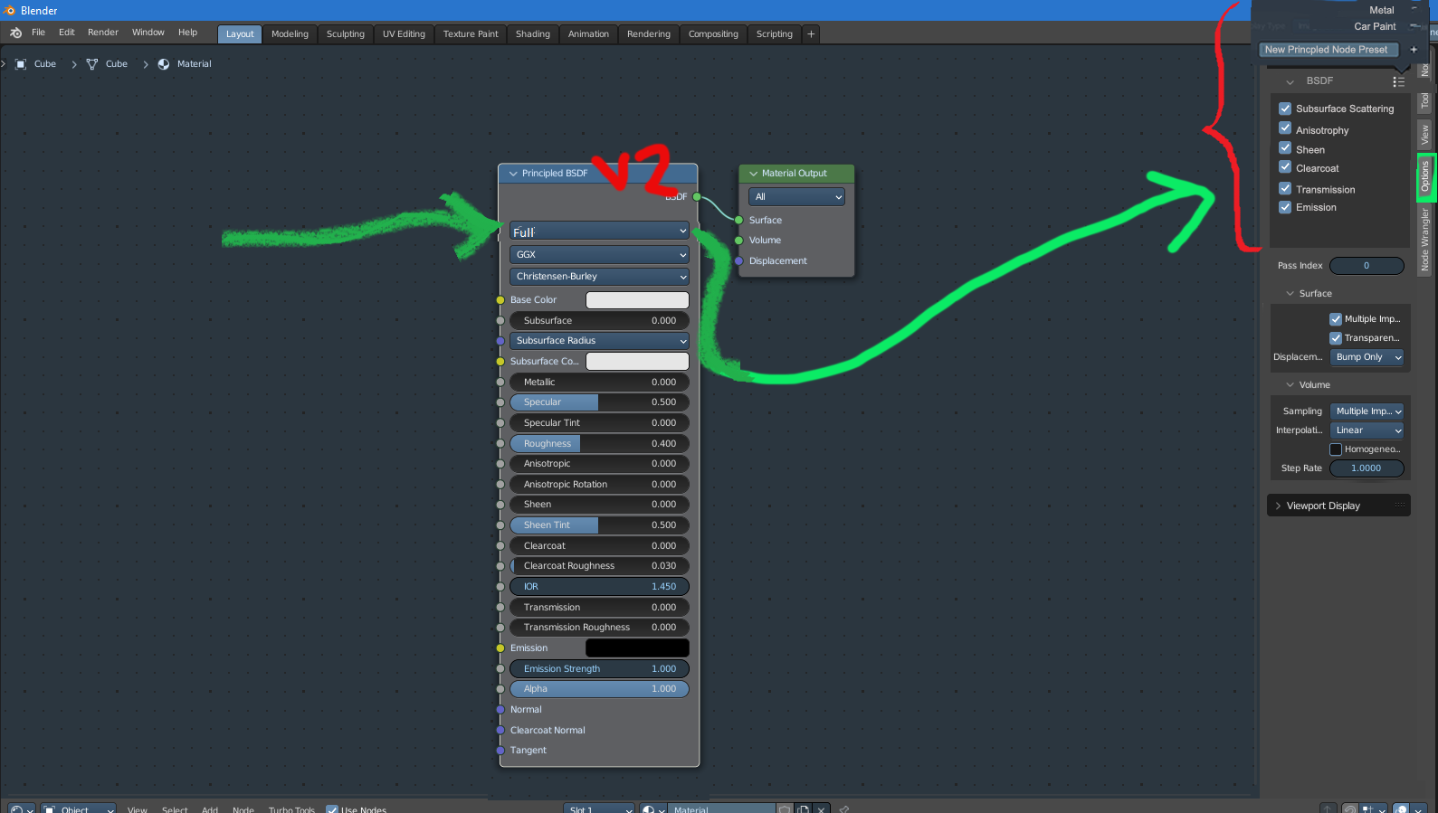
Whereas collapsible sections is a simple and clear solution that could make Principled v2 node more compact than the current one.
People have been making immensely tall geometry node groups already, the need for some UI butter is obvious. Sections and separators should exist both for the few builtin nodes that may benefit from them, and for user-created node groups.
Disagree: This is a different case.
The Geometry Nodes multi-input socket is for inputs of the exact same kind, being processed in the exact same way.
But here, the data could be different (some floats some colors/images, some of them non-color data, some vectors), and is definitely used in completely independent ways.
A new socket type is better here imo
That’s an incredible mess of options and combinatorics strictly says that’s a terrible, brittle idea. Even with the current feature list, the ENUM needed would be enormous, and adding a single new category in the future will multiply the number of possibilities.
A better approach for that might be a bunch of checkmarks, to individually turn on or off these features
I like this idea in principle. I think Lux does something kinda like this sometimes.
But how do you then prevent people from just plugging in a different node after all? And what if multiple but not all nodes are reasonable?
I was aware of this type of socket from GN nodes, but it doesn’t work with collapsible sockets design wise nor based on conventions established already. Using such a type of socket would stretch the section item vertically, which defeats the purpose of reducing the node size, and it would also require the different user workflow for accessing hidden sockets.
My approach to this design challenge for collapsible panels is rather local solution as I see it. It should solve this immediate issue in a clean way and shouldn’t add more complexity nor add extra functionality which doesn’t exist already. Except maybe a new socket type and shape.
It could most like use some further exploration to polish this solution with involved parties if it’s the direction developers would like to take. I’m open to collaboration on this issue.
I have more global design ideas in mind for node’s system, but I’m not ready to present anything since it’s a huge undertaking and would require a lot of work upfront on research and would need access to the team to understand some of the current issues and limitations UI/UX wise which needs to be solved. And I don’t have such access to the team, so the best I can offer are some immediate solutions to current issues if anyone thinks it’s any good, of course.
Imo it should ideally someday be possible - feasible, even, to do a 100% back-to-front nodes-based workflow at production scales and still be able to navigate the scene speedily and with clarity.
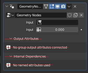
I do not see a problem with how Geometry node settings are presented in the properties editor. Perhaps the few things I would change:
It would be cleaner if “Output attributes” and “Internal Dependencies” wouldn’t be shown if there is nothing to show.
If the node group has a huge list of inputs, the user could group them together in submenus. Perhaps add separators and titles… Just some options to organize their inputs. This is where, i think, this is important, not on nodes in the node editor.
However, the way material properties are presented in the properties editor, i believe, is barely usable. It’s borderline useless. You simply can’t do materials without the shader editor on.
I believe that the inputs for material properties should be presented in the exact same way as for geometry nodes.
To explain:
Each material would only contain a node group used and the individual input settings for that node group.
This is what the properties editor, material tab, would only show:
Material slots
Material selector for a slot.
A node group selector for that material.
Preview.
Inputs of that node group.
That’s it.
Blender could have a few premade node groups: PBR (default), Toon, Basic, etc.
The user can edit these and make their own in the shader node editor.
With this done, if all the user is doing is simple PBR materials for their archiviz project, they wouldn’t have to look at the shader node editor at all. All the settings they need to set up the materials would be right there, in the materials tab. They would just link to the image files, like, albedo, roughness, normal map, etc., and all their materials are done.
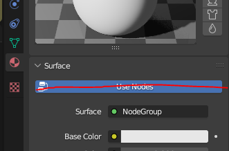
Btw, this huge “Use Nodes” button has always been useless:
Imo one big issue right now is that the responsibility of organizing nodes in a visually penetrable way is strongly on the user right now.
I mean, to some extent it probably will always be that.
But I gotta wonder whether some of the stuff I’d currently have to do with careful insertions of dozens to hundreds of reroutes could somehow be automated.
If I decide to make stuff look reasonable at all, I spend much more time making the layout look decent than I do actually connecting up nodes. And I don’t think that’s really a great thing.
And very large nodes with a crap ton of inputs aren’t making this any better, especially if most or all of those sockets are actually connected. You quickly run into wildly crossing paths where it’s difficult to tell what connects where at a glance and such.
It’s very easy to cook spaghetti with nodes
Another incidental issue I ran into a couple times is when I thought a node just wouldn’t work at all no matter what I did, until I figured out that I had accidentally duplicated but not moved a node, so I was inputting to one copy but outputting from the other one.
It’s not very common that that happens, but when it does, it’s a doozy to debug, especially if you are looking to narrow it down to like a single node out of hundreds