Strange works perfectly here in 3 and 4 columns … Interface Scaling 1.05 … Roboto Medium Font … both settings larger than default…
It’s best to test these things with the factory defaults, otherwise it’s hard to compare. Roboto may be more narrow.
(As an aside, I think we could switch to it, but that’s another topic)
1 Like
FYI, there have been more changes in the latest builds:
- Preferences have been further redesigned, adding more sections to avoid grouping unrelated settings together. More panels are also expanded by default, making it possible to quickly go through sections and see settings of each.
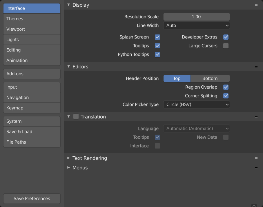
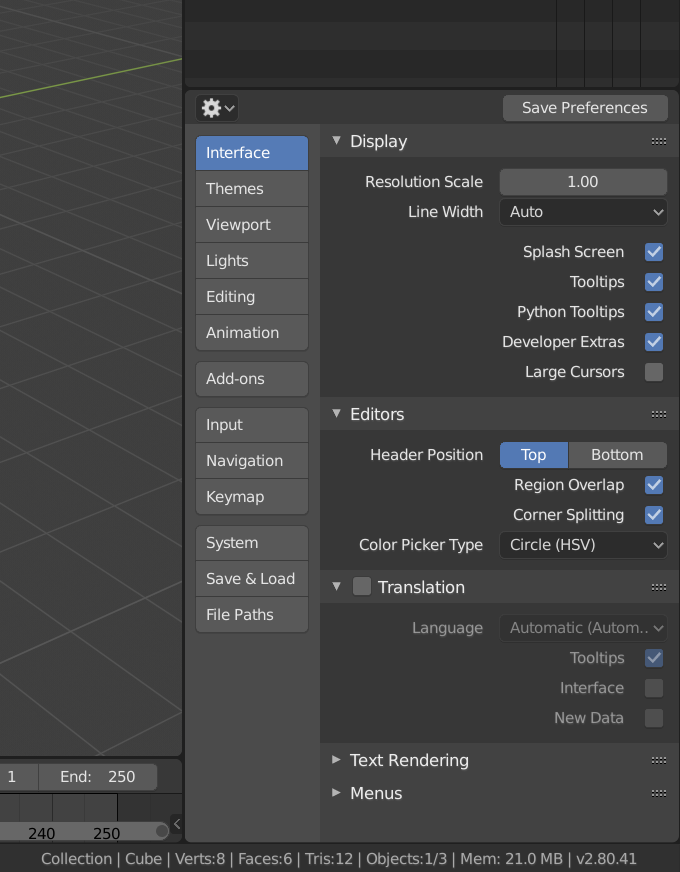
The new preferences also work quite well when opened in place of the properties editor, for those that like non-overlapping behavior:
8 Likes
Looks much better already.
Btw, is it possible to have more than one preferences window open displaying different sections?
Not currently. This can only be done after preserving the panel open/close state is solved, otherwise it will not remember the active section.
1 Like
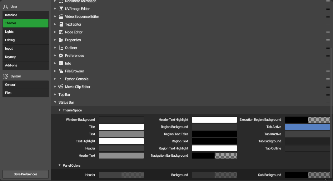
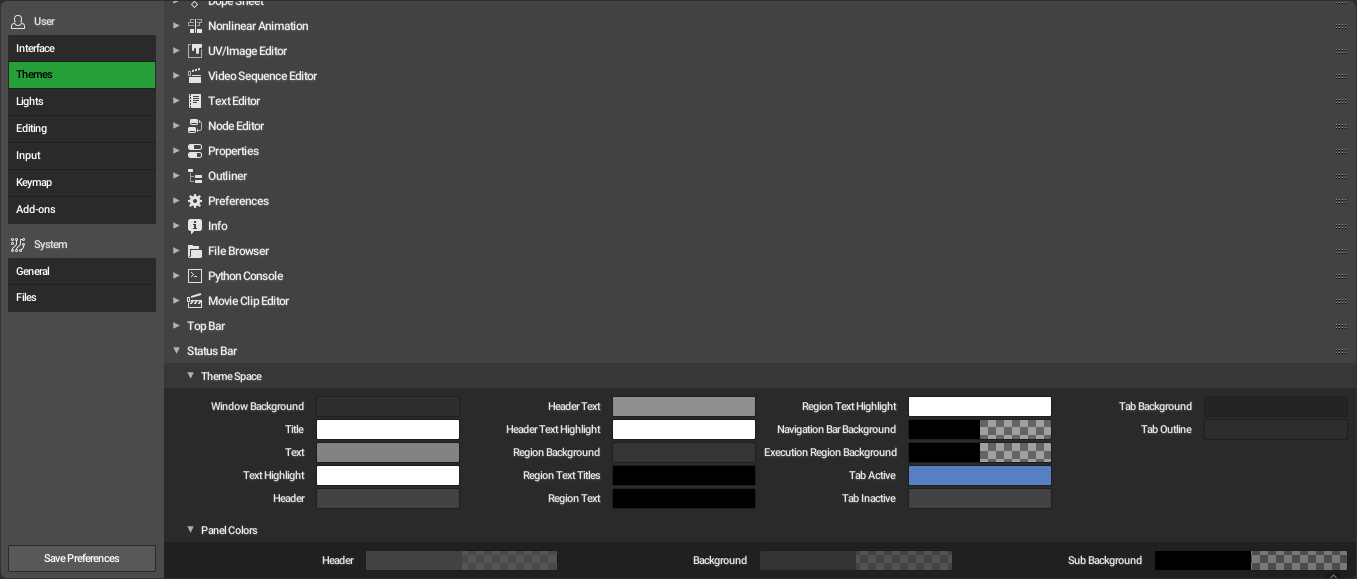
Unlikely anyone’s going to use the Preferences in the side Panel for Keymaps and Themes …unreadable and too much scrolling… that’s around 4 pages scrolling per Item.
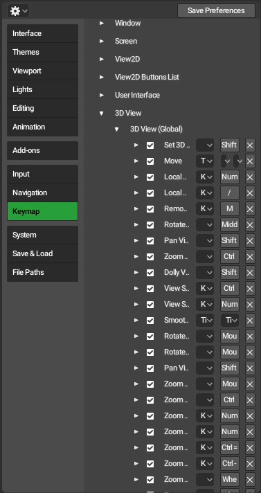
I feel the Preferences needs the Themes and Keymap in multi-column.
Posted a SS with interface_layout.c edited a couple of posts earlier … look how readable it is plus can work with multi sections which is the whole benefit to this redesign. ( could not figure out how to flow the Keymap )
The defaults could be single column but the user should be able to expand the window and have the items flow to the grid
Smarter columns would be good, but it needs work to be done properly. We can’t hack the layout code in a way that only works for a non-default font and is likely to break layout in other places in the UI.
1 Like
Of course the work needs to be done properly … I just had the sources as I compile blender so I was digging through it. im not a programmer. was just experimenting.
I literally didn’t know anything would change !
If you mean the font I used this is just experiments.
Looking at the code I feel a lot can be achieved by setting proper column widths and adjusting the break points … just polish needed. Everything seems to be there.
On a side note as a non programmer I was blown by how well organized the code is. You guys are awesome !
1 Like
It seems that the ‘one line, one setting’ was not kept, (edit)
could it be limited to 2 column max then ? for consistency.
Also, when there is one setting and a tickbox, the line is hoovered on the right side instead of being in the middle. I think it’s a temps bug but just flagging it in case.
What does this mean?
please do not kill me …
my desire is to have animated columns dynamically inspired by google’s material design
I know that in order to do this the behavior of the heart of the ui components should be revisited, but I think it would be the best solution to freshen up at the root
^ ___ ^
material design is opensource, maybe it could give a sneak peek of how it is designed at the coding level
From the perspective of a web developer and design student, I thought I would add my thoughts about this.
The most immediate thing I see which might not be immediately evident is the left rag on all text throughout the UI. In the properties pane, this isn’t too bad since there is only a single column to scan, but in the settings panel this becomes visually messy and therefore tiring. Every example of a ‘good’ properties panel that I saw earlier in this thread uses left aligned text throughout.
As a typography guideline, it is usually a good idea to left align text unless there is a good reason to do otherwise. This reduces cognitive load because it is what we are used to and it helps to scan since we start reading on the left, so the eye has less distance to travel between rows.
It might be too late to consider doing something like this (and it does introduce some other issues like short labels becoming a long distance away from their corresponding input) but thought I would add it to the discussion.
I don’t think tabs, sections and subsections (as it is now) s a bad way to go about organising the UI. Maybe it is just that Blender has a lot more settings than most other software.
On another note, I feel like there might be some things which could be learnt from the web layout specifications such as flexbox and grid. While the whole spec might not be applicable, whoever is working on designing Blender’s layout API might find something interesting in those specifications, especially CSS Grid.
3 Likes
Well the new UI has sort of a flexbox actually. You can preview this effect in many panels already. Try making it wider and see what happens 
I actually made sort of the same comment about the right aligning columns. I thin they are using like that so the input, enum menu’s and booleans can by aligned nice. Though this does break readability a bit. It does make panels much less filled and looking stuffed. But on the other hand panels now are way longer. I think its a difficult subject and hard to get everybody likings.
1 Like
Can we have this fixed? This is pretty annoying when you have to resize preference window every time it opens.
I see a couple of people asking about the feature of storing the window width. I had a conversation with a dev but cant find it again. It would be nice if this width can be stored, i now need to resize each and every time. I personally find the default size simply to small
1 Like
Found this piece of code and altered a bit, perhaps its a bit over the top. But i made an add-on which opens a render window and switches to the preferences.
For those interested, you can find it here. I added width and height. The panel is a different vs the normal one, we dont see the hamburger menu in the bottom left. You can still save it from the “Preferences” button you see at the bottom
1 Like