This change is bad. Is this really the best solution the dev team came up with? The previous way was better.
It adds extra clicking and scrolling. I have to go through all the drop downs to see where a specific setting is.
This change is bad. Is this really the best solution the dev team came up with? The previous way was better.
It adds extra clicking and scrolling. I have to go through all the drop downs to see where a specific setting is.
I didn’t say it’s perfect,
It’s version 1.0.0, let the devs time to get feedback and adjust things instead of saying it was better before.
I just expressed that is the way to go.
In fact it actually was. This is just more pretty now, but usability-wise it’s ugly.
Wanna test? try to do some heavy theming with this new design. 
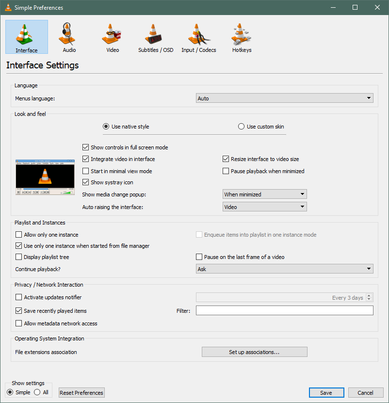
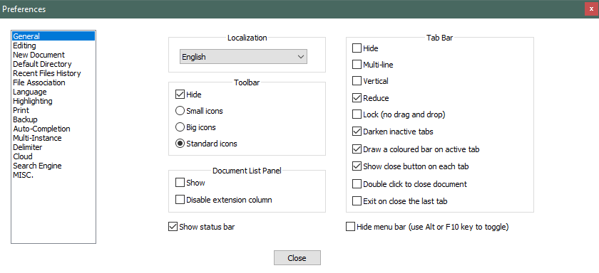
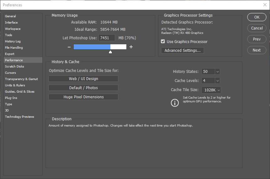
Here are a few other programs preferences.
ACDSee
VLC
Notepad++
LibreOffice
Photoshop
Anyway, I’m sure this’ll get figured out, not like I’m going into the preferences all the time as it is. If anyone wants a really confusing settings UI, look up Cura and KISSlicer; I love those programs, but woof, it took a while to get used to those.
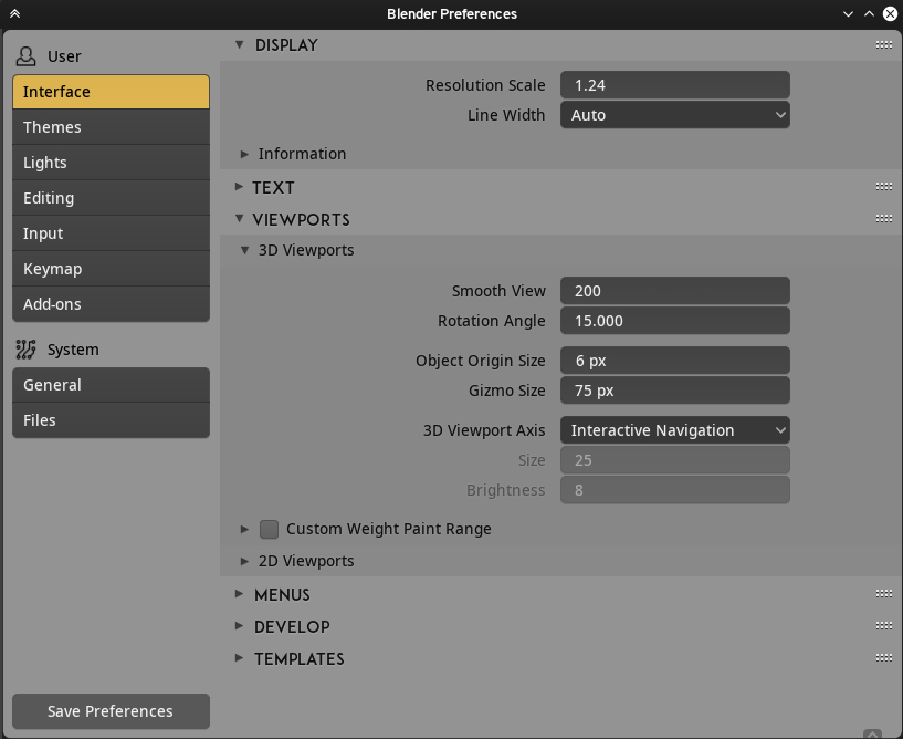
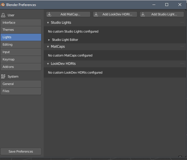
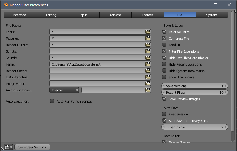
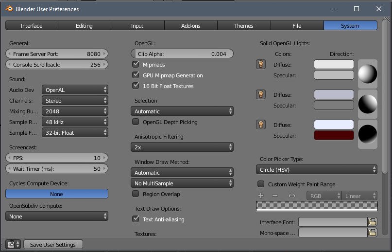
This is already exactly how it works. There is a source list on the left and panels on the right with lists of preference options.
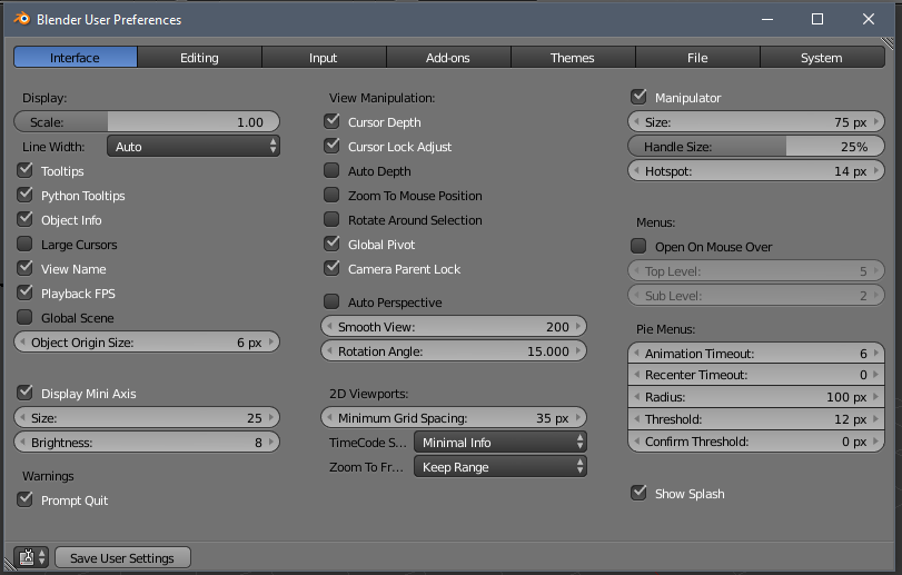
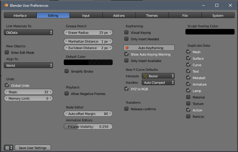
I think having the values aligned to the left makes them easier to read and it looks less chaotic.
Also, what about an option to set the headers as all uppercase? Not just for the preferences but for the whole blender. I think it would make the headers more obvious. Don’t know how much work it would be to implement it as an option though.
So with the new user prefs how do we change T transparency in UV/img? And how we can change for example color of individual header?
Same as always. In the Theme.
Oh, i see now little Theme space arrow.
Now the games are made … and probably, as usual, will be made a deaf ear … will be written words useless.
But let me say, as a final user experience, with functionality in mind and nothing else …
These old preference panels, maybe they were not perfect, but they were not even that bad … my memory, does not completely store all the features where they are arranged, it stores at most the categories and know where a feature is potentially located …
with these panels, just a glance and I found the functionality that I needed …
Now with the new one, visually I have no imput, and I have to waste time looking for the various categories and sub categories in branches to expand and I can not find ■■■■. how much waste of time.
Congratulations “to modernity and evolution.”
… it happened for the topbar, the no longer tool sidebar, the panels of the properties that have undergone the same end of the new modern (gnome) preference panel … and finally we do not forget the very useful and very functional monochromatic icons.
Long live the Evolution.
Blender is so loved that everything has been done to make it no longer be Blender.
We recall here defunct preference panels. Soon the nostalgia will prevail, and we will ask why, but we will not be able to remember.
The meaning of what?
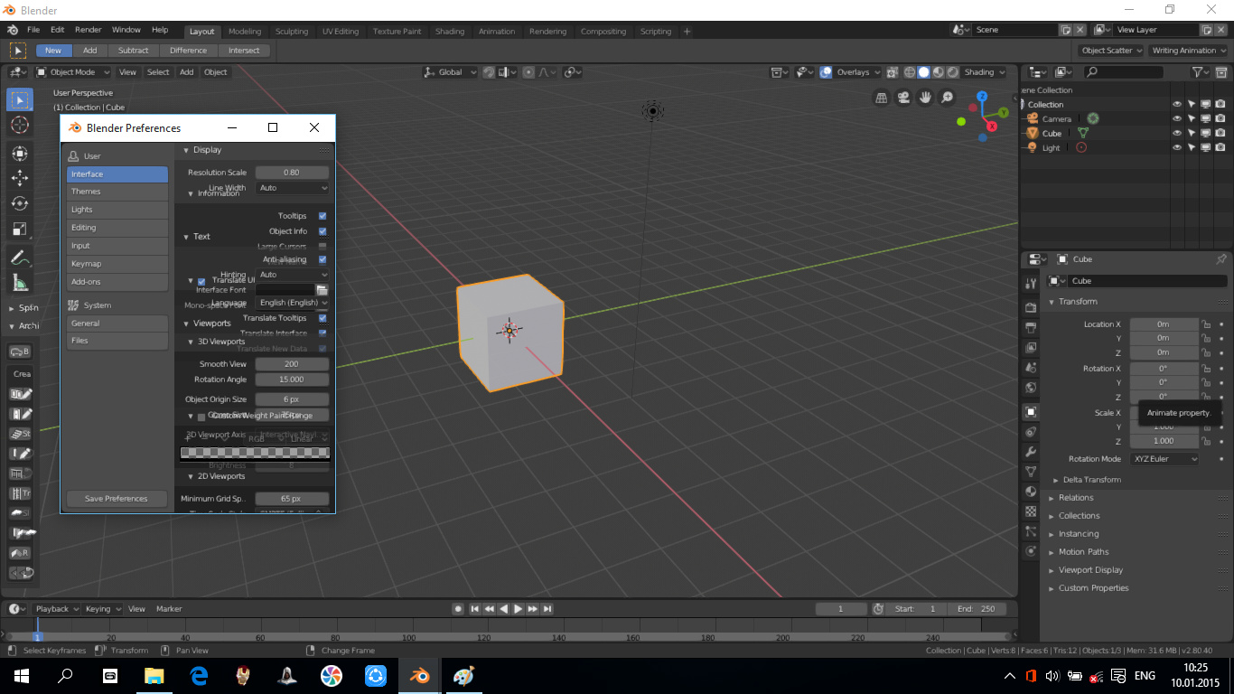
Yes, there is a bug there, but it’s not actually related to the Preferences - it exists throughout Blender if you resize the window, it will do this until you let go.
Hi William, I apologize if this is the wrong place to ask.
Is there any plans to add an option (or feature) to allow the sub-categories that we open in the preferences to persist? I feel like this is a middle-of-the-road option which will still keep the organization but allow some of us who prefer to have everything already open and would save some of us time (and avoid frustration – especially beginners) looking for that one option hidden somewhere in one of these sub-categories.
Hi William. In my opinion, the preferences window has become much more convenient and readable.
But the resizing of the window and open panels is not remembered and each time you need to open the necessary panels and resize the window for yourself. That would solve the problem of 100,500 clicks. And it will save time.
Yes, the window size is reset every time you open the Preferences. This was always the case in past too. Ideally it would remember the size you gave it.
The same goes for the panels. Just like panels are stored as open or closed in the Properties, we could do the same for Preferences. The tricky thing is, I suppose, where this gets stored. It makes no real sense to store it in the blend file - makes more sense to store it in the Preferences.
the meaning that is a work in half, you can do much better, perhaps listening to the perplexities …
there is a need for more columns
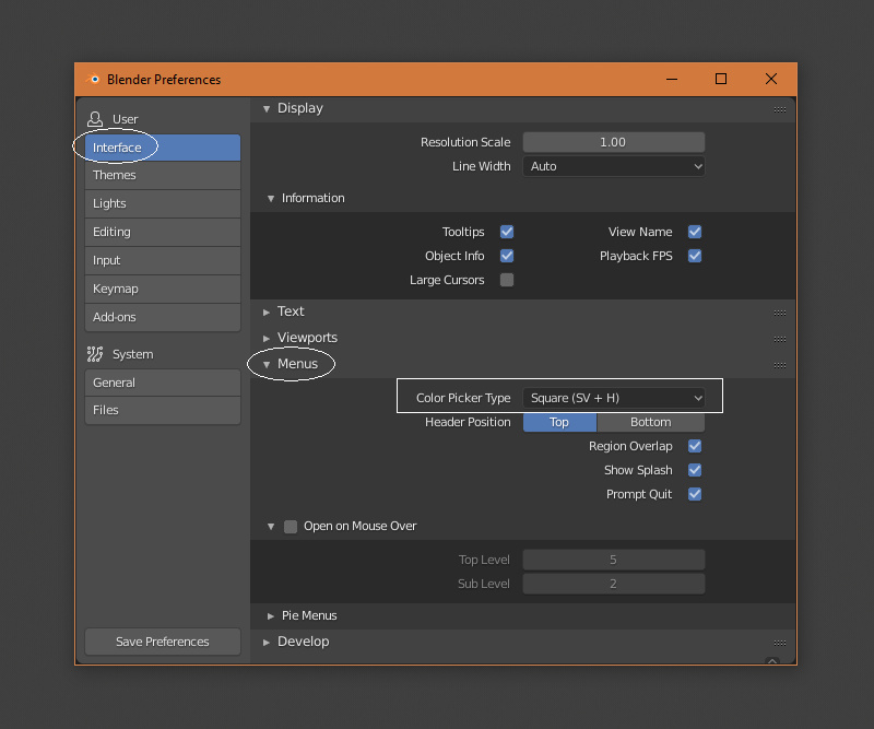
@billrey “Color Picker Type” is inside the menus category. I actually had a hard time trying to find it.
Seems a bit odd to have it there, no? Also the “Region Overlap” kinda feels out of place there as well, imo…
This comes from 2.7x, where these were also grouped with menus.
Do you have a suggestion for a different way to organize these specific preferences?