Hi eobet, one is modifying the shape itself ( nudge) the other one keeps the shape and drags the mesh over the frozen shape (slide relax).
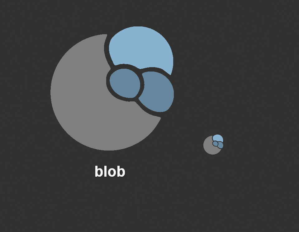
Here’s a proposal of a rather small adjustment. Generally I found the blob icon quite fitting. It’s just a bit easy to confuse with the inflate brush. So I adapted it to resemble the rendered version more.
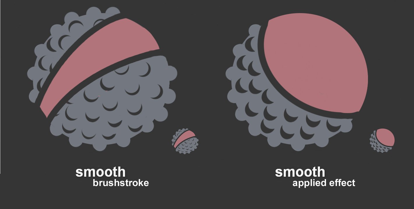
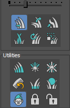
Here are two more tries for the smooth brush icon. Personally I like the brushstroke version much more, but as I did the other one before I thought I’ll post both.
So I don’t really have a clear proposal or anything but could these maybe be reconsidered? (Grease Pencil masking)
If masking is on, the symbol kinda makes sense, but without masking, just a dot, that really tells me nothing. Maybe it could be the same but with the top circle filled entirely?
Some of the sculpt mode toolbar icon suggestions here seem like something we can use. I will adapt some of them using the icon_geom.blend, and make sure they all fit together.
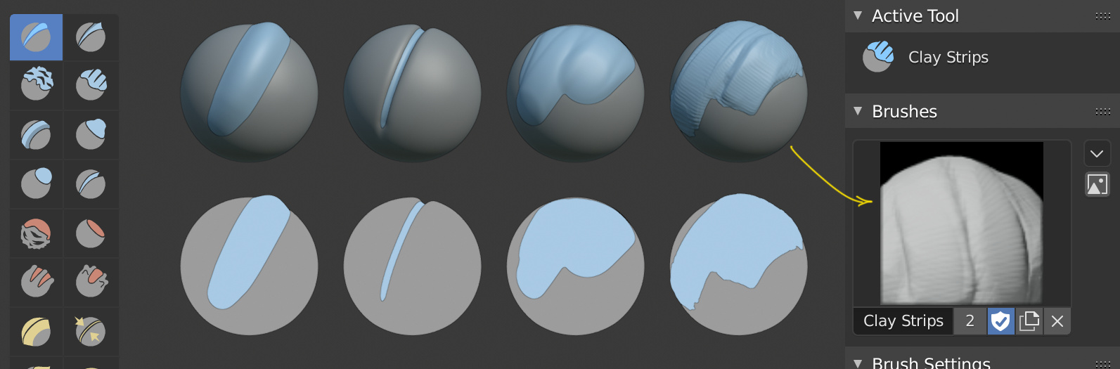
I repeat myself a little, but playing a little with the sculpture icons, I have made a method to preview the effect of the brushes. It consists of making two balls of almost the same size and varying the material of the inner ball (the ball is a cube, subdivided and spherical).
The system works very well when the brushes increase the volume of the object, otherwise not, I think if the same were achieved by vertex color, it would be a good method to preview and test the brushes in a dedicated editor.
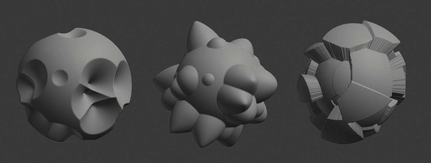
Maybe, just as when previewing the materials, you should be able to choose between different primitive objects, in order to test the brushes. Pointy, bulky or squared shapes could serve as a starting point.
These are made the subdivision and offset modifier.
Give us the option to keep the icons monocolor for the tabs in the properties panels while preserving multi color in the outliner where this is more needed, basically like there was initilally. Blender had this pretty much flawless appearance in what regards UI style and this was kinda broken by introduction of multicolored icons for the properties tabs.
I also don’t like the arrangement and coloring of the icons in the Properties and would probably prefer them monochrome over the way they are now.
I really wish I would have had some interest in my own preference with these icons. To not recolor them until they are drawn in the shader - the code is already in place for that. So to be able to make any of our mono icons take on a different shade at any time we desire. Then they could have used one set of coloring in Outliner, a different arrangement of colors in Properties, be monochrome elsewhere, make some red when wanting to indicate an error, etc. It just required adding a single new “icon_color” member to uiBut that could override the use of text color.
But adding such a preference to what we have now would be a bit odd. First it would have a very narrow scope so would be a hard sell. But it also would only allow a switch between the colors we see now and shades of grey. We’d immediately have cries of “why can’t they be these other colors instead?” LOL
I dont agree ! this isnt a minor option or switch that between multicolor or monochrome. This is kinda fundamental and perfect bipolarizing.
And this option is not meant “only” to switch colors at the properties tabs level. Its also meant for not screwing the coloring in the other parts of blender where this is kinda necessary like for the content in the outliner. It has a bigger scope.
What I’m simply saying is that, under the current design and code (which I don’t like) all we could easily give you is a “show icons in shades of gray in the Properties Editor” checkmark somewhere. And I fear that such a patch would not be accepted because there is resistance to adding preferences for small things.
Had the design been different, we would have had more flexibility. Right now a single icon can be, at most, white in some editors and green (for example) in some other editors. It cannot also be yellow somewhere else.
is there any icons (tiny) that express “randomize” or “randomization” ?
it’s maybe worth it to add a dice icon in the tiny icon list to express such common operation ?
Can we get a uniform (consistent) icon or icons for the 3d cursor across the whole Ui? I think Ive mentioned this a long time ago and you guys agreed that the icons can be brought closer to eachother.
The 3d cursor tool icon can be a bit more consistent with the icon in the viewport and with the ones from transform orientation and pivot point in the header.
It would also help a lot if the 3D cursors cross continuted completely into the center. At the moment the lines just stop somewere making it impossible to see where exactly the center of the 3D cursor is.
Basically something like this: