that’s it !
love it !!!
it’s looking extremely professional and unique !
that’s it !
love it !!!
it’s looking extremely professional and unique !
Really cool! Are you brazilian or portuguese by any chance? 
Evandro_Costa I am from Catalunya “Spain”. I deduce that my translations are not entirely good or the file names are a bit weird XD.
As I see that in general you liked the ball with the logo, I have completely redone it by simplifying the mesh and starting from the logo without perspective since is acquired in the 3D view. In this way the geometry is more symmetrical and fits better.
I upload the new file.
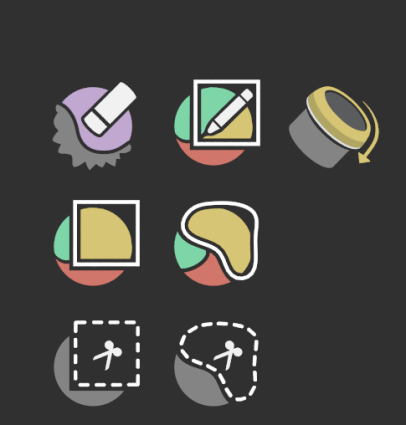
Can the the icons for the properties tabs be switched back to monochrome without affecting those in the outliner as well?
Also I recall some of you agree about a more consistent look among the 3d cursor icons per se and between them and the 3d cursor tool icon. Cmon 
@jendrzych what do you think of this mock-up of a quieter checkbox icon and colored collection?
This is slightly altered from here and the colored collection icon was adapted from @Hadriscus in that same thread.
I bet it’s faster to redraw them, but just in case, here’s the SVGs:


love it.
Is the checkbox design consistent with other checkboxes in Blender ?
I’ll make this more clear. I’m working on adding collection color tagging for GSoC this year. GSoC 2020: Outliner Discussion and Suggestions. The final design is not done yet, so the filled collection icon and checkbox are still under discussion. If we do stay with this design, a filled collection icon and non-filled checkbox would be nice.
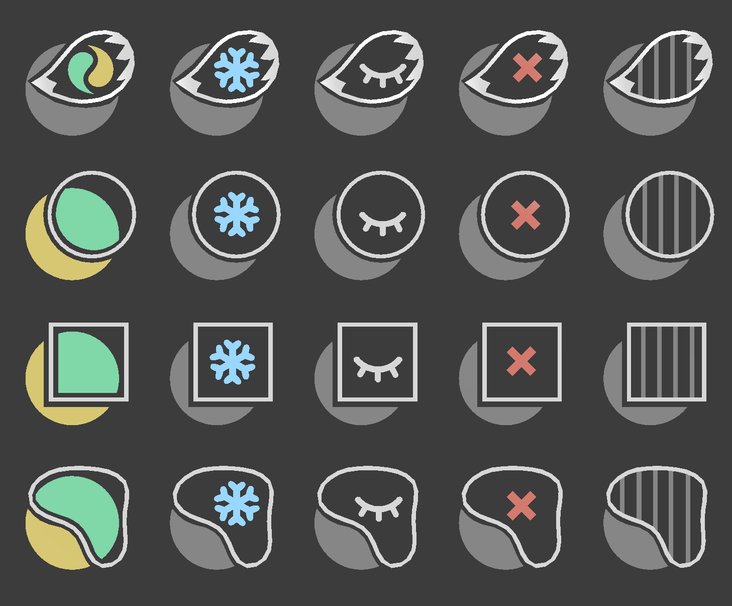
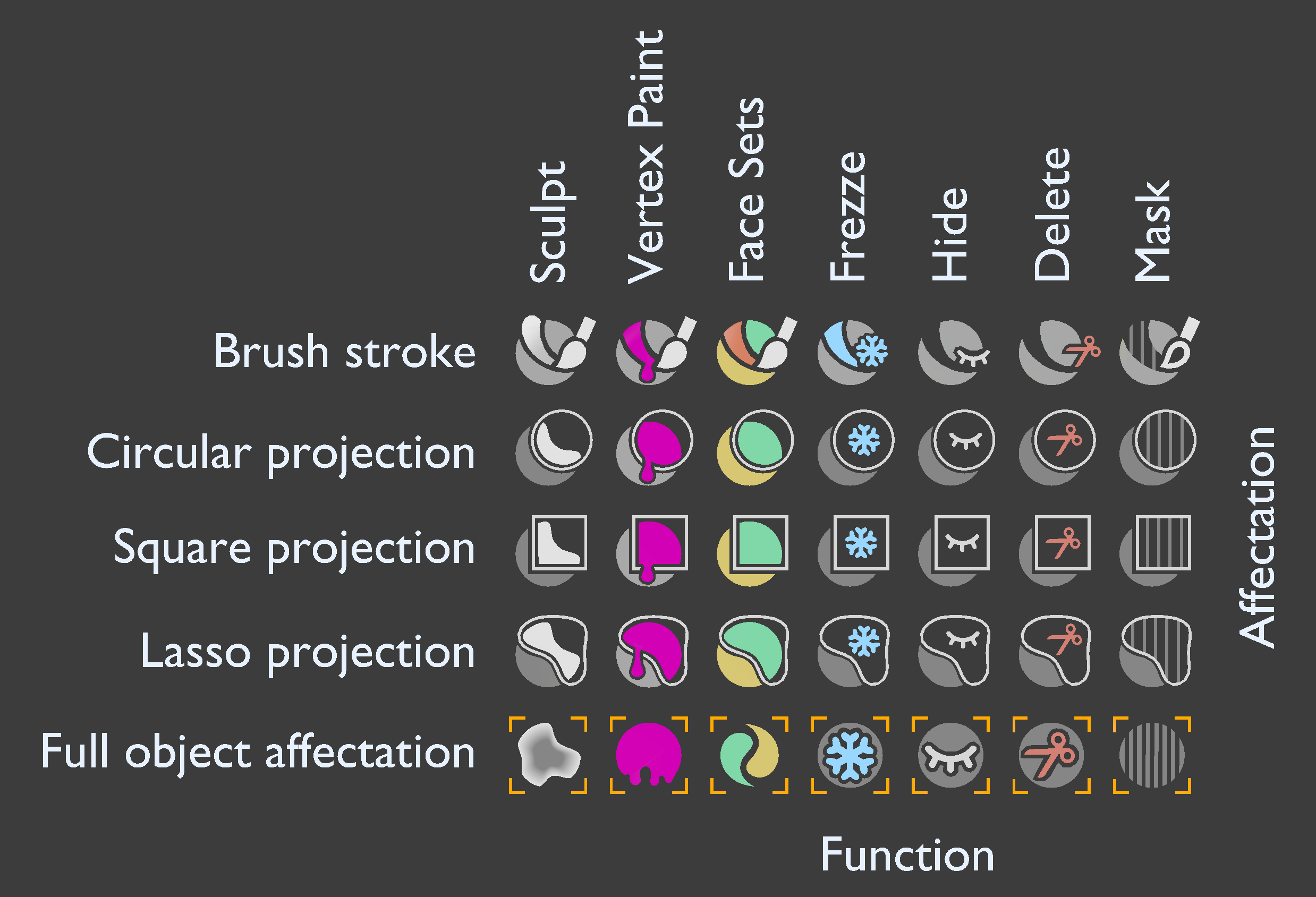
Due to the last call to make the icons missing sculpture mode, I have proposed some in
https://developer.blender.org/T80331
On the other hand, I always confuse the mask icon, because the mask on the icon appears light and in the 3D viewer it is dark.
For this reason, and to unify how the icons are symbolically displayed, I would like to make a couple of proposals:
· Modify the concept mask by freezing, and keep the concept mask for when you can work with layers of modeling or painting.
· Use the icons proposed here to: Face sets, freeze, hide, delete and mask. They have room for improvement since the mini icon is not always in the same place and is slightly re-centered in each case.
What is your opinion?
Upgrade.
Circular projection and brush stroke should also differ well.
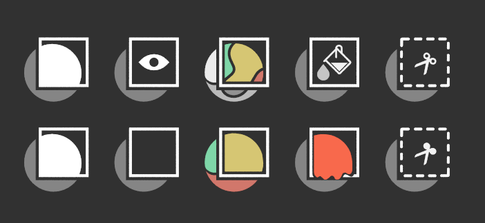
I had same idea before, but it adds more complexity to the icon, it may look nice on large size but it looks confusing at its actual size on the tool bar. This was my original idea with subicons but they didn’t look good in the tool bar so I had to simplify them or leave them as is. These are box icons for the existing and planned sculpt gestures, mask, hide, face-set, color fill, and trim.
Very pretty the row below. Anyway, the mask icon, because of the color inversion with the 3D view, has always confused me.
I really like dripping paint.
Darker color on the mask icon makes it blend in with the background and it would be hard to differentiate between hide and mask, so I can see why it has brighter color instead

These are the icons I have after a few iterations, still not sure about the displacement eraser though
Meanwhile I am also thinking about the subject, and I consider that since in
https://developer.blender.org/T80384
Pablo is thinking about a redesign of the brush selection, it is a good time to look to reorganize them and unify representation criteria. For this reason I think it is a good time to create guidelines. Here I leave my proposal as a starting point, surely it can be simplified better, as RC12 has done with its proposal.
That project depends on asset manager afaik, and its going take a while to happen, so we still need icons for tools till that’s done, but I agree with the proposal, there has to be some guideline to make the icons more consistent.
Hello.
Can you tell me where you can find all the icons in good quality?
It is from the latest version of the program.
Is this generally allowed?
I just started to master the program. And I decided to use Stream Deck. There you can put an icon on each button.
(Google translate)
Get the blend file from https://svn.blender.org/svnroot/bf-blender/trunk/lib/resources/ and render the needed icon. Blender writes them in a custom format using https://developer.blender.org/diffusion/B/browse/master/release/datafiles/blender_icons_geom.py and reads them later at launch.
Thank you very much.
For my GSoC project (proposal here - Proposal) the main goal is to have more information on the strips, so thumbnails and modifier indicators. The thumbnails are almost ready - ⚓ T89143 VSE Strip Thumbnails but for the modifier indicators, I wanted to include this because the thumbnails represent the source footage only. The modifiers can be checked in the side menu, but when you have large edits, it does get hard seeing only the rectangular strips that is currently in blender. I was thinking of having some icons displayed, to show that a modifier has been added or even a scale/position/crop changes have been applied to the strip. I can then use this to figure out what strips have been left out and it is easier to select strips and perform a copy from selected strip operation.
This will basically help in telling the user what a strip represents - if file names aren’t clear or if there are duplicates of the same footage, knowing which is the cropped one or the one with a mask will be useful.
The placement will be like this :
two things -