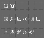
I prefer the eye icons from right, and link icons from middle. x)
3 Likes
Yeap, I think this mix is the best!

2 Likes
One of rules I try to follow is to avoid mixing several symbols in one icon. The pictogram ought to stay as synthetic and as minimal as possible. Building a pictogram out of several different symbols is acceptable only if it’s critical to the idea we want to depict. This applies to cross/deletion too. Diagonal crosses were eliminated all over the icon sheet and replaced with simple symbols directly pointing to a state different from the active one, with visual style (thin, slightly transparent lines) that emphasize the difference of the state.
When a menu is collapsed, the icon displayed does not look like a clickable button, more like a handle for dragging. Maybe it’s better to keep it as a menu item.
2 Likes
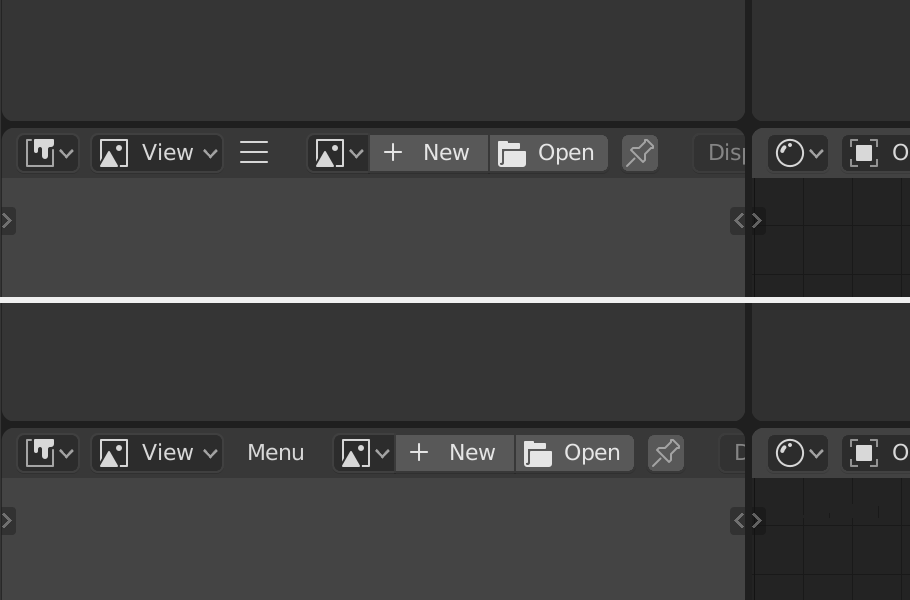
The 3 lines is a standard glyph for menus. This symbol is often referred to as a ‘hamburger menu’
3 Likes
I think what makes it kinda confusing and easy to miss in this particular case is the fact that it’s just one random glyph on a busy row of other UI elements.
The hamburger menu is indeed very common, and increasingly universally recognized, especially among younger generation, but one important piece of puzzle is that the hamburger menu icon almost always stands on its own, on easy to spot and reach place, mostly a corner, usually a top left one.
So I think that in order for the hamburger menu to be easy to spot and find in Blender, it should have an exclusive spot in one of the corners with a bit of space to separate it from all the other UI elements. And this universal rule should be used for all the editors 
3 Likes
Well, I think this works when user first see easy to recognize icon - the right one.
Then, after clicking on it and seeing difference it started to make sense for the eyes/mind… Maybe third variant will be good enough!
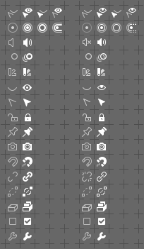
This idea works in practice much of time, because often it is the enabled state that needs more importance and highlighting. But it doesn’t work as well when it is the negative that needs highlighting. In Outliner it would work better to have the restricted state icons have more weight and prominence than the regular state.
I think ideally the icons should clearly show the states, but be agnostic about whether one of them is more important than the other. Right now low opacity is built into the icons with the “off” states. But I think instead the blender source should pick the appropriate icon for the state but then draw it with low or high opacity depending on the context of how they are used. That way the Outliner can show lower-strength icons for “on” (the normal state) but higher-strength icons for “restricted” (the exception).
It could be suggested that we could draw the restricted icons in bright red or yellow to highlight them. But the low opacity of the disabled icons preclude using stark colors since it would blend with the background.
Well, it’s just a question what do You want to underline. A matter of preference I’d say - You may say the glass is half full or half empty, but both of the statements re true. Here we have similar situation. Current design makes enabled states strong, that’s true, but most of software I work with does it this way. Lack of information is an information as well, so both states are noticeable and easy to identify. Moreover devs could colour code the states (green = ON / red = OFF, or so).
1 Like
I generally think it is a matter of context.
If we are showing the possible state of a single thing then there might just be two icons, on and off. In that case it makes sense to make “on” look prominent and the “off” less so.
But when we are looking at a large table of options for multiple things, I’d rather highlight exceptions. So if the default state of multiple items is “on” then it is the few “offs” that are the most important at that time. But if the default state is “off” then I really want to notice the ones that are “on”.
As for color coding them, I agree. That is something currently lacking in the source: being able to easily draw the icons in an arbitrary color when needed. We do technically have that ability, but it is a bit too low down, only something that can be done at the very moment you draw the icon. Icon color needs to be brought up a bit higher so it can be used in more places more easily. Every time I look at that problem I get a bit buried in my wishlist of options and how to implement them.
The exception is the definition of a minority. What You can name an exception relies on local dependencies. I can imagine workflows, where enabled objects are smaller part of a whole setup.
The point is to design system, that has clearly defined contrast, so that each state is instatly recognizable. Your concept meets the requirements, so does my design. Which is better is a matter of aesthetic preferences and internal coherence of visual style and design paradigmes with the rest of icons.
1 Like
Agree the right column looks better to me especially the link icon is the most readable to me
The middle one looks the best to me. The eye all the way to the right looks weird.
Yep, it’s odd, but You knew it’s an eye. Didn’t You? 
On a serious tone - I made it like that to give it the same weight as the rest of active icons in this set. Standard eye looks much lighter and does not match other active items.
2 Likes
All multi-state icons collected together and tweaked to make their states equal in style and contrast.
Revamped on the left, old on the right. Squint your eyes slightly to see the difference more clear.
16 Likes
It’s shaped/shaping up nicely Great job!
ACDSEE logo eye is always wild and frightening


Old Illuminati eye style just feels better, because it is not looking directly at you


3 Likes
Figured some people viewing this might be interested, the colour/outline adaptation I was working on is almost finished, only missing modifiers + the second sheet that has files/folders on it.
7 Likes
New, simpler icons for 3D Cursor (ObData and Object).
Two different icons for each: 3D Cursor Transform Orientation and 3D Cursor Pivot Point.
I hope You can easily spot them in the set.
Changes, related to this task: LINK
12 Likes