Why are these properties minimized? Why does a new user first have to find that little tab that pops up, and then expand it? Why can’t it be auto expanded for a new user, and then if an advanced users wants to minimize it, let them, and then have Blender remember the setting!
How do you expect new users to ever find this setting? First you need to hunt for an invisible menu, and even when you find it, still you need to know to click on options, know what to change and know what to change it to. It’s ridiculous for such a basic feature!
SOLUTION
The “n” panels are the worst thing that’s left over from 2.7. I strongly, strongly suspect that new users overwhelmingly do not find them by themselves, but will have to be told that they are there. Increasing the size of the little “<” symbol would go a long way, but having them maximized by default, especially in the shader workspace for example, would also be welcome.
Well, since all the industry standard Outliner stuff is apparently coming in 2.81, I can answer the above myself and say that, no, 2.8 is not ready to bring in new users yet (it’s to lure Autodesk users over, because they’re used to other horrible UI quirks).
I guess I wanted to bring this up again because it’s such a seemingly small and simple thing to change, and it has been brought up many times yet I’ve not seen an official comment on it yet (though I might have missed it).
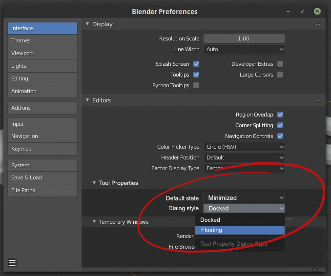
Buffff, let’s see, the history of the toolsettings header hidden by default… I was the one who imagined and proposed that header and we have been unable to convince the developers to show that header by default. It was even said by active and passive in the development thread of that feature. It’s obvious.
Although we don’t know the details of the decision, only that it was an internal decision. It’s all the details we were given.
Hum! Some what important…
But If we show all the setting in first time for new users, It’s will be too complex for that’s, As he have to learn every single option & can’t start quickly, i think…
So un-necessary info (for new comers) are hidden by default. e.g. Redo Panel, Numeric Panel… Solution: I think, something on screen demo/tutorial (step by step) will be too helpful if will be implemented. Which will gives enough info about all the UI in different editors… (latter more and more tutorials can be made by experts users)
Thanks, how Unreal Engine, Daz Studio and many others software gives on screen tutorial
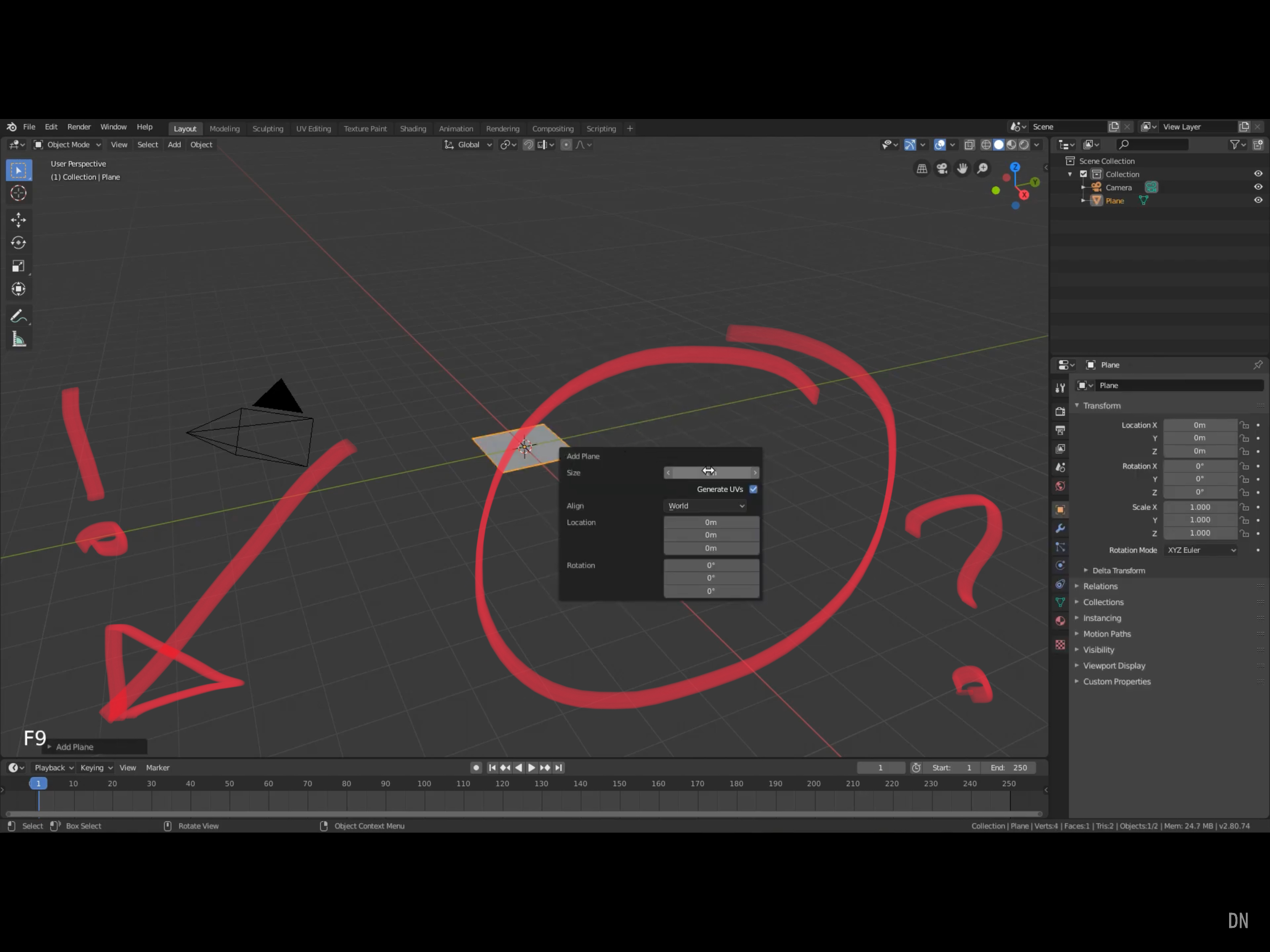
I just found this video from someone who is definitely not a beginner, and what does he do 1 minute 30 seconds into the video? Instead of maximizing the property window, be presses F9 to bring up an entire new floating property window (and the most laughable thing is that Blender let’s him do this, while keeping the original property window STLL MINIMIZED IN THE CORNER)!
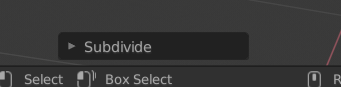
this “redo” tool panel is simply incomplete …
I hope that sooner or later a more concrete solution will evolve …
it is also hoped that with everityng node for the mesh it will also acquire a non-destructive history.
If you are wondering why Pros will pick pressing F9 instead of expanding the tiny property box and why it is minimized by default, this is why.
3d modelers tend to draw extremely fast, and the constant popup properties box gets old really fast if it has not caused motion sickness yet.
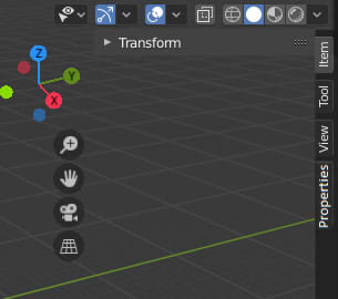
Alternative Solution: Maybe they could change the minimized N panel to show at least the names “Item, Tool, View and Options”, and move properties box to be below the new minimized N panel’s “Options” with the vertical name “Properties”. That way new users can see it, and it doesn’t affect Pros as bad when modeling.
Thank you for validating my point that Blender is made for people who are already Blender pros, and not new users.
Again, pros who know their way around Blender could easily minimize that window or find the future setting that permanently does this. New users who don’t know Blender are currently left out in the cold.
As for your second point, I already suggested that back in February, and it’s been pretty frequently popping up in the main UI thread.

 Create Large Scale Oceans in Blender 2.8")