The same file in 3.6.1 and the 4.1 patch (no tweaking, just using the default added math nodes):
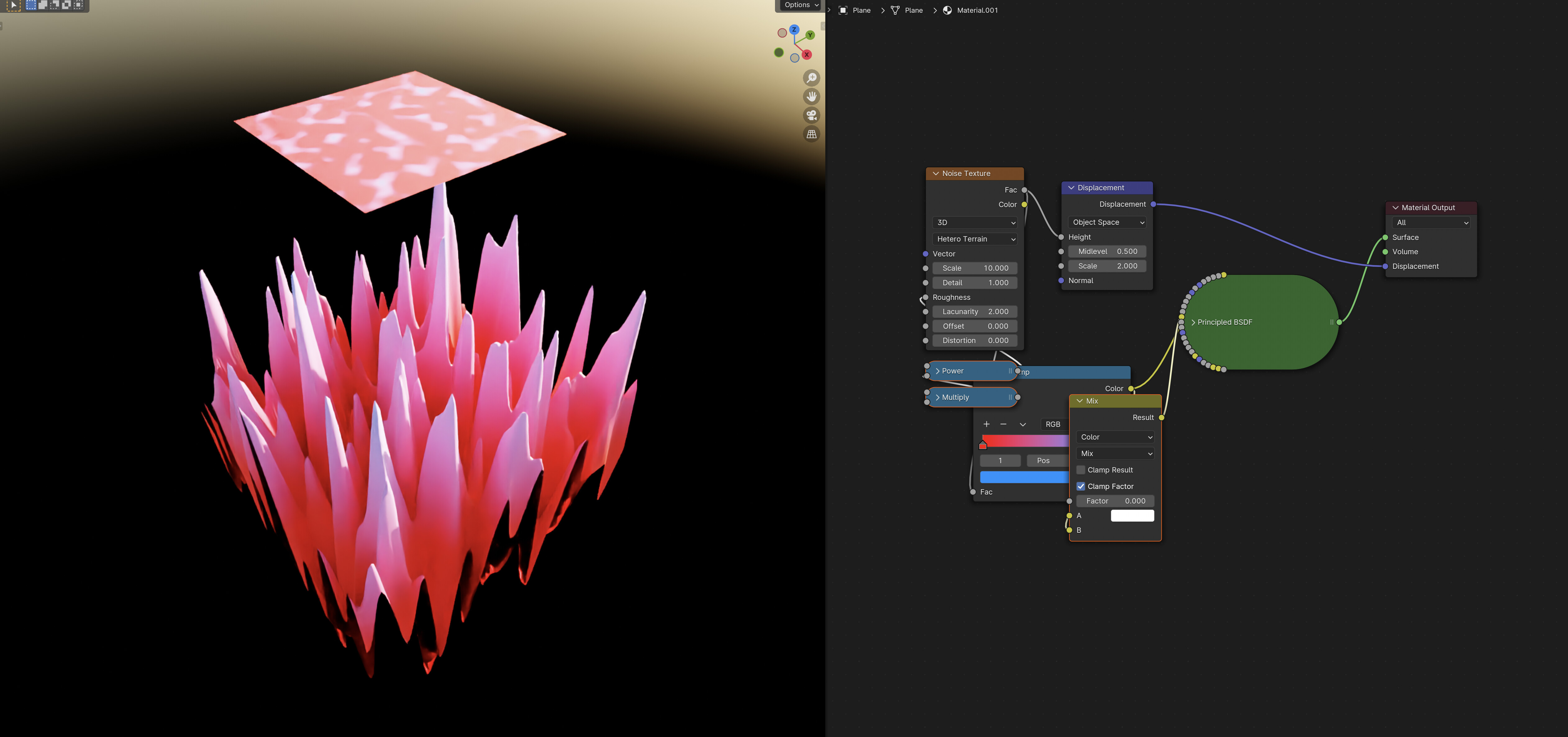
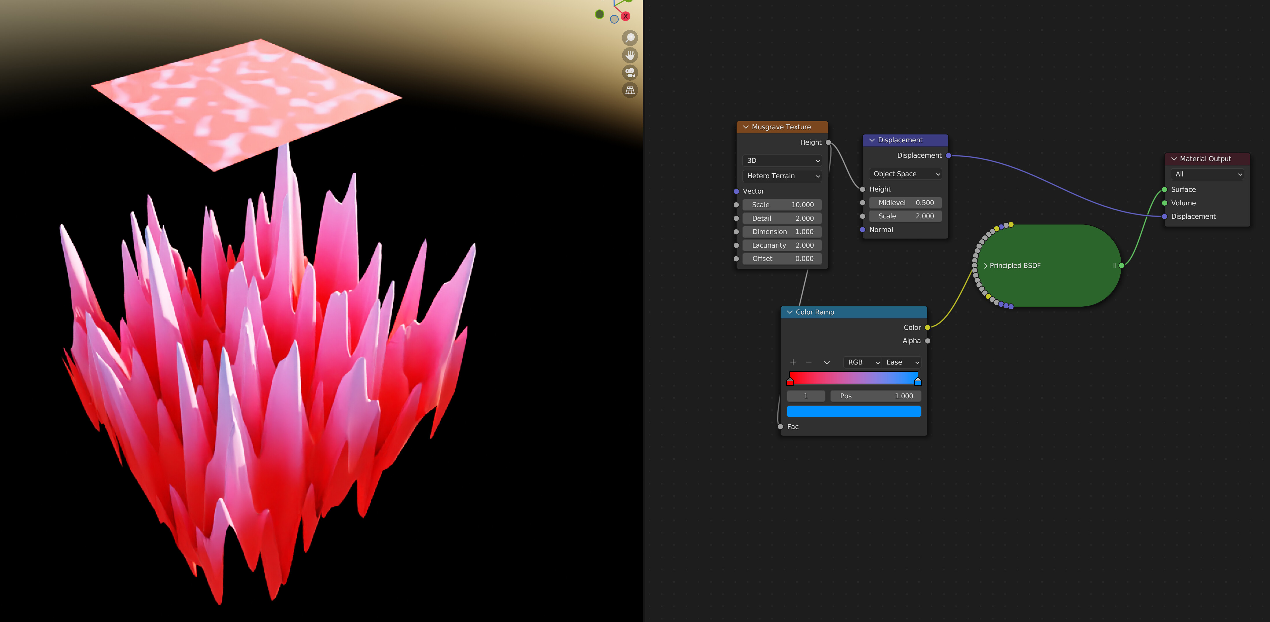
The height differences are starkly visible. I mean, you can’t not see it, it’s visible to the naked eye.
For a better comparison, I’ve divided the two images:

There’s a LOT of very clear difference between the two results. Anywhere that isn’t white or white-adjacent in this image is a difference. (Sure, some of that is from the denoiser, as you can see with the grid background, but not enough to be significant)
There’s also slight, but significant, differences in the non-displaced square.
I would agree that using three nodes to mostly replicate the function of one is not user friendly