I am referring to the image you linked.
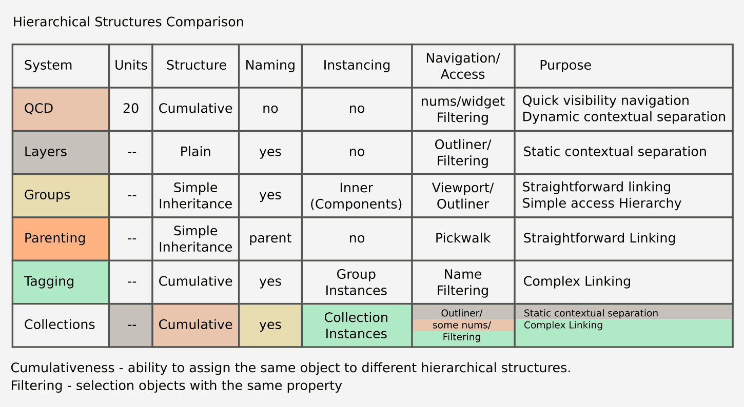
Purpose
Quick Visibility Navigation
Dynamic Contextual Separation
The popover takes into account visibility navigation.
Menus takes into account dynamic contextual separation.
I am referring to the image you linked.
Purpose
Quick Visibility Navigation
Dynamic Contextual Separation
The popover takes into account visibility navigation.
Menus takes into account dynamic contextual separation.
Well, if something contains popovers (aiming with the mouse to some GUI elements) it is already cannot be called “quick”, because of limits of human’s perception and body, it have “common” status.
Like any other menus and popovers in program.
But it is totally ok - some workflows does not requires enhanced quickness.
The popover is simply an extra click.
There is a strong probability that a widget for QCD would also end-up in a popover of header or should be a closable floating panel.
In terms of CG Workflow Design, The popover is “Aiming to menu call button, press, then [seraching name], then aiming, another press”. That’s why it is a common operation, like in any other menus.
It can be repeated 10-15 times in minute, while QCD nums allows about 100.
But, again, it is totally ok - some workflows does not requires such enhanced quickness.
Widget for QCD will not help to Collections mostly because QCD and Collections are heterogeneous systems with different capacity (20 vs infinity).
QCD widget with anonymous slots can be the only part of QCD system, so it is possible, but will not replace popover.
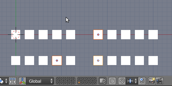
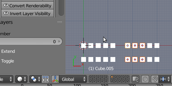
Collection visibility popover supports click&drag like 2.79 layers.
2.79 layers were problematic, too. If you did not remember on what layer you set an object , you had to select object, go to its properties or browse layers to find it.
In 2.8, nothing prevents user to keep a reasonable manageable amount of collections included in a viewlayer and to multiply amount of viewlayers.
ViewLayers feature was main point of first viewport demos.
These ones deserves a shortcut to cycle through them.
Let me explain. By speed is meant speed.
With no popups, no aiming GUI, no names searching, no shifting, no holding - pure speed at full control.
It is required by some workflows, like multiple inplace LOD comparison during editing, and others listed in the topic.
A simple example, It will be incredibly difficult to make the same visual comparison of a set of models when using any kind of GUI, independently of how much profound it is.
In 2.8, nothing prevents user to keep a reasonable manageable
Unless if the scene did not come from another user who did not care about it.
Quite a frequent occurrence, when deadline is yesterday.
Ctrl left click on eye icon works like that in outliner.
It would be good to have that in collection popover, too.
But you can adapt filtering in outliner to only display collections.
I agree 2.8 requires extra-steps to put in place fast display.
But if you take that 2 minutes to re-organize a little bit outliner, you can work efficiently during 2 hours.
There are no GUI solutions, that can be faster, because of mathematics.
As said, it was a simple example.
But we are talking about really massive production workflows.
Hundreds of files. Thousants of models. Tens of thousands of elements and variations derived from different programs, perhaps billions of comparisons throughout the entire production process.
The question is simple - to bring those billions unnecessary aimings, searchings and menu calls with GUI or not to bring.
We who have been working in such conditions for quite a long time, our answer is no, please no more, we have families, we just want to live sometimes…
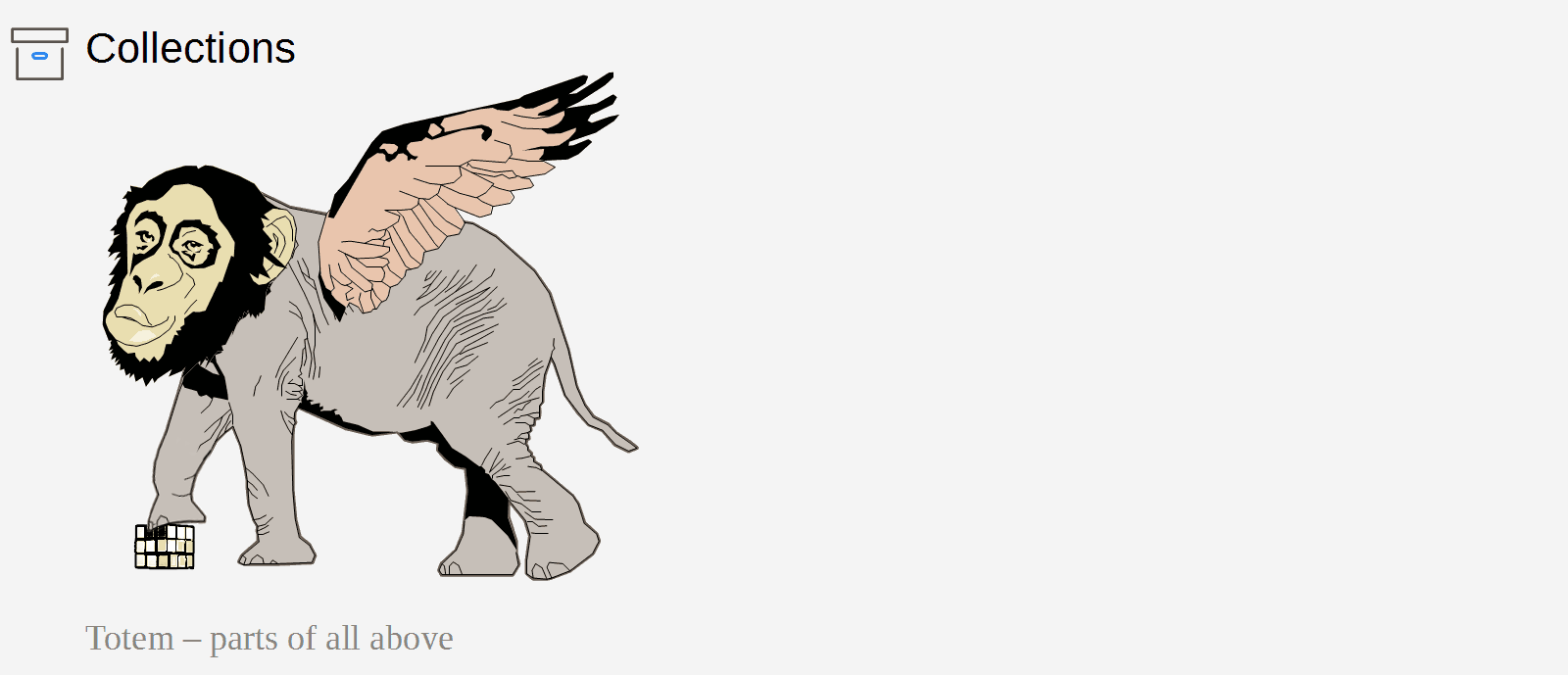
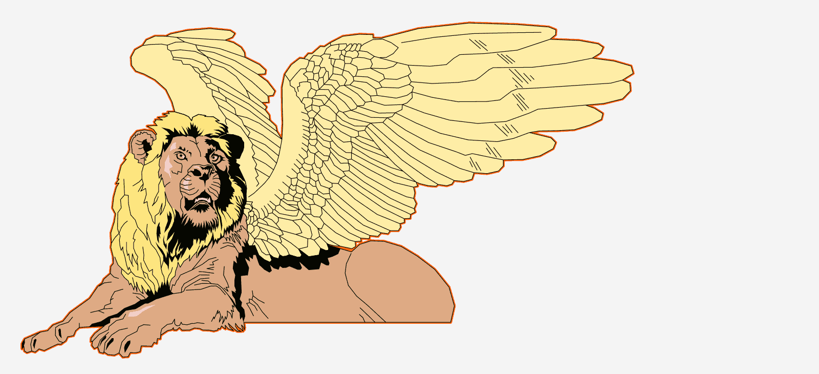
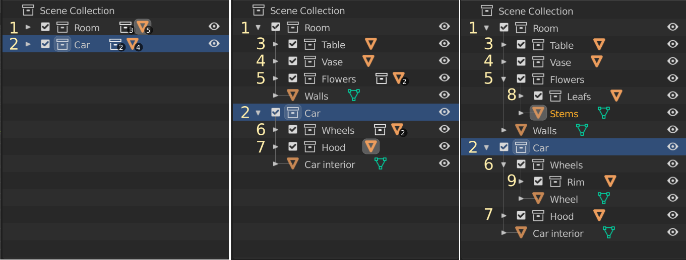
You forgot the rubik’s cube in the Collections illustration. I was so sad of it that I added it in a dirty way:
Now I can leave this world in peace.
Obviouly, it was not forgotten, but lost, because blender doesnot have common grouping system yet.
So everything there were right.
The cube is hidden between the paws of a lion as a sign of seamless integration.
And yes, we all are worried about cube’s fate.
For me it’s better to make a separate type of object - “Group”. I think it’s better because it can uses it’s own “Edit mode” instead of empties. And then replace empties with collection instances by this “Groups”.
But of course the main problem with collection instances is that then you want to edit collection in instance, instead to pressing tab to enter in edit mode (like in node groups and metastrips) you need to search collection in outliner, move camera to this collection, change visibility settings of all collections (or use local mode) then bring camera back - so a lot of useless actions…
About Common Grouping - we need just the same behaviour/workflow in master,
but without all that mess, that brings Group Pro addon to scene.
I love group pro, but I really want this functionality in master, fully supported and guaranteed to work forever, even when Group Pro is no longer updated.
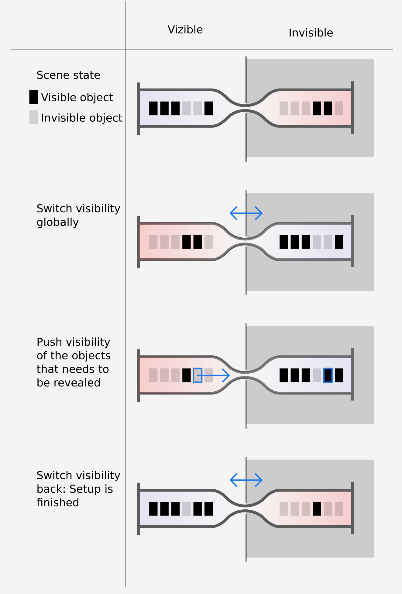
Also - important - fuction to inverse visibility is needed.
That will split scene into two global “slots” (visible vs invisible) with ability to switch between them.
Maybe Alt+Ctrl click on any eye sign in outliner.
That will give full fast control over hidden objects of entire scene.
A very nice tool for vertical (hierarchical) scene navigation.
The same switch can be made between render visibility and viewport visibility, to view what actually will be rendered as visible objects, control it with visibility switch from picture, and then switch back.
This way visibility can be the map for displaying different unobvious properties like render visibility.
Can be the solution for an issue.
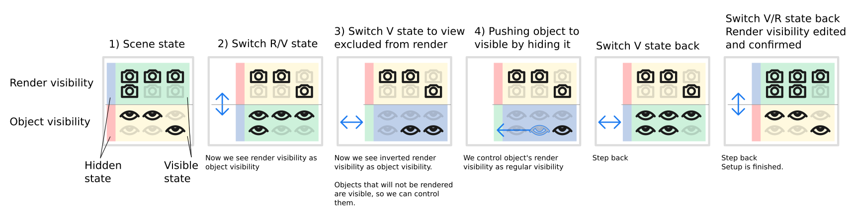
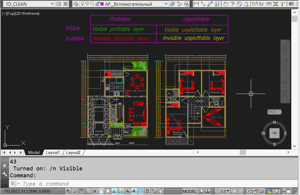
We made such switch system for AutoCAD, and it is nice if it properly marked, we have full control over visibility and plottable state of thousands of layers.
We can switch in, edit plottability as visibility, and switch back.
In the Eisenhower matrix, this is how the switch looks like.
Not by inverse, but the same purpose in Revit:
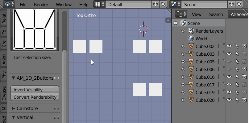
Here is an example addon, an example of swap/invert modes.
First button inverts visibility state
Second - swaps visibility and renderability
Object visibility can be inverted or swapped, that gives ability to view rendederability of objects as visibility.
Personally, I would like to prefer columns switching, to define mode (first column is for changing value by visibility), that will make things more clean.
UPD: Ability to isolate layers/collections of selection
Ability to invert it
Cool proposal. Needful!
Nikita Akimov (aka Korchy) decided to make S-Up tool for testing pickwalk behaviour in collections hierarchy. Very useful!
Also - a very nice solution from Michael Soluyanov
Looking like Group Pro, but doesnot messup with scene structure, using default abilities
Interestnig solution of Collection numeration from Dfelinto
https://wiki.blender.org/wiki/User:Dfelinto/Reports/2019#June_17_-_21
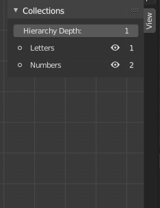
But the problem is that numeration is dynamic. That means, it requires more memory to remember which number belongs to which collection depending on current depth state. For example, if user want to send objects to Collection with number 5 via pressing M5, it is hard to say where objects will be sent.
So it will be better if first 20 slots, that available for numerals keypressing, will have static (adress) numeration independently of hierarchy depth, but with numeration starting from first level of hierarchy.
Static is looking not so fancy but is more usable.
Example - when scene’s collections are formed, user can call collection as “1_Room”, “2_Car”, “3_Table” during single scene setup, and this numeration in static representation will be actual independently of depth parameter.