one could do one cursor (as it has now), or leave the previous version.
(I don’t use sketchup, too)
one could do one cursor (as it has now), or leave the previous version.
(I don’t use sketchup, too)
Why is this chat being flooded with random rants about cursors? Can someone please split this into a separate thread?
Ok I see. Really what bothers me is having this big picture in the way when I work, the crosshair was perfect. They recently removed the sculpt mode arrow and added a crosshair, and that was a great change. I’d just like a crosshair all the time, it’s tiny but detectable, and doesn’t get in the way visually.
Dissmissing feedback as random is not cool either way. I assumed cursors were icons, but maybe this deserves its own thread ?
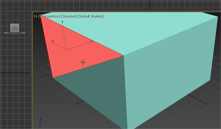
We are using multiple software including Sketchup in our production.
There could be a need to make some random selections every time you want to find out which mode is currently in use, but it have proper display of an edit mode, that fades out components that are not in edit mode currently.
Blender doesnot have such a thing, and its object and edit modes are looking pretty much the same, so it requires multiple checks of current mode every time if you try to concentrate on something except remembering your current mode.
@kaiwas: Really not clear to whom you are talking. But in case you are talking to me, I must correct you. I didn’t say one cursor for everything, but that less are better, that often changes are simply not needed and that it’s not good to switch the hotspot without severe reasons. Quite some of your demoed icons are just the default cursor with companion icons. And most others are just temporal cursors used to show hover related mode switches. So I see nothing here confronting my argument.
You’re right.
It’s just not clear why it was necessary to remove what worked well and did not cause big problems.
Different cursors for all modes are not needed, but I would like to see what many are used to.
This could be done optionally.
And the large cursor was useful for small laptop screens. Where had to peer.
because cursors only recently had their own unique “icons”)
The role of the cursor is to show which tool is active. To make it clearer which mode you are in, we can do other changes, such as changing the edit mode theme or other related things. In any case, this is not related to the design of icons, nor even really to the design of the cursors themselves, so please stop hijacking this thread.
So, we need a separate design task on this.
Because we are not using that tools, actually.
Edit mode’s cursor is perfect as it is right now.
Next step is to add the companion icons for each tool, like this:
And that’s all. 
Yes, something like this we should add, although because you can now click to select with almost any tool, it’s not as necessary as it was before. You can click on the gizmo to perform the tool action. Ideally, the cursor could be more context sensitive.
So, how we can visualize Tweak tool cursor, to avoid described problems with mode uncertainty?
The Tweak tool should indeed have a special cursor - would be useful to have a thread with ideas for tool cursors.
Exactly
The cross hair always was a pain to use. Can’t believe there are still few people wanting this… lol
That’s my mockup, where did you find it?? 
But yeah, that’s the best icons a tool can have, it’s really clear what it does…
Crosshair was a great solution. Loved him. Adored him.
I don’t understand how you can dislike him.
Perhaps because everyone has their own view. Limiting your choices when it was already just weird.
nobody asks to do it. you just need to return what was already there. At least as an option.
(everything was done in translate.google  )
)
You’re probably too used to it, I understand. But the default arrow cursor is more precise. Just try it… 
Could sombody give a real reason to remove the crosshair that nobody have complaint in the last 10 years and that uses other software like 3Dsmax and Modo (main modeling programs in the world) without any problem? And that change has generated a lot of complains and bug reports only in one month?
You are too clear. Similar to dictatorship )
That is most likely just the person who removed it.
Could you simply stop with this kind of imputations. It wasn’t Redwax who took it away. And disagreeing about the use of a cursor is really not dictatorship. If it is anything it is freedom of opinion.
It’s really just a talk about a cursor.
Are you kidding me?
Everytime I see this argument, I laugh really hard. Are we kids or what? Do you fall into editors by accident? You really can’t tell if you’re in edit mode or not? Do you really need a blatant sign to tell that you’re in edit mode?
Come on man, that’s the worst conservative excuse I’m reading here. It’s better to go straight and type “please don’t change my blender, I’m so used to it”, instead of typing pointless arguments.
Nothing is more precise than the default mouse cursor!