It s pretty nice that you spend that much attention to keeping a clear line in the interface. In Blender 2.8 it s time to clean things up. But you should really have a close look at the pop-up menu from heavypoly. From usability standpoint it s such an improvement. If you re a beginner or not doesn t really make a difference. Even if you use blender since day one you have to go over the whole screen with your tablet or mouse instead of being right at the pop-up. And it s not complicated at all. Fill and stroke color / toggle materials and layers together. That’s all the artist wants. And I would even say if blender wants to have more 2 d artists exactly this simplicity is needed. That s not a constructive idea how to solve the keystroke problem but I felt the need to comment  you’re doing a great job by the way. Even the Blender 2.8alpha daily builts are a beast.
Hey, I’m not against the idea of something like that at all. I hope that’s not how it came across. As I said, I think something like it could be good to include.
I just immediately jumped to what was needed to actually include something like that.
It should be a bit easier to grasp, and also should be a consistent concept across Blender to keep it consistent. If someone could contribute ideas on how to make this more structured and consistent for all the modes, then that would be very helpful.
Hi Bill, here’s how it would work for regular materials. The menu is context sensitive so it switches depending on if you have GP or regular mesh selected.
@HEAVYPOLY
I have customized the shorcurt with your popups tools and I must say that I’m finding very well …
I often need to quickly set the visual characteristics of single or multiple selected objects.
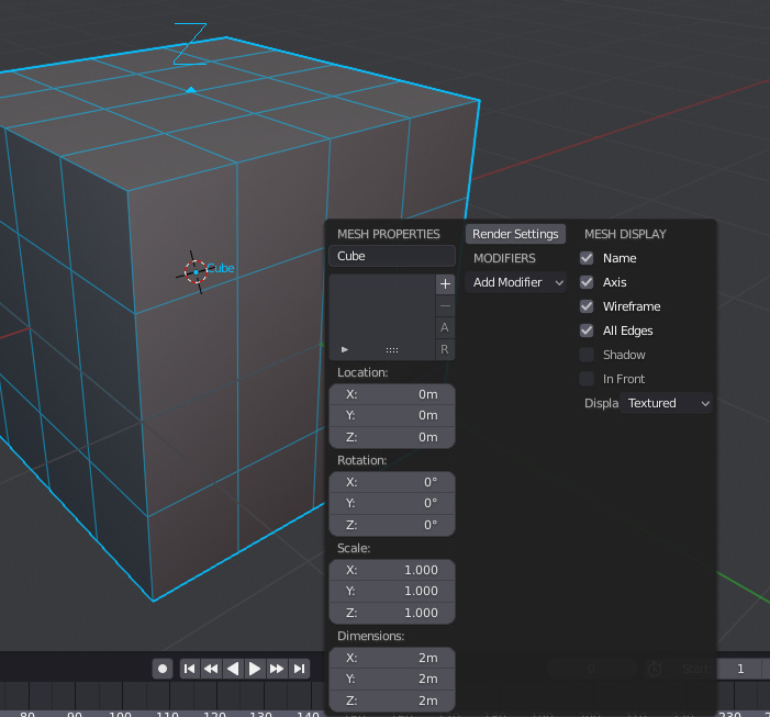
what would you say to create a popup for the viewport display properties?
greetings by noki
hey @HEAVYPOLY thank you for showing me how to fish
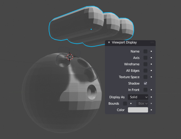
these are my first little fish ^ ___ ^
I’m happy as a child