Testing D14173 on revision 48724 these are the only comments that I can make:
I personally don’t like the colour that is used during this operation. The blue just seems “weird” to me. I think it might just be because I’m used to the light and dark indication used in Master
Sometimes what an action will do is not clearly explained in the UI. Look at this example:
Based on what the blue highlight showed, it’s not clear that I would end up with the result I did.
Other than those UI complaints the patch seems alright to me. I will continue to use it and give feedback if I have any.
So far I am just using the highlight color in Visual Studio, just so that I don’t have to think about it. However, I’m fairly certain that this idea would need a singular highlight color, not two as it is with current code. Could be any color of course.
Will look at that weird docking. I think I can make that work better.
I was just gonna suggest an interactive divider when splitting windows inwards but you have already implemented it! Overall I think this is really promising. Couple of notes/bugs from my short time playing with it—
Would only highlighting the part that’ll be created with the splitting action be nicer/better in anyway, like this? I’m assuming this relatively bright highlight color is a work-in-progress thing so not really worried about that part yet:
Some docking previews don’t end up with intuitive results, though it appears to be a problem in master as well, not a bug this patch introduces. Still, seeing as you’re looking into it…
There is a consistent crash that occurs when you try to create a new window thinner than a threshold, either vertical or horizontal. As I see it, we perhaps shouldn’t even get the normal docking (splitting) options when a window we’re moving into is thinner than that threshold, it should just assume we’re merging them. Also, if I’m not mistaken, that threshold is based on a percentage at the moment. As the window gets bigger, I have to move the cursor more and more to get to the splitting options. I wonder if limiting that to a certain distance (say, twice the height of a header) would be more intuitive? This could also solve the crash issue: if the threshold is not based on a % but a fixed value, you couldn’t even attempt to create such a thin window in the first place? Not sure.
The initial splitting movement seems to favor the ratio of the window to decide how to split it—if the window is more horizontal, split begins with a horizontal line, and vice versa. Current method (master) relies more on the initial movement of the cursor, regardless of the window ratio, and maybe it’s just habit, but that feels better to me.
With splitting each new side is equally valid so not sure how you would decide which is the new side. I guess the larger half could be different from the smaller? Not sure.
There are some things that can be tuned, but in the end it has to be an automated process where there is never any blank areas left. So there will always be solution that take you by surprise. But yes, I’ll keep trying to make it as intuitive as possible.
Yes, that is known. I am not checking for minimum sizes at all yet.
Yes, it is currently deciding what to do based on where you are on the window diagonal. Staying at 45 degrees will feel better at the top-left corner but would get weird at the bottom-right. Will take a look though.
When you drag a editor onto the seam between editors, it splits into a new window.
I feel like an editor should only be able to split into a new window if you drag it outside the main Blender window.
Demonstration of what I believe is unintentional behavior.
I’m not sure how easy it is to do, but I feel like the “blue highlight” should highlight the entire region the editor will now occupy after you finish the operation. So instead of showing this:
Yes, forgot about the seams. I should be able to fix that by using the source window bounds instead.
Ideally it would show what it looks like when it is done, but my joins are quite often too complex to know ahead of time. I’ll give it more thought.
In the mean time I did just update the patch again to change the behavior for some immediate neighbors. Which is for your first video. I didn’t test it tooo much so hopefully it has not bad effects.
I just had a think about it. The UI change I proposed could also be a bit confusing for some users. As moving your cursor a little bit could result in the “blue highlight” changing in size drastically. Some “highlights” will be limited to one editor, others will span multiple editors. It could be quite confusing.
I’ll test it and report back if there’s any feedback I have to give.
Dragging a single editor from one window to another will not work until you start “splitting it” in the original window. And after this operation, editors will end up being transferred between windows when you drag it between windows.
Consider how the current action zones work. You drag for a certain amount before it starts to do anything. Over the years we had to finely tune those thresholds because once you drag a certain length you are committed to either split or join. And if a split, you are also locked into one direction or the other. Many years ago I spent hours getting those working as well (no laughing!) as I could.
What you are showing in your video is just that you aren’t dragging enough (before it leaves the window) to register. But… with the changes to these operations in this patch there is no need for any of that phaffing around. We can just immediately start the operator since you can change your mind between all the operations at any time.
Update the patch to remove all the threshold-checking. Now works like it is on steroids.
Yes, that is on my “to do” list. It might not seem like it, but I can deal with that issue with a patch that is completely separate from this one. Basically it just takes a small change to the “Close” operator’s poll function, and then a bit of work to make closing a single editor (if in a non-main window) close the window too.
Why I consider it separate though is because that should also be the behavior when you right-click on a header and select “Close Area” if it is by itself. Right now the poll function is specifically disabling the operator when alone.
That is now fixed. It shouldn’t allow you to create a window that is too small.
You can also now press Shift and Ctrl at any time during the operation. The current Dupli and Swap operators only run if you start them with shift or ctrl pressed at the start, but with this new code you can change back and forth at will. For example you can start with a regular drag, press Shift, then let go of your mouse button anywhere to create a popup window in that location.
This might just be an issue with my desktop environment on Linux (KDE) or it might be considered a bug with Blender.
If I click and drag on the corner of an editor, stop moving my mouse, then hold Ctrl, the cursor and the Blender UI won’t update to show that I have changed what action I am doing. I have to move my mouse for the update to appear. This also happens for Shift.
The same issue as above (UI and mouse cursor doesn’t update unless the mouse is moved) also occurs when releasing the Ctrl or Shift key and not moving your mouse.
I feel like the UI shown in D14173 should also apply when you: Hold Ctrl (and maybe Shift) then click and drag on a editor corner.
I’m sorry I seem to be providing mostly “bug reports” here rather than feedback on the design.
Here is a video demonstrating all the issues. Sorry if it’s a bit unclear since I didn’t provide audio or directly note what was happening at each point.
Nice, thank you. I’m a very casual observer on this forum but there doesn’t seem to be many people apart from you who care about certain things (like fonts and gui) and have the know-how to do something about them; so your contributions are appreciated.
I just updated the title, descriptions, and captures of the patch - ⚙ D14173 UI: Multi-Window Area Docking - as it is now in a shape that I am fairly happy with, and most operations do what I expect.
So it is probably a good time to chip in on the visual feedback. It is currently using a shade of blue that I borrowed from Visual Studio so that I wouldn’t have to think about it. I don’t mind the blue as it doesn’t signal good, bad, danger, etc. Just using greys and white might be more Blender’s style though.
Best way to give feedback about the visual feedback is to mock it up. Just start with a screen capture of Blender, add a layer on top in your favorite graphics program to make an overlay, tweak the color and opacity until you are happy. If you make something really cool, post it here. If you just want what I have changed a bit just tell me the RGBA values.
I decided to experiment with changing the colour of this operation to see what colour I personally prefer and a few things came to mind:
If the highlight colour continues to be a colour in the final version of the patch, it should be themeable as the colour picked by you is much more likely to clash with other themes than a grey scale highlight.
If this does remain a colour, blue is the right kind of idea (for the default theme). Reds and greens and other colours are WAY weirder than blue (when using the default theme).
Now for more specific changes I personally would like to see:
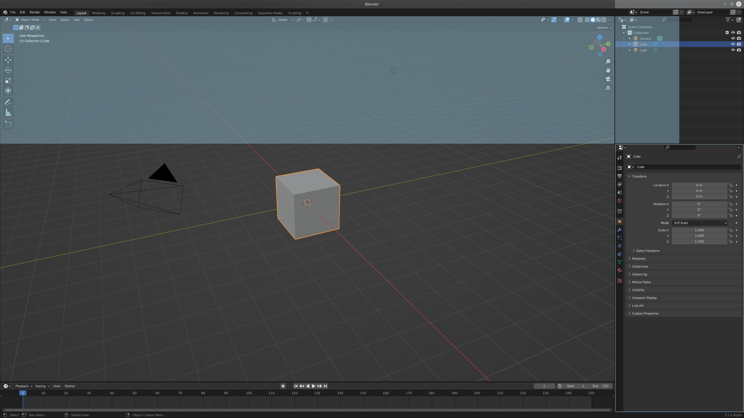
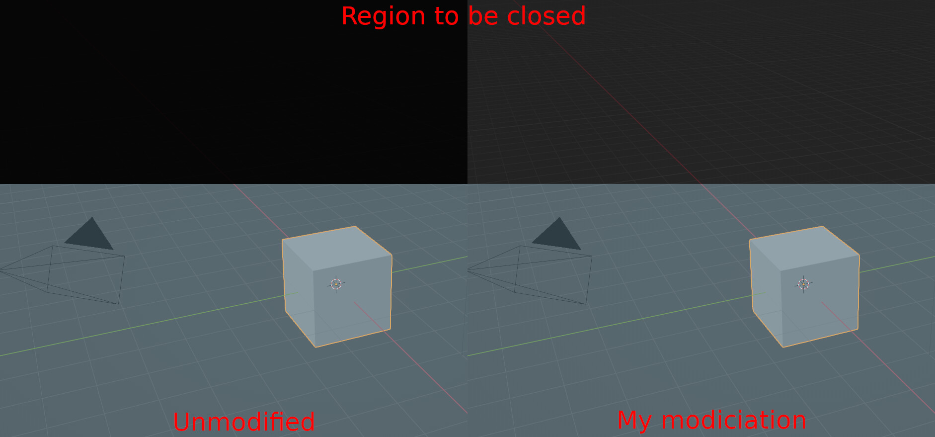
The “dark overlay” when an area is being closed is too dark in my personal option. Line 252 of /source/blender/editors/screen/screen_draw.c should have the alpha value changed to something lower, like 0.4 or maybe even lower?
I still don’t really like the blue. It’s too pale in my opinion. But adjusting the brightness, saturation, and hue, I still haven’t found something that looks nice to me. I’m sorry I don’t have an alternative colour to suggest.
I tested the “grey highlight” just to see how I feel about it. It’s alright. And it’s more familiar as it’s the same-ish as previous versions of Blender.
Note: This is all my personal opinion and I am just one user. These changes may not be what the “general public” want.
Wow, you really hit it home with this one!! One small detail is that if you press ctrl and then click and drag to swap, the highlight doesn’t work.
I like this dark gray with hints of blue on the borders. Color is 0.1f, 0.1f, 0.1f, 0.4f in case somebody likes it.