Add-ons are scripts and plugins to add functionality to Blender. The meaning of this has not changed at any point.
Extensions are add-ons or themes, and potentially other things like assets and keymaps in the future.
In Firefox terminology, it’s the reverse where add-ons can be either extensions or themes. They are not interchangeable. But Firefox does not prominently feature the term “add-on” in the user interface. It’s mainly the domain addons.mozilla.org that has both extensions and themes.
I’m not sure why you are cutting my bullet points short, it just adds to the confusion and misrepresents what I am saying.
Other software like Firefox does bundle various things like extensions, themes, dictionaries and language packs under a single “add-on” term, available on a single addons.mozilla.org website. Blender is doing something similar with extensions.blender.org.
And the word “plugin” does not have any specific meaning in Blender. It is often used to distinguish between a script in Python and plugin in C/C++, but that’s mostly about implementation and from the user point of view in Blender they are both add-ons.
The copy was edited and cut to point directly to the noun-verb-object result of the comparison.
I think you’re inferring an attack, or intentional misrepresentation, that isn’t there.
The language and terms invites confusion, that’s all. If BF fine with this, by all means - that’s BF to decide. I was simply trying to explain to scopelma the difference for why the new tab (addons) has been added to the interface, using more common terms that other software does use, not criticize you for adding the tab.
ETA:
I have edited the post, so that it’s no longer an edited quote but a quick re-summary.
What I’m asking is to please edit the comment so that someone reading it out of context is not confused, and avoid doing such things in the future.
It’s fine to criticize. The terminology can be confusing, but there are various trade-offs and history that means no single solution is perfect. But please try to avoid adding to the confusion.
Ideally matcaps, studiolights, presets, node groups, brushes, keymaps, … will all become available as extensions at some point. But we had to start somewhere.
I am with you on this. I want to state this clearly, as I have not in my comment: I think this split is correct and should be kept. Browsing a gallery of extensions and managing the individual add-ons are different tasks.
I think, however, that this is overshadowed by the fact that currently a user will face two screens that look the same and will be called in words that in the rest of the world mean the same thing.
Totally! Just, these two scopes should be defined by words that do not mean the same elsewhere. Make it clear:
“Install extensions” and “Manage add-ons”, or whichever terminology is clearer and more coherent. I personally get the meaning of the two tabs, I’ve been following this project since the beginning. I just think that someone who has not done so will not see the meaning of this.
The terminology is similar and the UI looks the same. I think using more descriptive terms will be good design that will help the mass of people that in a few days is going to use this.
“Install Extensions” to me doesn’t make it very clear that this is also where you manage updates and uninstall. “Discover”, “Browse” and “Explore” are not better at that though help understand other aspects.
If renaming like this is done, I think probably the “Add-ons” tab doesn’t need any extra word like “Manage” or “Preferences”. Because then you could almost add it to any tab.
I see your point, but neither does the current non-descriptive “Extensions” label.
Fair point, and leaving it as “Add-ons” would be coherent with the “Themes” one. Then, it would be the first one that would need an explanation of some sort. Some possible labels:
Extensions Platform
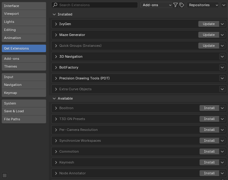
Get Extensions (I like this one as “get” could possibly represent both the action of downloading and updating)
Extensions Gallery (a term that is generic enough to encompass anything that might be done with extensions)
Manage Extensions/Extensions Preferences (I see the repetition: they could be put in front of everything else and they don’t say much)
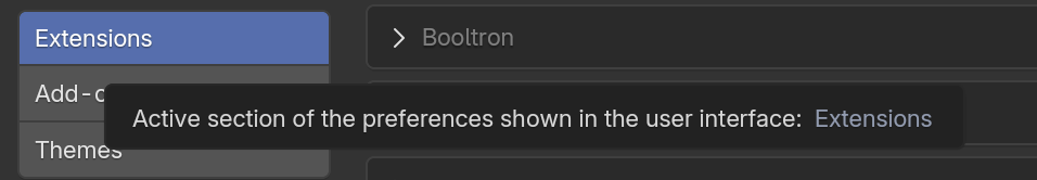
An alternative or complementary UI solution: providing a description on hover. Currently, I get this:
@dfelinto@pablovazquez What do you think about that? I think “Get Extensions” would be a nice way to set it apart from the Add-ons and Themes tabs, and hints that this is where you can go to discover and install them.
I know no one asked my opinion on that one and thats only my pov after all but i dont think this is a good design decision.
Aren’t we supposed to “get” addons and themes as well? Changing the name of extensions tab while leaving the others unchanged can make the design inconsistent. “Addons”, “Tabs”, “Themes” are the contents that user expects to see stored inside. We already have the “Install” button against each extension.
Anyway it’s up to developers to make the decision.
To be clear, this is not really my design decision to make either. I’m just making suggestions to other developers working in this area.
The name would be different because I think they do something different.
In the “Get Extensions” tab you’d primarily go and get add-ons and themes from an online repository. While in the “Add-ons” and “Themes” tabs you manage ones that you already installed or at least downloaded.
For what its worth, that gets my vote as well. It clearly leaves the Add-ons and Themes tab much the same as they have been (ie largely a place to manage already active/downloaded items).
While making it more clear that you go out to an external source (website) to browse/search/ ‘Get Extensions’, which in the future can be other things like keymaps, studiolights, etc.
Then once again, with those downloaded, the user can manage them under the ‘Keymap’ tab or the ‘Lights’ tab or maybe a future ‘Brushes’ tab, etc.
Thank you for your continued improvements, and listening to feedback.
For improved accessibility; is it possible to implement a floating header for Extensions and Add-ons, similar to the Outliner, so search bar and options are always visible while scrolling?
Thanks also for fixing the earlier reported typo.
Kind regards.
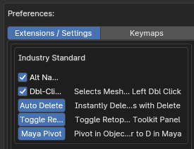
Hmm, not sure about this, could the box borders around the addon prefrences be made optional? Currently for some addons there are now 4! box borders, and it looks a bit ridiculous
In Blender 4.1 you could choose where you you whanted it or not in the addon prefrences, now it mandatory
Hello,
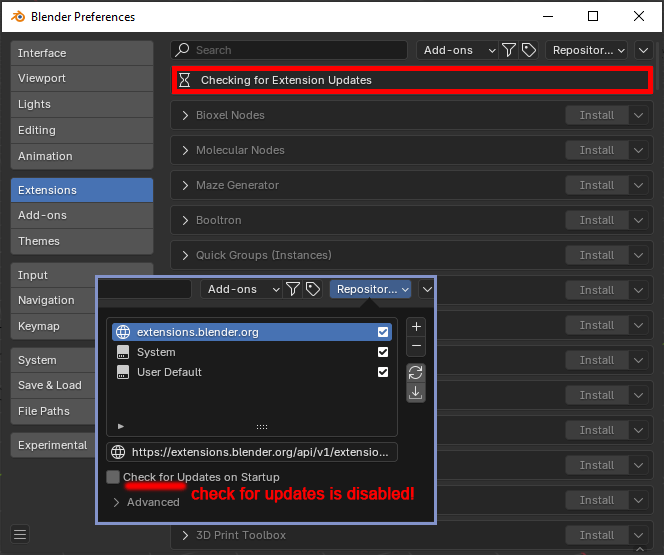
sorry if this has been addressed before, but if check for updates on startup is disabled for the repo, it checks for them still at the startup, I am confused, isn’t that settings controls that?