Yes, that’s right. Along with thinking about the colouring of the icons, we also have to re-design the icons themselves. The current icons needs to be as simple and elegant as possible. Then the proper colouring will be more suitable to the overall theme.
1 Like
![]()
one more ‘export’ icon. Found in most mac export or share buttons.
‘Share’ or ‘Export’ icon from mac apps. ![]() Similar design can be used for render output tab.
Similar design can be used for render output tab.
1 Like
Some time ago I’ve started design research for color coding Blender’s monoicon style.
To test such ability, I made entire demo redesign of FreeCAD icons.
If someone interested in viewing result I’m glad to introduce COIL icontheme.
2 Likes
How can I use those single color icons? Do I need to recompile blender? 
They look great much better than bi colored icons because they can be seen faster.
It’s not possible to color individual icons at the moment. It’s just a mock-up.
You can, however, set one color for all icons.
Themes -> User Interface -> Tab -> Text
They don’t look like chrismas lights, as far as they are in the right order
13 Likes
Yes, you’re right. I said that because I’ve seen people use that argument.
I can’t wait for someone to create this patch to color the icons.
2 Likes
During making FreeCAD icon redesign, I found, that it have ability to supports SVG icons on a fly, so I can change icon themes as often as my mood changes.
It seems, Blender’s UI development is still far from such kind of delivery.
Well, I guess you still can create & edit your icons using vectorial solutions, and export the result as bitmap.
Bitmap doesn’t support UI scaling. Why to use it?
Current code uses bitmaps, and does it with scaling.
So why then they resizes realtime so smooth?))
Videocards can easily scale down this kind of textures.
I think blender will calculate the rendering of bitmaps at the start only once
and then uses a sort of icon cache …
once the correct scaling is set, it does not need to be recalculated every time …
Generally there is no reason to use vector icons in UI.
For example, you have a line that is one pixel thick. Until you reach double scale (two pixel line), you will have a blurred line, whether it is a vector or a raster.
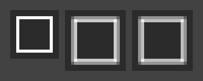
Original, vector, raster.
It’s also better to convert to raster in the program where the vector was created, as there can be minor differences in the results.
Vector lets the icons be scaled up or down without any pixelation.
Probably I’m not able to explain it to you, just try to scale the 16x16 pixels icon yourself and you will see that until the scale becomes exactly 2x (32x32), there will always be a blurring (antialiasing). No matter if it is a vector or a raster, there are simply not enough pixels.
In reality, scaling the UI more than 1.3x is unlikely you will need. And even if you need 32 pixels icons for the interface, you will have to draw other icons, more detailed versions.
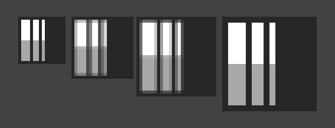
16x16 to 32x32 pixels
Actually I think the moment it was decided that we would have monochrome icons they should have been made as a font. We are already using a nice library (FreeType) that would scale, render, cache, and anti-alias them quite well. As an icon font file it would also have been easy for users to swap one for another.
Vector lets the icons be scaled up or down without any pixelation
1 Like