I repeat what I wrote to @jendrzych on blenderartist for a better understanding here too
I believe it is not something that concerns the designer but the writing of the code, make sure that the color management is managed via code
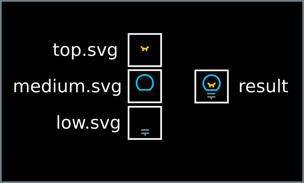
3 layer for colors, top, middle,bottom that’s all
the only thing you need to do is to split this svg into 3 svg:
one that contains the low level (the outer parts of the icons, or in “shadow” etc)
one that contains the medium level (for example the body of the icon)
one that contains the top level (for example, the vertices)
then the developer will have to assemble these 3 svg in a single body with customizable icons in the colors …
is just an example to make you understand … I do not know exactly how technically it should be processed
then the colors entirely managed via code
the aim is the total customization, and it is not said that it must necessarily be the default theme to have the colors, as far as I’m concerned it can also remain entirely white, the important thing is that they are customizable
Don’t worry about the implementation, we can easily figure that out once we know what the icons should look like.
I’m still missing mockups that show how the icons would be colored in a way that both improves the usability for quickly identifying icons that also looks good with the new icon set. Even just to get an idea of what the properties editor header should look like. There would be code to write, but it follows from a design.
I also haven’t seen a mockup for a light theme yet, it’s not clear to me that coloring works well there at all because you need to use quite dark colors for contrast, and it seems difficult to find good looking colors.
I think all we should need is to add some more icon theme categories. Then it’s up to the theme to pick the precise colors for each category. Finding the exact right colors and combinations for the default theme is almost a separate task that can be experimented with once the theme categories are in place.
We already have theme settings for:
Modifiers
Shading
Objects
Obdata
Collections
We could add:
Toolbar tool
Toolbar tool Add
Toolbar tool Remove
Toolbar tool Modify
Toolbar tool Sculpt
Toolbar tool Sculpt Modify
Force Fields
Orientations
Snapping
Proportional Editing
Pivot
Record
Warning
Error
Individual theme options for each Properties header icon.
this is an example of the three-level coloring proposal
the colors chosen are irrelevant just to process the example
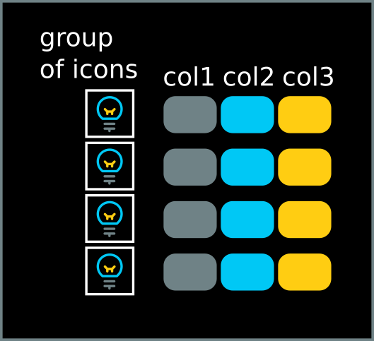
not all icons must necessarily have 2 or 3 level, in the icons in which there is no need of multiple colors, simply draw it entirely on one level, in this way, a color level is added only to the icons in which it is necessary. Doing so in the second and third color levels, the colors of the portion of icons where it is necessary color are influenced
in this way the first level influences the color of groups of icons
the second level affects only those portions of icons that need another color (for example in the mesh icon only the vertices) and so on …
in terms of design, the process in this way is also progressive, so the designer initially starts to test with the most necessary icons to have multiple colors … and if it works then a more elaborate coloring work is decided.
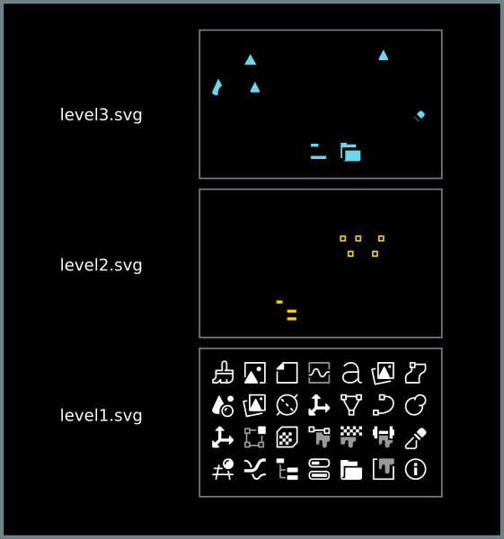
this is a representation of the list of categories with the three levels of color similar to the list proposed by @Evandro_Costa
these are sample portions of how the grid of icons in the 3 levels should be worked out
i made this mock up a while back to test colors in both light and dark themes and it reads reasonably okay, and i think the less saturated the better, what do u guys think?
I really like the desaturated colors. I think the two color icons are the way to go. But default theme should be done in a subtle way so the colors aren’t too distracting. Similar to Znio’s proposal.
About the properties editor: I find it really difficult to colour the icons there, if you colour everything it become even worse than without colour at all IMO, while colouring only a couple of them bring too much attention to the selected ones… I think that with the vertical alignment and a bit more breathing space they could stay white.
@billrey, at that rate we will end up with 100 categories. The other problem we have is that icons are used for different purposes, so in many places we’d have a random subset of icons colored and others not, unless we put all icons in a category.
@Znio.G, those colors seem too faint to make a difference for usability, they do not seem to be visible at a glance.
@a.monti, if the properties editor header icons stay white, then I’m not sure we are improving usability enough, even if they get extra spacing. But on the other hand I’m also not sure how to make the properties header look good with new colored icons, none of the mockups so far were convincing to me.
We already have this system in place that can define a theme category for our icons, so you can make them all the same colors or you can pick different colors for each category. I think this works really well already, because each theme can set colors that match it. We should keep going with this.
All that’s needed is to expand this a bit more where needed.
This would solve the problem we have, which is that sometimes both a shape and a color can be useful for quick identification, using a system we already have in place. It works with the new icon designs too.
my proposal is to make the button head highly dynamic, link it to the selected objects to the outliner and to the way in which “work mode” we are based in the workspace we are located
doing so the property panels would be strictly divided into several categories and closely related to the mode in which it is working and then the head buttons would never exceed the presence of more than 5 buttons
would change the paradigm a bit, it would become more “working mode” llinked, but so you would have everything cleaner and the panels would emerge only when needed in
edit: just to move forward a chance but without being taken seriously and kick me…
adding, for example, a “scene / render mode” …
we understand that a lot of panels needed only for shading and rendering would end up in this category …
another possible example:
add “simulation mode” another a lot of panels would end up in this category
that’s the bit of the issue, if you make them more colorful they’ll pop-up and be too distractive, u’ll need the right balance for them to work in both styles, i’ll try again.
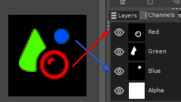
Just in reponse, I posted this elsewhere before but here is another idea:
Using color channels
Using this technique once can keep the single SVG file and its just a matter of setting the color to either blue, green or red depending on their channel coding
If we follow your proposed categories there are about 30. And then people will ask for object modes, and shading modes, and editor types, and icons in editor headers other than the 3D view and properties, etc.
It is more complicated than this. In light themes we use the same icons on light and dark backgrounds, which works fine if they follow the text color, but breaks if each icon has a fixed color. Within toggle/radio buttons with a blue highlight many colors will be difficult to see or not look good. So just adding colors for more icons without any smarter logic will break light themes.
We also reuse the same icons in the outliner and the properties header for example (the coloring is currently only enabled in the outliner). Making them separately themeable probably means splitting up the icons in the icon sheet.
I’m also not sure yet that there even exists a good way to color the new icons in the properties header in a way that is both easy to identify and looks good.
The color coding works ok in its very limited form now, but extending it to the entire UI brings up new issues. I want us to agree on solutions to those issues rather than fixing one thing and leaving something else broken.
I agree that your mockup has the icons a little too desaturated, but I wouldn’t go to far in the other direction. I really like the tool bar icons that are slightly desaturated until you hover over them or activate the tool.
How is this different from what is currently happening in the toolbar? We know from the various toolbars that teal, purple, fleshtone, and mint green all work. In weight paint you have blue icons with a dark blue or black outline. That works as well. I really think that the icons should be two colors: text color and category/theme color.
Some of your points I can see. It’s an issue that we re-use the same icons in different contexts if we want to then color them differently depending on the context. The theme category then needs to be set in the python UI file and not in the icons definition. That approach should solve that problem, right?
The thing about bright themes I don’t get. The default pastel colors obviously don’t work in a bright theme, just like white text on a white background is also illegible. Bright themes would have to just pick different, darker colors - it’s up to the theme to make sure that text and icons are legible.
Here’s a quick job of modifying the colors for the Blender Light theme. I think that is a non-issue.