I propose the following… If greater customization was the reason for monochromatic icons, maybe it should be discussed among devs and exp. users if this change would not be best as being the customization option (as a saturation slider on the theme options maybe?), instead of being forced as the default at the main version as if it was the agreed, proven, tried and true best option for everyone.
Maybe the devs added as the default to gather user feedback? I’m not close to any dev, therefore I cannot tell. But IMO the feedback has been clear so far.
Are you a dev responsible for the change @jendrzych?
If you are, first I’d like to thank you for your engagement with the community. You could have been changing everything behind the curtains and ignoring everyone. I applaud your openness.
Next, I’d like to ask you, if you agree with the following 1D_Inc table. If not, why not?
Thanks for answering, even though since you are not a dev I understand your answers may not represent the dev answers. But I will question them anyways, in case the devs agree with those answers:
“Optional Icon sets” may be out of reach for the current dev team. But then how can “greater customization” be the reason behind the change for monochromatic? Those two answers appear incompatible.
Unless we are talking Fixed icon set, but customizable per-icon color on the theme preferences.
Example:
There you go, want monochromatic? Put the Saturation Factor Slider to 0.
This is true greater customization. You cannot change every single icon image per se, but you can change every icon HSV as you wish, therefore making it possible to customize it back to the old colorful palette (of course Icons would have to have base colors for the HSV to work).
I find strange to impose a change that affects (IMO negatively) everyone in a way that cannot be customized back to the old questionably better appearance (since it has more color and contrast, therefore easier visibility and discoverability).
What goals, if you mind me asking, were set that impose monochromy to default blender? If you have a quote/link I’d appreciate.
Like I said, greater customization would mean the ability to customize it back to the way that a lot of users appear to agree that was easier to recognize at a glance.
I really like your proposal …
but I would do it simpler simply …
I hope that the classification and coloring of the icons is divided into sectors, for example “modeling, animation modifiers, some subcategories”
and that these sectors have 3 levels of coloring, I do not know if it’s possible and I’m asking too much, but at the code level, the icons in svg can be changed the color variation for three layers, “low layer, middle layer and layer in high”
so you would have a complete personalization … that would satisfy everyone …
at that point I would not even care that the icons were all white in the default theme, important that it is customizable
Yup, something like that would be good. We don’t even have to make the colors unique for every icon - we can just define more icon categories. So, Modifiers, ObData, Materials, Collections, etc.
We also don’t need a saturation setting. A color picker per category would be enough.
We already have theme settings for:
Modifiers
Shading
Objects
Obdata
Collections
We could then also add
Toolbar tool
Toolbar tool Add
Toolbar tool Remove
Toolbar tool Modify
Toolbar tool Sculpt
Toolbar tool Sculpt Modify
Force Fields
Orientations
Snapping
Proportional Editing
Pivot
Record
Warning
Error
Individual theme options for the Properties header icons.
I don’t think it would solve the issue.
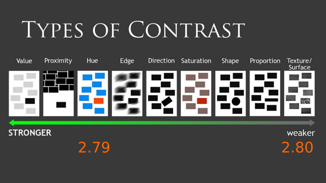
The icons needs colors, at least 2 colors for optimal readability (color coded ofc), something like this showed above:
Just tinting group of icons with one color is not the way to go imo.
In those examples there’s always a primary color and a secondary white (except for the lamp coil).
If there were a color changer field, it would change the primary, in those cases: Green, Dark Green, Light Blue, Orange, Orange, Orange, Yellow, Yellow, Light Blue, Blue.
Ideally every icon would have one dominant main color and one shade of gray (all the way to white or black). If there were a third/fourth color, it would have to be a value/saturation variation of the main color, or a fixed hue.
I repeat what I wrote to @jendrzych on blenderartist for a better understanding here too
I believe it is not something that concerns the designer but the writing of the code, make sure that the color management is managed via code
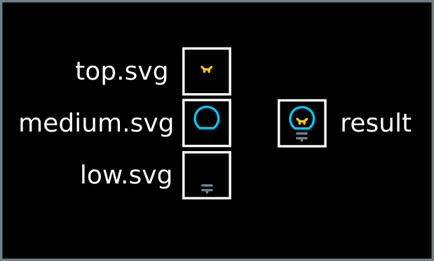
3 layer for colors, top, middle,bottom that’s all
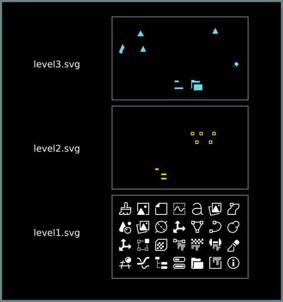
the only thing you need to do is to split this svg into 3 svg:
one that contains the low level (the outer parts of the icons, or in “shadow” etc)
one that contains the medium level (for example the body of the icon)
one that contains the top level (for example, the vertices)
then the developer will have to assemble these 3 svg in a single body with customizable icons in the colors …
is just an example to make you understand … I do not know exactly how technically it should be processed
then the colors entirely managed via code
the aim is the total customization, and it is not said that it must necessarily be the default theme to have the colors, as far as I’m concerned it can also remain entirely white, the important thing is that they are customizable
Don’t worry about the implementation, we can easily figure that out once we know what the icons should look like.
I’m still missing mockups that show how the icons would be colored in a way that both improves the usability for quickly identifying icons that also looks good with the new icon set. Even just to get an idea of what the properties editor header should look like. There would be code to write, but it follows from a design.
I also haven’t seen a mockup for a light theme yet, it’s not clear to me that coloring works well there at all because you need to use quite dark colors for contrast, and it seems difficult to find good looking colors.
I think all we should need is to add some more icon theme categories. Then it’s up to the theme to pick the precise colors for each category. Finding the exact right colors and combinations for the default theme is almost a separate task that can be experimented with once the theme categories are in place.
We already have theme settings for:
Modifiers
Shading
Objects
Obdata
Collections
We could add:
Toolbar tool
Toolbar tool Add
Toolbar tool Remove
Toolbar tool Modify
Toolbar tool Sculpt
Toolbar tool Sculpt Modify
Force Fields
Orientations
Snapping
Proportional Editing
Pivot
Record
Warning
Error
Individual theme options for each Properties header icon.
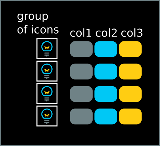
this is an example of the three-level coloring proposal
the colors chosen are irrelevant just to process the example
not all icons must necessarily have 2 or 3 level, in the icons in which there is no need of multiple colors, simply draw it entirely on one level, in this way, a color level is added only to the icons in which it is necessary. Doing so in the second and third color levels, the colors of the portion of icons where it is necessary color are influenced
in this way the first level influences the color of groups of icons
the second level affects only those portions of icons that need another color (for example in the mesh icon only the vertices) and so on …
in terms of design, the process in this way is also progressive, so the designer initially starts to test with the most necessary icons to have multiple colors … and if it works then a more elaborate coloring work is decided.
this is a representation of the list of categories with the three levels of color similar to the list proposed by @Evandro_Costa
these are sample portions of how the grid of icons in the 3 levels should be worked out
i made this mock up a while back to test colors in both light and dark themes and it reads reasonably okay, and i think the less saturated the better, what do u guys think?
I really like the desaturated colors. I think the two color icons are the way to go. But default theme should be done in a subtle way so the colors aren’t too distracting. Similar to Znio’s proposal.
About the properties editor: I find it really difficult to colour the icons there, if you colour everything it become even worse than without colour at all IMO, while colouring only a couple of them bring too much attention to the selected ones… I think that with the vertical alignment and a bit more breathing space they could stay white.
@billrey, at that rate we will end up with 100 categories. The other problem we have is that icons are used for different purposes, so in many places we’d have a random subset of icons colored and others not, unless we put all icons in a category.
@Znio.G, those colors seem too faint to make a difference for usability, they do not seem to be visible at a glance.
@a.monti, if the properties editor header icons stay white, then I’m not sure we are improving usability enough, even if they get extra spacing. But on the other hand I’m also not sure how to make the properties header look good with new colored icons, none of the mockups so far were convincing to me.