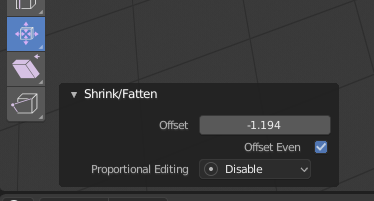
The Offset Even check box for Shrink/Fatten tool is reversed. If you have Offset Even checked in the top bar, you get an uneven offset and vice versa. Also, the check box for the same setting doesn’t work in the Redo pop up after you’ve done the operation. Clicking it does nothing no matter the current state.
It seems like I’ve posted about this already and it was fixed, but it may have been another tool.
edit: I just tried the Redo popup again and noticed that as you drag the Offset slider, it seems to constantly switch back and forth between Offset Even being toggled on and off with seizure inducing speed.
Overlay is a popover. Popovers are internally panels, and the sections you marked are actually coded as sub-panels. They just lack the collapse interaction which nobody had time to work on yet (we need more devs!)
They don’t like floating panels, they don’t want 40 floating panels on the view, even if you just want only one for a repetitive action and you will remove it just after.
Yeah, I don’t know any user who complained having this ability in any software. Hopefully Blender Foundation realizes why this is the norm in pretty much all production software.
That’s a great mockup by @Wazou! And imagine how useful that would be if you could pull that out in a floating panel.
So here Properties is not a separate editor at all but is a part of the 3D Editor? That does mean you can’t change Scene, Layer, Output stuff unless you have a 3D Editor showing. Since it is anchored to the right side, how does it coexist with the Sidebar (N-Panel)? This Properties has no header at all so how would you pin the context if desired?
Personally I think this kind of thing would make sense if could remove the Properties panels that are not applicable to the selected object. So move the scene-related things to a popup on the “Scene” selector at the top. Do the same thing with adding View-related things to the View selector. Then add a similar interface for render engine to the top and add all those settings to a popup there.
After doing that you’d be left with just object-related setting and you could merge N panel in and anchor it to the side as shown in the mockup.
It could work like that after making the Properties Editor so slim, so that only tabs are visible. I imagine the very Editor’s width can be set in steps: (1) only tabs, (2) minimal usable width (depending on the DPI), (3) a width smoothly adjustable by a user (everything wider than no 2). Sort of the way the Toolbox works now.
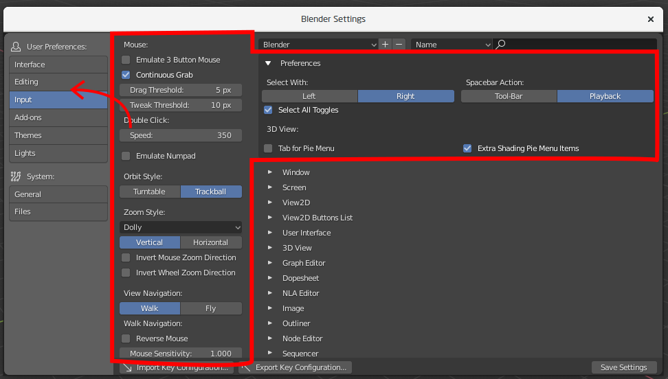
I may be completely dumb, but how do I disable “Limit selection to visible” option in 2.8? I don’t see the option anywhere. Only thing that toggles if selection is limited to visible is this “Show whole scene transparent” option, which really makes my whole scene ridiculously transparent and impossible to visually navigate.
Yet, I am unable to find the option that just toggles if the selection selects only visible faces, but does not modify the scene shading. These two are completely unrelated things
Does that mean that Shift select will finally do a list selection in the outliner, like in every OS and Software I can think of ?
CTRL would be use to add, and ALT to minus ?
Thanks for the reply
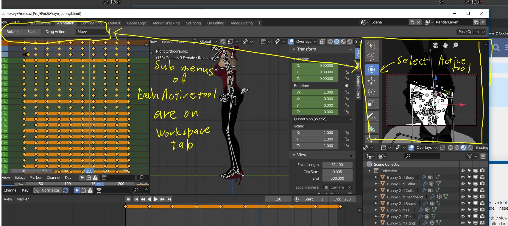
Is not it better, all active tool option menus located in the 3d view window?
At current it should be shown on top left side of the Blender UI.
Transform sub menus (Gizmos and Drag options)
Selection tool sub menus (add, subtract, Radisu (for circle) etc)
Cursor tool sub menus (surface tool procject, and Orientation)
all these sub menus (options?) only need for each active tool. and Active tool are located on 3d view.
so it seems not good, Active tool sub menus locate Full UI top left side. These are not gloval menu.
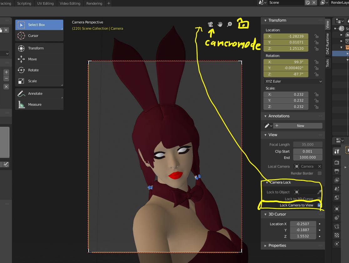
In this pic, I hope to tweak facial pose, on right side 3d camera view (the view for facial camera)
then when I select these small bones,with Active tool, those options often hide from my monitor.
At least I expect, option menus of activer tool locate near the tool. And tool location are in 3d View.
Though I can not offer, how it achive, but I think, it may better locate Top or Bottom 3d view.
even though I need to drug menu as same as 3d view headers, when these are hidden.
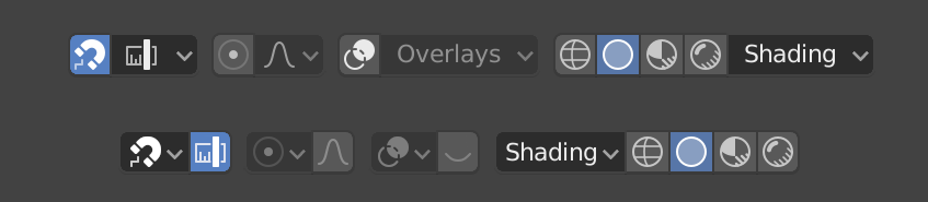
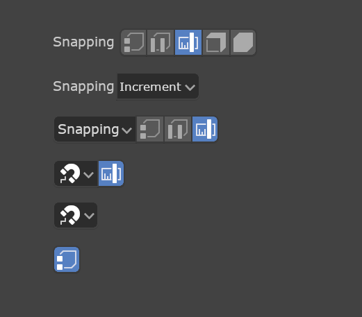
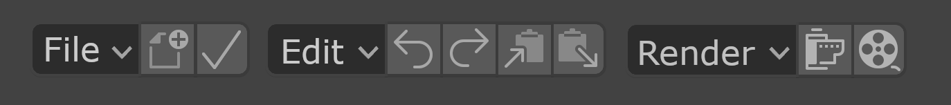
One thing I’d love to see changed is for us to adopt a more consistent widget design and ordering. What I specifically mean is to have consistent left-to-right order, have menus (and popups) be self-contained, and for tool buttons to be only optional shortcuts. Let’s start with an example:
Obviously the top row is how a few items look now, and below how they could look and operate. By moving the menus to the left it means the menu (if using text) can act as explanation for the section in the correct left-to-right order.
With dropdowns and menus being “self-contained” I mean that the buttons can be removed if desired. So the snapping menu, for example, contains “off”. And Proportional editing includes “none”. By having the menus work on their own and the buttons being optional shortcuts, it means that all the following are consistent optional layouts for users of different experience and needs. And because they keep a consistent left-to-right order they can properly coexist with any other items with similar options:
This type of change opens up things we can’t really do now like having some File and Edit shortcuts closely associated with those menus:
Note also that having a consistent left-to-right ordering also makes it easy to swap the order for users who are used to a right-to-left reading order.
Yes it seems good, to exchange view mode easy.
Then I feel when we are in camera mode, I hope there is icon which can “lock camera to view” ON OFF toggle, I really often use it with middle scroll.
I often serch this toggle button in N panell menu. But this option may better near the camera view icon, I think.
(OFF adjust camera frame size, with scroll, to fit in current 3d view window size)
(ON move camera toward focus, )
I hope to exchange turn-table, and Rotation style,(Turntable and Trackball), Navigation style (Free Orbit)
I made add on , but it located in N panell ,for 2.79, it seems better, we can access them, near the camera
toggle icon.
those options are actually for view and camera setting.