Yeah it’s the Window -> Toggle System Console feature. But this will also show if you run blender from the command line on windows which is still valid to do.
Thinking back… I think this text/warning may originate from one of the libs blender links in, one of the audio ones. Perhaps a better default will silence it, not sure?
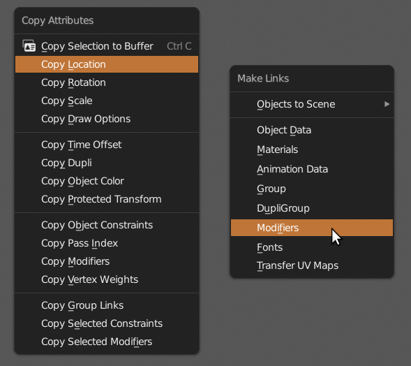
Some of the actions you can do in the “Copy Attributes” menu (Ctrl + C) and the “Make Links” menu (Ctrl + L) do the same thing or at least similar actions.
I was under the impression that with the copy menu you can copy and then paste attributes but not transfer them. If I’d known this before I would have used it way more often.
The terminology on these is pretty confusing since you don’t copy or link modifers for example, you “transfer to selected”.
Perhaps updating the menus or at least the terminology in the menus will help to not confuse users … like it did for me for years now.
One more, and I’m not sure if any of these got pointed out before in this thread:
Some buttons are very near to the corners of the editors. Take for example the “new collection” button in the outliner. A good third of the button is inaccessible because when you click and drag on the corner it splits or merged the editor. So it often happens when you want to use the button you accidentally split the window.
I would suggest to add a bit of distance to the buttons from the corners so this happens less but when the outliner is too thin, the buttons get closer to the corner anyway.
But perhaps that’s ok. So users have to take a minimum width for the editors into account.
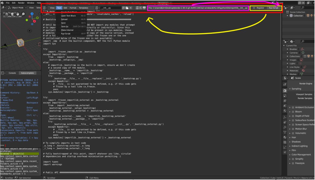
2 Papercuts concerning Scripting in Blenders text editor:
When working with external files the path of the file is often so large that I need to scroll a lot between Text/save on the left side and Run Script on the right. Still it make sense to have the path there/somewhere could you simply move to Register and “Run Script”-Button next to the other buttons.
While I had the scroll for issue one and made the console, 3D View … smaller, I realized that you can’t maximize the console. Is that on purpose? Would be nice to have sometimes
thx for the great work and the possibility to give suggestions on all these channels. you are great!!
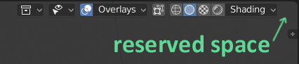
If in 3d viewport you click on the Render Mod button, then to popovers will be added one more button “Pause”. And all icons will move to the left. If you turn on another Mode, then Pause button disappears and all icons are moved to the right again.
It is not very convenient to switch modes, if the buttons are always moving. This is how to shoot at a moving target.
I suggest to reserve there an empty space for Pause button.
It’s annoying that it moves, but also poor if there’s always a blank space on the far right. We could also just move the pause button to the other side of those viewport controls so they aren’t shifted around.
I think that 5 mm of empty space will not be a problem.
If empty space is a problem, then it can be filled with an inactive greyish Pause button. But I prefer empty space. Move Pause button to the left is not the best solution. Button location next to the modes is justified, I think.
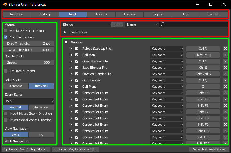
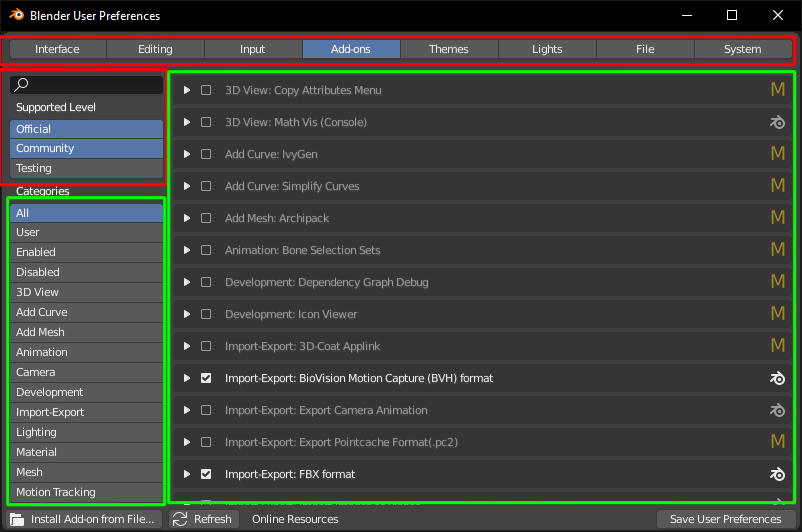
There is one very annoying thing about user preferences window - everything is scrolling. I think there should be areas that stay “locked” and other that can be scrolled.
This is a fast example (red - locked, green - scrollable):
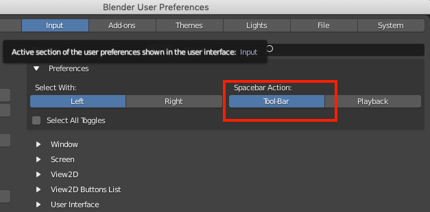
Hi guys, not sure this is a paper cut, but in the user preferences of the latest build there’s an inconsistency over the spelling of toolbar. Here it’s “toolbar” (which as a native English speaker looks more natural to me):
whereas here it’s “tool-bar”:
It should be consistent at the very least, and I think it should be “toolbar”.
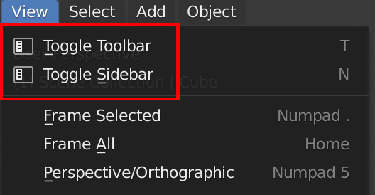
I had this issue as well. When I want to close window i hit that “X” few times before realizing close is above it. Proposal for this is so great. I always thought Chrome and other browsers having those buttons integrated in window is next level UI. I understand it could be tricky and even messy introducing that change.
You’re right, the Blender window frame is pretty useless, it could be integrated into the UI like in VS Code to clear up screen real estate and make it look nicer and less redundant.
Circle select (Brush select) wont erase selection on middle mouse if accessed through shortcut “C”
Also why tools like move is activating on all mouse position ?
I’ve added a patch for the ANT Landscape spelling papercut here: https://developer.blender.org/D3971
This is my first contribution to Blender, so if I’ve done anything incorrectly don’t be afraid to point it out.