Note that although my version shown is wider than yours, with mine you can select what is shown:
1 Like
You do realize we are talking about seven pixels right? LOL
1 Like
Every pixel matters… 
1 Like
You just made it sound so dire. LOL
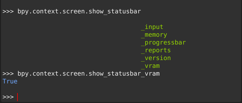
The idea is you could right-click on the status bar, turn off “Version” and you’d gain 38 pixels.
1 Like
Hi,
This is a feature proposal, but the lack of it is an all-time papercut for me:
For pen/tablet users there is a more relevant proposal:
StylusUX - pressure sensitive & pen-optimized interface elements & tools
Problem:
Quite frequently the rate of the value change with sliders (officially Number Fields) isn’t the one you want: too fast or too slow. You can use the
Shiftmodifier (Precision Mode/Input), but it is a very binary helper. Thus, tweaking a value with mouse/pen can easily make the UX disturbing, annoying. Additionally it can result runaway situations, like
- Where is my geometry?
- Awww this will subdivide the geo with this crazy number, it’s better to restart Blender now before memory saturation…
- With
ShiftI still need to move the pointer pixel by pixel:- Not enough, not enough, too much…
More info is in the proposal there, thanks.
My questions are:
- What is the easiest and most effective way to implement this?
- Who would be interested?
2 Likes
Hello,
I reported this as a bug, but there they told me it’s not and redirected me to this forum.
If I misunderstood, pls delete this message.
Proposal:
when we move some objects we have nice detailed Location values
but Dimensions and Rotations lack of this
it’s only a visual inconsistency
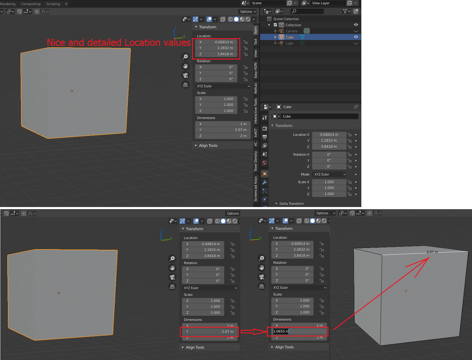
So, maybe, if we have a 4 or 5 numbers after the decimal point for Location, why not implement this for all units? Or add option to disable rounding values, if for some one 2.0655m is a very long value to display…
It’s very annoying for CAD modelers.
5 Likes
Hello,
I’ve noticed that the node input/output sockets aren’t aligned with the background grid of the node editor. When you’re working with a lot of Reroutes and have everything neatly snapped to the grid, these angled node connections frequently occur.
Here’s a quick comparison of un-aligned vs. aligned node in/outpus:
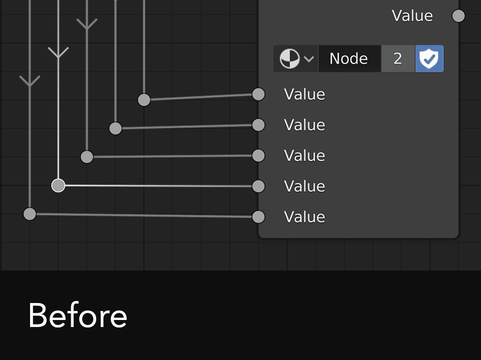
I’m certain that this small fix could improve readability and make complex shaders appear more tidy and structured.
J
26 Likes
Agree tilt should be tied to “tangent rotation” somehow. Currently the “normal” orientation does not move along with the tilt value.
What is treshold here? It goes between 0 and 1… so is that 0 - 100% length? Sadly no, because the results doesn’t match that.
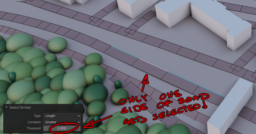
A more natural input would perhaps also be a unit treshold, that accepts cm, mm or meters.
3 Likes
Hello Guys.
I don’t know where this should be mentioned. as a UI/UX issue or change of functionality or a complete loss of it.
In 2.7 there was some settings for the 3d gizmos where i can change their size to be larger but their handles remain small for the scale and translate but in 2.8 the handles become too big.
Here is a video for what i mean.
I would like if this functionality is brought back but with some usability improvements and that’s by adding two operators that do the proper resizing in the viewport without us having to adjust the handles size manually, then you can remove the preference option.
Thank you.
2 Likes
The timeline “show seconds” option is messed up in certain zoom levels:
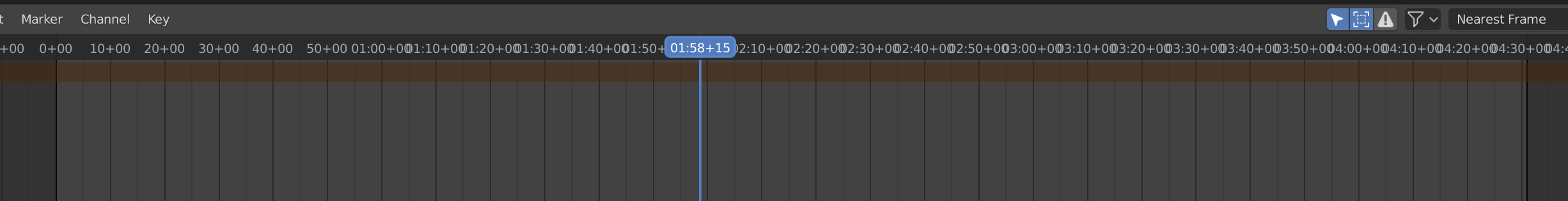
It’s really annoying since I often need to work in seconds.
If I got to decide, I’d drop the “+00” extensions altogether and have more space for even seconds. Maybe add the frame numbers if the individual seconds are so far apart that there’s space for them? It doesn’t make sense to show the frame numbers when there’s not even space for every individual second.
edit: the blue current frame indicator is fine as it is, I was referring to the rest of the top bar.
2 Likes
6 posts were split to a new topic: Emissive materials are black instead of white in the diffuse light render pas
The Ctrl+F* is sometimes reserved by Linux for switching workspaces. The common sense tells me that if user have multiple objects selected and presses F2 this should open batch rename util.
1 Like
Some feedback regarding the Sculpt Mode UI…
The downside to all the fabulous Sculpt Mode additions is the awkwardly cluttered UI. Heaps of tiny checkboxes and nested rollouts you have to open for much-used tools like Topology Auto-Masking and Projected Falloff. And such functions seem to be hacky, or hardwired to each brush, because they can’t be added to a Quick Favorites or Pie Menu Editor menu.
As lots of tools and brushes have clearly been inspired by ZBrush, I’d suggest also taking a look at the easy shortcuts ZBrush offers for rapid masking, slicing and polygroup / face set management. Also, essential functions like brush size, brush strength and brush hardness should be as easy as RMB / pen button + gestures.
3 Likes
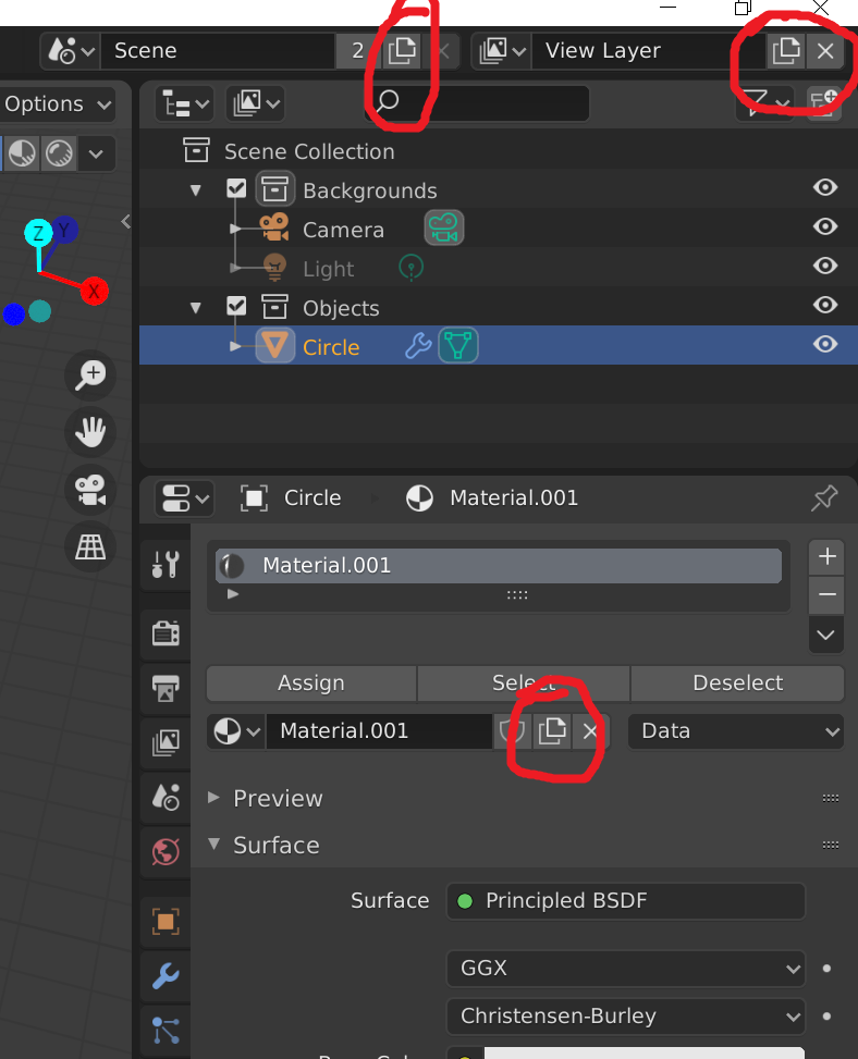
I think the icon used for ‘new’ in Blender looks far too much like commonly and widely accepted ‘copy’ icons. The ‘new’ icon should probably be something with a plus sign.
“New” icon in Blender
“Copy” icon used pretty much everywhere
10 Likes
Yes, that 0.25 multiplier thrown in there seems like a bug. Of course they can’t fix it now without breaking every hair system out there. Hopefully the new hair object type fixes the units, especially the ones that make no sense whatsoever like the physics timing controlling hair size.
The icon for ‘new’ in Blender is a plus sign. This is the Duplicate icon.
2 Likes
2 Likes
Well all of the tooltips say New. But New in Blender is a crapshoot on new or a copy or whatever. For example, you can’t make a new default material from the view I just posted. It’ll copy, but the tooltip says New. If you hit the x to unlink the material it’ll let you create a new default material but the tooltip is exactly the same as when you copy. The scene ‘new’ button will bring up a menu for new, copy settings, linked copy, or full copy. I think the view layer will copy, again with a tooltip that says New. It’s an absolute mess and you never really know what you’re getting when you click that button. So I guess it’s not really just the icon but the interface has icons that do completely different things all over the place. I guess I can investigate more and document every time that stupid icon shows up.
2 Likes