whooop … i like that, looks sexy!
the grey visibility icons could use more brightness though because right now the look disabled.
it looks nice, but when you have a ton of objects in your scene, having the stripes does help you look at what’s enabled/disabled without having to hover over the object.
4 Likes
I believe the Outliner alternating rows are hardcoded. It could be themable, so you could set the strength and color value in the theme.
3 Likes
I don’t know the correct word, but in the UV editor I see two options for stitching vertices together, but no option for pulling them apart:
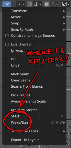
I have unrwapped an island and aligned it. Now I want to separate it into two islands without unwrapping again (because that would ruin my previous align work). I don’t even know if it is possible?
It’s there… redownload…
Anti-aliasing settings are now hidden under a tab AND a drop down setting in the latest 2.8 build:
WTF!?
There’s 2000 papercuts in this thread. Why did the developers have to go and create a new one?
Follow up papercut:
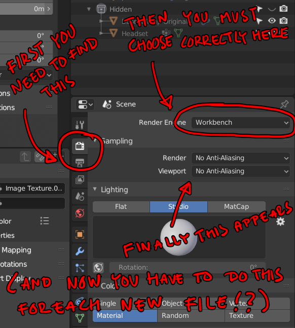
When switching to “solid” display mode, the “render engine” doesn’t automatically switch to “workbench” in the “render” tab to reflect what actually happened.
It’s not meant to work that way. You can be en Solid view even if the renderer is set to Cycles. That’s by design.
Otherwise you would have to be in Cycles Rendered view to tweak the Cycles render settings.
But when I switch to workbench, the lookdev icon disappears from the viewport, so to me, it does seem that you have to be in that render view to tweak those settings.
Either way, it’s a complete mess right now.
1 Like
Viewport AA parameters must be in the shading panel. Because that antialiasing not only affect to render shading when using workbench. It affects to solid view when you use eevee or cycles.
Or duplicate options in boths sites, or separate both AA parameters
And this parameters must be named (overlays multisampling)
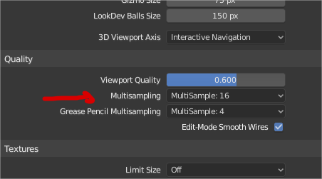
and maybe viewport multisampling must be here
1 Like
I think in this case the paper cut is that know people don’t know about Workbench engine since in any other software it is appear to be just a Viewport (2.79 have it this way too).
So, right now it is not obvious that Viewport and Workbench is the same, because it also changes the render engine for camera.
1 Like
While using Cycles engine, the lookdev mode has ugly shadows. Switching to eevee and enabling contact shadows for each light solves this issue. But then when you switch back to cycles you don’t have those shadow setting anymore.
1 Like
In Texture Paint the Fill tool has default settings of strength 0.5 with pressure sensitivity turned on. So rather than filling it does semi-transparent glazes. Probably should be default strength 1 with pressure sensitivity off.
Edit: also maybe unified color.
1 Like
Edit: Aaaaand Harley to the rescue.
New one.
Undo / Redo entries in Edit should be grayed out if there are no more steps to undo/redo.
Right now you can click Edit > Undo/Redo until end times.
What it looks like now
What it should look like
17 Likes
honestly I don’t know how to consider this, if it’s a mistake or a wanted thing.
Used to blender 2.79 way, it makes me a little confused …
I noticed that now I can clone the individual chisels and make different versions … for each category …
but the fact of having this empty box at the moment makes me perplexed …
it’s probably not even a paper cut … but I’m too confused how to consider it
perhaps it would be better to access this box-list, just in case you clone the brushes … if there is only one brush, it makes no sense for an empty list to appear when you click on the image …
and the space should be dynamic, which widens as the number of brushes increases, increasing …
3 Likes
I noticed the theme settings for the axis colors are only used in the navigate gizmo in the 3dview.
I couldn´t find any settings for the axis colors in the Graph Editor. So I was wondering if those two should be linked but then I noticed that the Dope Sheet and the Timeline do not even show the axis colors and also look a lot cleaner because of that.
Now I am not a fulltime animator but I would go with the cleaner look and just remove the axis color display.
This thing:
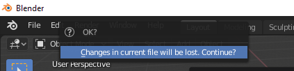
is super annoying. Can we PLEASE make it into a standard center-of-the-window modal confirmation dialog, basically a variant of the exiting with changes one?
I want to start a new document so I reach up into the corner where the File menu is, select New -> General, and then I want to move the mouse back towards the middle of the screen, and the extra-subtle at-mouse “OK?” dialog vanishes as soon as the mouse moves away and now I’m sitting there wondering why the “New” operation is taking so long.
And speaking of dialogs, are we still going to get the new Windows exit-with-changes dialog for 2.80? I had the volume turned way up again.
9 Likes
Yes, please…
There’s a task for it here: https://developer.blender.org/D4829
It’s not a UI design issue but a technical issue that makes it a bit tricky in Blender
2 Likes
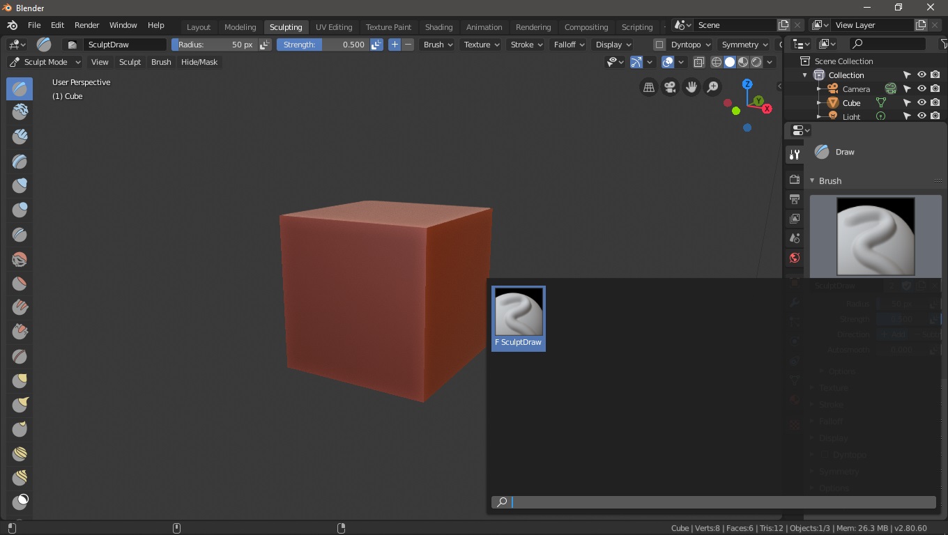
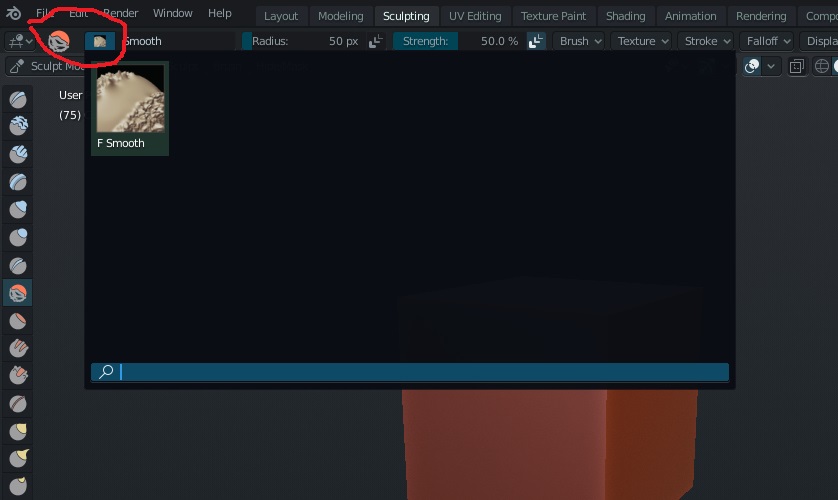
in the top panel of the brush-sculpt having two icons that represent the same brush seems a bit superfluous to me, why not unify the two?
at the click of the icon the list of brushes appears …
(same thing as I’ve already pointed out in the other comment here too, an empty compartment doesn’t make sense when there’s only one brush)
edit:
maybe you are aware of these inconsistencies, ergo the brush gui should be evolved … well in this case take these paper cuts as a reminder 
2 Likes