Text labels use some kind of backdrop or shadow, which dramatically improoves the local contrast. It would be fantastic to get something similar for icons, since now they look dull and flat next to the text.
No shadow:
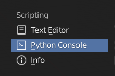
Shadow:
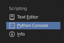
Text labels use some kind of backdrop or shadow, which dramatically improoves the local contrast. It would be fantastic to get something similar for icons, since now they look dull and flat next to the text.
No shadow:

Shadow:

This shadow on light themes would make a world of difference!
One thing that would extremely improve my workflow: When Circle selecting (C to activate) > Make “Double C Click” to deactivate. “Right Click” to deactivate when using a tablet makes me lose a valuable pen shortcut just for this… 
Video demostration:
My little patch for this paper cut:
Is this:
https://www.diffchecker.com/SonqG20h
in line 1139
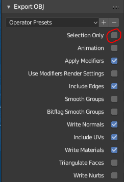
Almost every time we export OBJ (or any other external format for that matter) we accidentally forget about the “selected only” checkbox and have to wait for Blender to finish a whole city or a crowd, or we just crash it on purpose.
Why not have that checked by default?
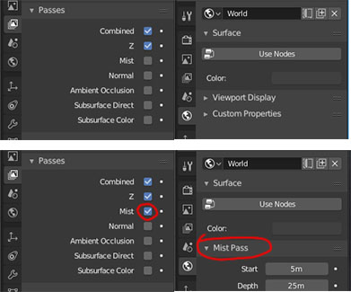
Mist Pass options in the ‘World’ tab are hidden when the checkbox of Mist is not checked in the ‘Render layers’ tab.
It took me a while to understand why I can’t find those Mist options and that they are connected to a checkbox from a completely different tab.
It’s a confusing behavior that something is completely vanishing from the UI with no context.
And, of course, not every time I need to change something in those options I need to render the pass itself.
I suggest to just leave it by regardless of the checkbox.
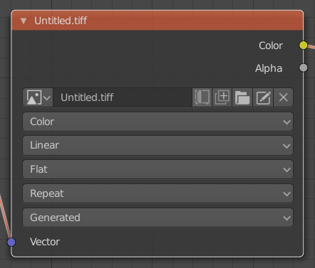
I think this is something that should be easy to add and very handy as you currently need to switch to image view, find the image you want to edit and open the image menu to find the “Edit Externally” option. It would save lots of time and it will be much more intuitive. Check the new icon added to the texture node.
Nice one! but… I think the placing is really bad: it breaks the relationship between object and collection which i find confusing, being that a “content” context.
Wouldn’t it make more sense to put it in the upper row next to user persp/ortho? At least that is a “view” context.
@lsscpp
I can try to put it in the status bar too, but I won’t write more code without knowing if the official developers finally like the idea. In any case, I personally think that it doesn’t look bad next to the collections either, but that’s a matter of taste. Yeah, next to the name of the view can look good too. Would also be very easy to put to the right of the whole after the name of the selected object.
I think it’s pretty useful to know which engine you’re configuring at any given time without having to go to the render properties just to look at that. Also for when you are watching a video tutorial at a glance you know in which engine they are explaining the tutorial without having to search where they explicitly specify it, assuming that the creator indicates in the tutorial.
The presets in the properties editor (light paths, dimensions, etc) feel unresponsive. Unless you are paying atention to the parameters they afect (which demands the relevant panel to be open), you get no indication that your action of selecting a preset actually had an effect. I think there should be some highlighting animation or something. (Ideally the preset name should stay in the subpanel title, changing to “Custom” if you alter any parameter, but I guess that falls out of “UI paper cuts” scope).
I found that in edit mode, the Overlay popover is longer than my screen, and the “scroll” behaves like in a menu, but I think it would be easier to have a more classic scroll ?
I do not know if it has been posted, one of that “simple” things that bother me the most is not to be able to add several clips or a image strip with drag and drop from the file browser editor and having to add image strips or several videos from the sequencer editor with “shift A”
While this might be good sometimes, I think an option to turn it off should be available as well, maybe an overlay checkbox.
I personally don’t want/need to see the name of the render engine in my viewport all the time.
@Luis.Burdallo this looks beyond ui paper cuts 
@ThinkingPolygons
Here are a couple of reasons why we might be interested in having that information visually:
I understand your interest in this information visible all the time, but that’s not true for me.
I’m coming from other 3d apps and I never needed such information all the time. That’s why I’m asking for an option to turn it off for those who don’t need it.
The overlay panel could have a section for head-up display (HUD) where we could turn on/off this type of info.
Maybe those panels should be rearranged from most used to “fancy”? It’s kinda weird to have bloom/depth of field on top of of stuff like SSR/SSS. 
 Well maybe. I suppose turning a drop menu option into a socket is not as simple as it seems visually, I know. I will remove it tomorrow just to make sure they see it and in case any of them reply about it.