mis-clicks become a whole lot larger of a problem.
Imprecise. the larger the value difference between min and max, the less less likely you are to hit the value you’re after. And if it requires tweaking after clicking (by dragging), you mayaswell have click+dragged.
Imprecise again. If the dragging behaviour only uses the space of the slider, then now you have no way of setting values without bouncing over and under the value you want (worse the higher the mouse sensitivity is, or the smaller the panel is).
not all value sliders have bounded ends, being able to adjust whist above or below the bounds would be a pain in the ass.
It’ll change the value to some arbitrary mouse position if you try and click+drag over multiple fields to edit them in sync.
It’s inconsistent with the other value field types.
The current click-to-edit, drag for fast edit, shift+drag for slow edit handles all situations quickly and effectively. It’s also consistent with all of the other value field types.
man, you’re just trying to force yourself to find faults that are actually distortions of evidence that this change has 100% advantages …to say:
“I do not want to change my mind, I’m lazy to unlearn and relearn”
I’m not lazy, I would have nothing to unlearn or relearn, because I use those types of sliders in other programs all the time. I’m using some right now.
And they suck.
If I’m changing a value, I either know the value I want, or I’m looking at feedback from the program to find the value I want.
In the first instance, with these kinds of sliders, you never land on the value you want, meaning you have to drag around anyway.
Even then, when you reach near the number you want, most of the time the increment it’s ticking up and down by will leave it at something like 50.21 or so when you’re trying to get 50 (assuming all the factors even get it that close, like the mouse sensitivity, or your ability to move the mouse by a tiny fraction, whilst holding a mouse button down, I might add!).
But then you go to enter in a numerical value and find it’s a pain in the ass to change the value numerically anyway, because you have to double click - meaning the program is going to change the value, causing a possibly time intensive update, before even letting you change the value to the actual value you want. Or maybe you’re lucky and the program left a 3 pixel wide space where the ‘I’ cursor pops up and you can single click to edit the number, assuming you don’t miss it.
The only other use for these sliders is moving along them during realtime updates to watch the feedback and find the right value. Which the click+drag functionality is perfect for already. Or, trying to get ballpark values for something when you don’t have immediate feedback because things are laggy or something else delays the feedback like rendering. In this last instance, it’s slightly faster, but that’s one out of three use cases for the slider, and a use case where things are assumed to not be happening fast (you’ll be waiting for feedback) anyway.
at present … you never used shift + drag
or ctrl + drag to set more precise parameters?
it would be the same identical thing for the other method …
trust me…
the current method is slow which makes me sleep …
and I’ve been using blender for 20 years
and I recognize that it is slow,
It is a fact that anyone can check in 2 minutes.
I absolutely love this thread. Papercuts really are deadly in large number, with enough of them you can bleed to death. This thread is full of so many great little things that could be improved in Blender (some of which have already been fixed which is great). Little changes like these make a huge difference in total.
All menus open either towards the top or bottom depending on the available room (which explains that this particular dropdown changed recently because 3DView header was moved to top by default), and their items are ordered from “start to end”, ie from button to wherever the dropdown is expanded, in this case towards the bottom. I’m personally not a fan of arranging things this way, as I tend to remember direction over ordination (pie menus!), and I would prefer dropdown items be fixed, whether or not they open towards the top or bottom.
not sure whether this is a papercut a pure bug but here’s the issue:
when an object is linked to only one collection, unlinking it from its collection using the properties panel makes it become orphan data, which make it disappear from the scene and the outliner and remain unusable. wouldn’t it make more sense to link it to the default scene collection?
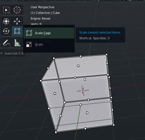
When you work on nodes and you scale out its very difficult to grab the input/output points.
In fusion 9 they make it that the scale of the node points are scale with the view scale.
I miss also that the grab radius is greater than the point icon. (red radius in the pic)
Shouldn’t duplicating a collection make copies of everything inside the collection, instead of linking the already existing objects to the new collection?
I just saw Pablo’s video Blender Today, and showed that now we can disable the animation framing when we enter the local view, and that is a very convenient option for the workflow.
But what I think, is that keeping this option too hidden between the keymaps by looking for the “local view” shortcut and detach “frame selected” to disable it, is wrong.
I think it should be an option in the preferences under the “navigation” preferences, because it is a very important option.
I came to the conclusion that it is not a good solution to hide more active tools under a button, after months and months of testing of blender, I am only now discovering by chance, the existence of this interesting and useful tool …
I could not have easily imagined that there was an active secondary tool for scaling objects…
we need a solution to make the “secondary” tools more accessible