View Layers selector opens under scene block:
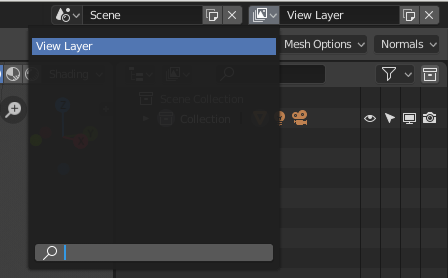
View Layers selector opens under scene block:
3D View -> Object -> Cursor to World Origin… pie menus are shortcuts to things in other places (most of the time). So find it in the menu, then set shortcuts from there. But true, if you only know it in the pie menu, it doesn’t help much to not be able to right click it right there.
Frequently when i’m navigating around in the 3d view, i will click in the transparent area of the N-panel by mistake and resize it, or increase the UI scale. This also happens with the transparent area of the T-panel, but much less frequently (this is obvious, given its much narrower size).
This is bugging the hell out of me. It’s reaching the point where i just never open the N-panel in my main 3d view, and instead keep it open in a smaller viewport where the transparent bottom section is never visible.
Seems to me this is an obvious remnant of 2.79 and is needlessly confusing. Why can’t T and N panels be like the other popovers in 2.8?
Anyone new to 2.8 will have absolutely no idea why on earth there’s a massive transparent unclickable area under the N-panel buttons.
The reason this setting here should come disabled by default:
![]()
This just makes the viewport seems broken for no reason.
OMG. Where do i find that setting?
Edit: Found it! Prefs>System>General
Completely agree!
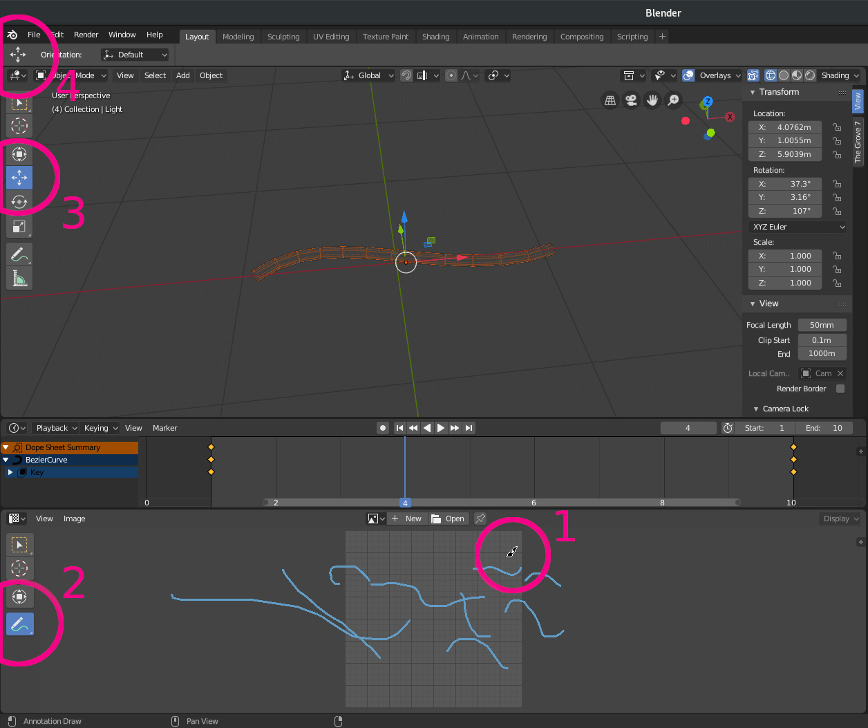
When I’m using a tool into an area (n°1, ex Annotate in Uv editor) I can see the left toolbar in the same area showing the correct tool (n° 2).
In the 3d view another tool is selected and properly displayed in the left toolbar (n°3 ex Grab tool, not Move as the popup… ).
But the upper toolbar (n°4) is not reflecting my current mouse position and tool:
the toolbar should update as I change the mouse from area to area, showing the effective tool I’m using.
+18 bump!
This is being discussed here
https://devtalk.blender.org/t/global-topbar-conflicts-with-multiple-editors-layout/
If it changed based on what view your mouse was in, it’d switch back to the 3d-view tool as you moved the cursor up to the topbar.
TL;DR
“Specular” brings confustion to users and they think its specular and not metalness workflow and they plug there specular maps. It should be renamed to Specular Level or Reflectance.
Specular only is good, that’s how it’s called in the official version.
Why do I have to lose the viewport view position if I just want to center the cursor with shift + c? wouldn’t it be better not to touch the view center with shift + c? if you want to center the view it could be shift + alt + c. Otherwise, if the purpose of shift + c is to center the view, then you should not center the cursor since we have shift + s.
This!
And also in the local view.
This might have been the same in 2.7 but:
Local View doesn’t seem to work on a selection in Edit Mode.
(It just zooms out on the entire object, rather than the polys/verts/edges you selected.)
![]()
I don’t understand why the island selection icons have to disappear just because I want to see which bloody island I’ve selected in the UV View and the 3D View at the same time! 
If the sync view is selected, I can just as well use the vertex/edge/face icons in the 3D view right?
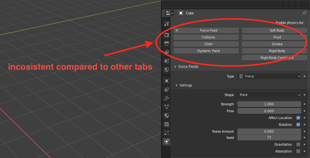
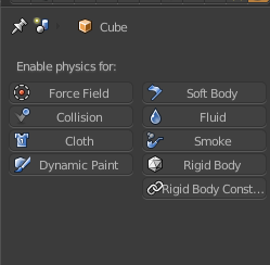
I’m not sure if this is considered a ui paper cut, but panels under the physics tab do not follow a common properties editor ui pattern, to activate a feature we use buttons
which are neither radio button nor dropdown with checkbox like used in render tab
It’s a known bug/glitch.
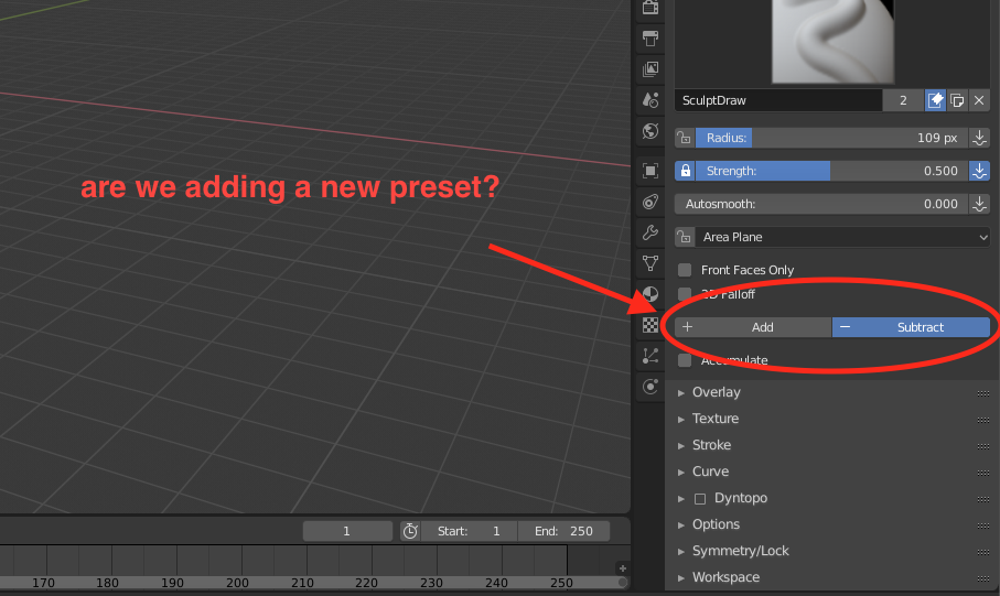
some ui elements could be replaced with more appropriate ones, examples are to find under sculpt mode active tool settings
both of these options would better be suited to be elements of a select field instead of radio buttons with icons (which could confuse even more)
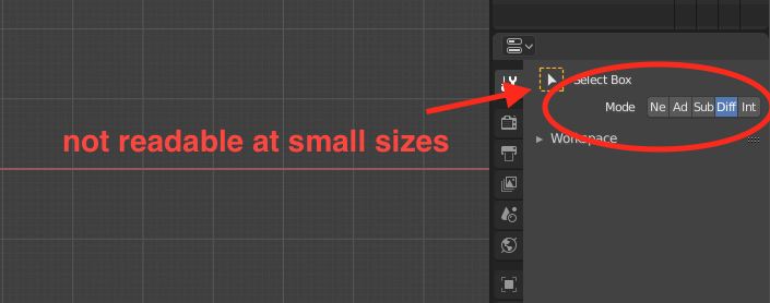
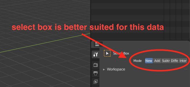
another example is again under active tool, but this time it is a select box tool (which is present in multiple editors)
one possible solution would be to implement it as a select field
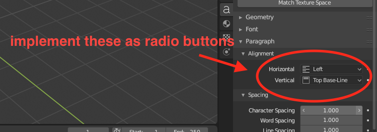
on the other hand there are select fields which are better suited to be implemented as radio buttons, here is one example
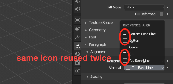
vertical and horizontal alignment icons self explanatory, these are familiar to users of any graphics editing software, and since they don’t take up much space they can be aligned in one row. the only thing that could be changed are the icons in order to distinguish top/bottom and top-/bottom base-line vertical alignment.
the things I’ve listed don’t really prevent us from using some features, but make ui more usable IMHO
thank you, I didn’t know that
Wrong! There are should be icons like old one.
I suppose you are newcome to blender. So how you can have paper cuts if you are not using blender to much.
There is not UI Feedback topic.
it’s not that I like one over the other, it’s just to make ui more consistent