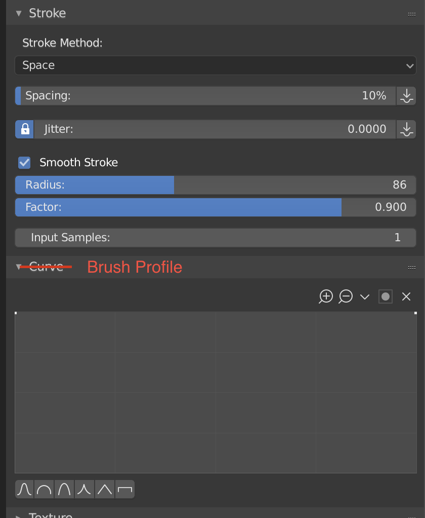
I’m always becomes slightly confused when I need to open up the curve setting for brushes… I think it should have a more describing name like “Brush Profile” so that it becomes clearer what it’s for.
In regards to moving objects to collections:
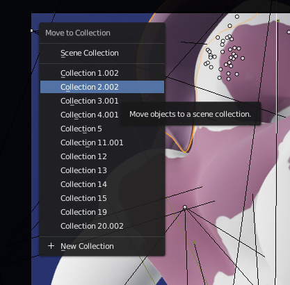
As it is now, when pressing M to move an object or selection to a collection it just gives you a plain list of all collections:
I think it’d be helpful if an indicator were next to each collection in the list displaying it’s visibility status; whether it’s visible in display, render, etc (similar to the visibility buttons/icons in the outliner).
Sometimes when moving things I just want to add it to a invisible collection or vice versa for quickly setting up the scene for a render, considering that the old view layers system in 2.7 did exactly this I think it’s a given that some of that functionality is brought in to collections.
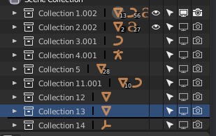
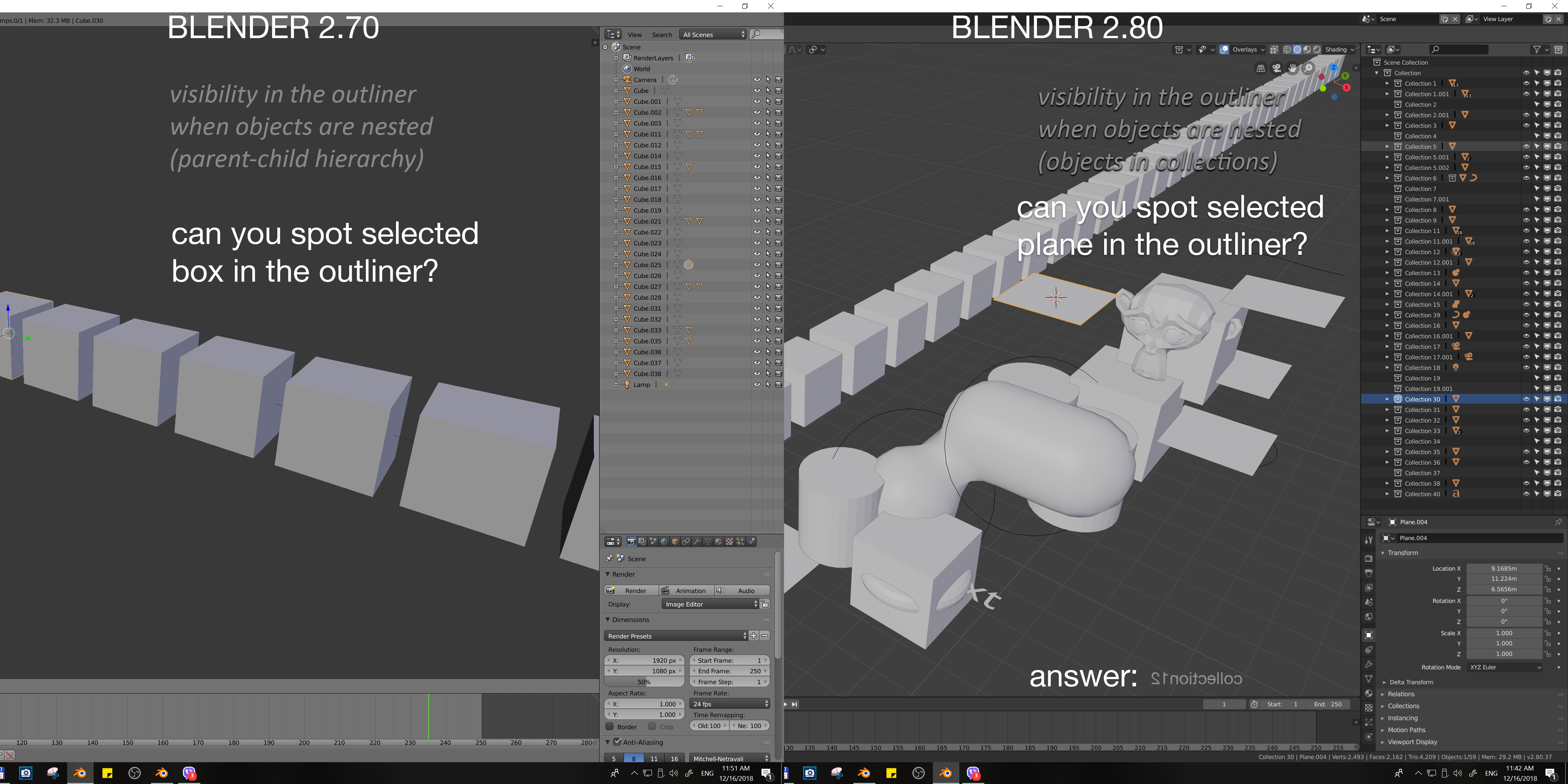
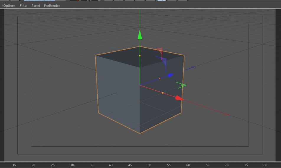
Lets talk about RELATIONSHIP LINES, they’re heavy to draw, super obstrusive, and really you cant tell hierarchy from them, It’d be better if the children objects would get an outline (like the selection one) but with a secondary color that lets the user know that is a child object.
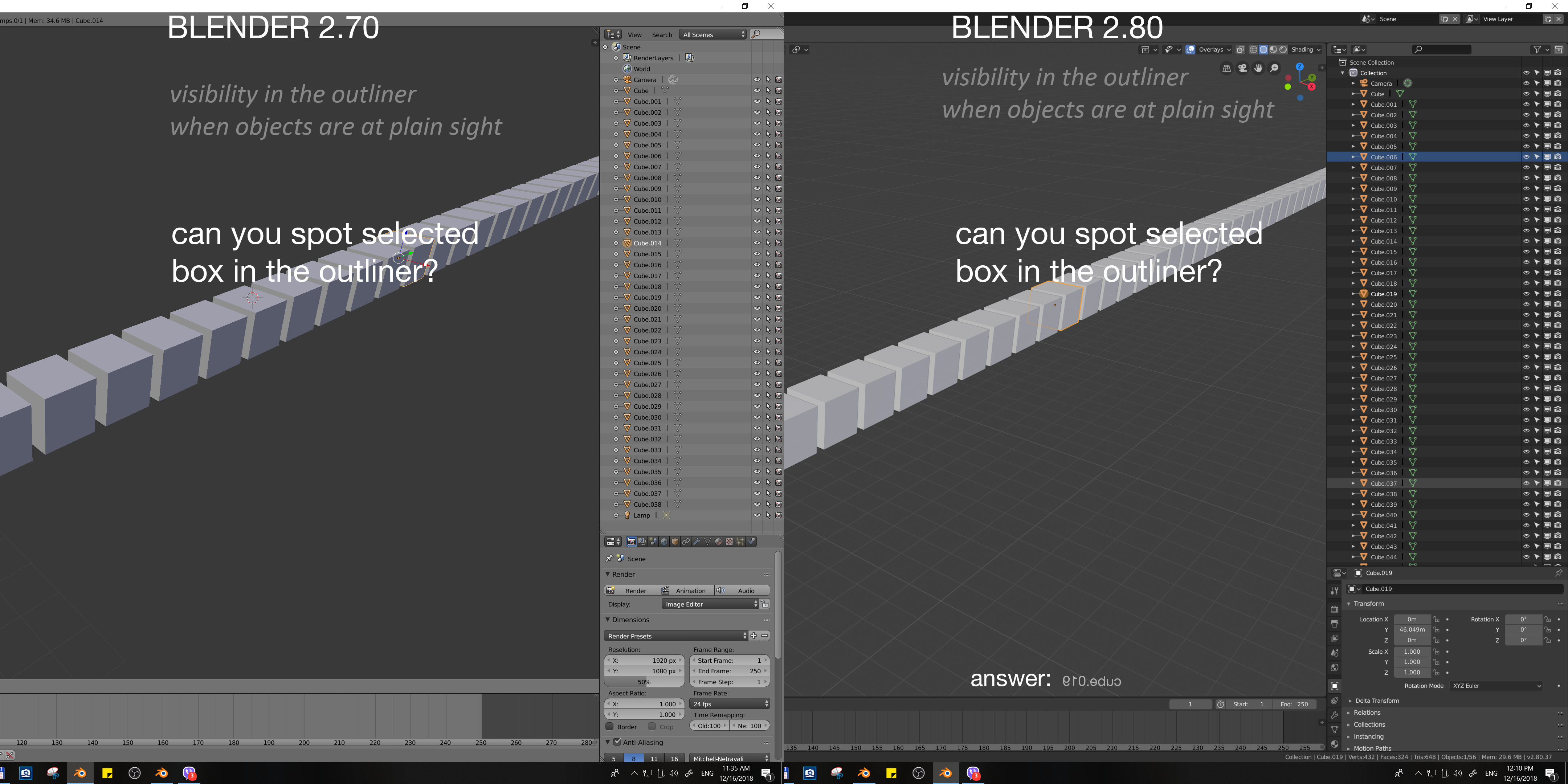
I love the new outliner and Collections. Now it is much more important part of the workflow, and after using 2.80 in a first project, I noticed something which classify as papercut “A small, isolated UI problem that makes using Blender annoying”. Here is a little quiz, I think my point will be clear. Directions: Try to find selected object from the scene in the outliner, preferably in a single glance
I hope that we can all agree that readability of selected objects from the scene in the outliner is difficult and after short time using it, produces strain in the eyes. I don’t know how much customization can be achieved with the custom themes, but I think that default theme should clearly highlight selected objects. It is true that outliner got some improvements in the selection within it (blue srip) and needs just a little bit of work to be perfect!
edit: this might seem quite out of context, it is in response to some early comment on the undo history.
i would like to see some changes in the undo system, one thing would be to make the undo history per object (or whatever fits the context) and having a visual slider (yeah its inspired from a well known software).
There is more places like that and I definitely vote for your proposal, but make it as general behaviour in blender probably wouldn’t be so easy. What if popup window consists from more than one field? Make it work only for windows with one field or define what field become ready to type? And so on …
Why we still have “Lift, Gamma, Gain” as the default in Color Balance Node?
In Blender 2.8, The Filmic is the default for the color management system. According to Filmic-Blender Website, It is recommended to use “ASC CDL” for color grading in the compositor’s Color Balance node. And not to use the “Lift, Gamma, Gain” option.
Why we still have “Lift, Gamma, Gain” as the default instead of “ASC CDL”?
Add the option to connect the shortcuts with the active tools and workspaces.
There is an inconsistency between the interface and the keyboard shortcuts. If I use a shortcut g, I should go to the move active tool, etc. If I use tab I should go to Modeling. At least this should put it as optional to this type of interaction, which is what all software is used. Blender should give priority to workspaces and active tools. @pablovazquez@billrey
I put these in the task about changing 2.8 defaults but they might be more suitable here.
Some things I’ve noticed that probably fall into this category of fixups:
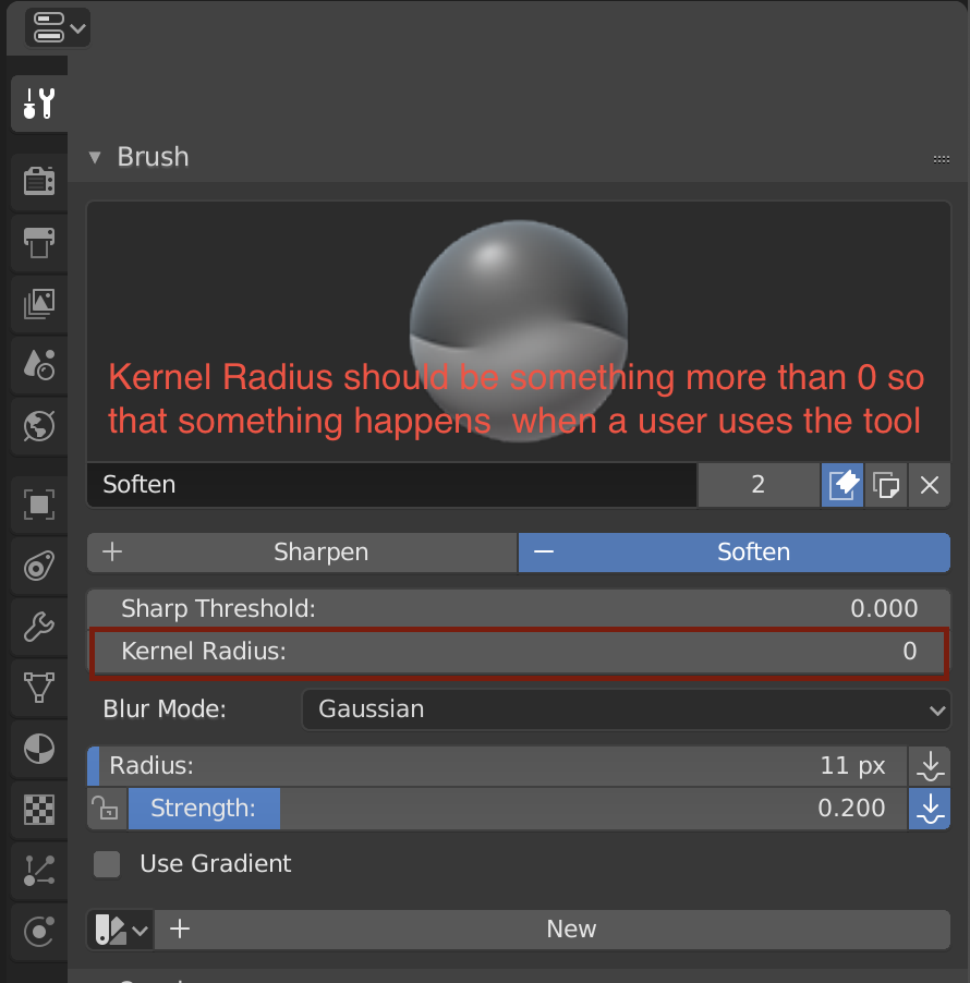
Presets Render Properties -> Cycles -> Light Paths : The values filled in by default are not part of any preset. This means that if you start switching between the included presets, you won’t be able to go back to the default values unless you remember all of them. There should probably be a new preset added which corresponds to these values Render Properties -> Cycles -> Sampling : The presets do not take into consideration the “Square samples” option. This means that you can select “Preview” or “Final” but the Squared Samples toggle remains set to whatever was there previously. This could be somewhat surprising. Additionally, I believe the presets that exist currently are only for the “Path tracing” integrator, not the Branched path tracer option; new presets are needed perhaps.
Presets in general : Would it be possible to include a “(default)” text next to any preset which is the default. For instance, the Cycles -> Dimensions defaults actually correspond to the “HDTV 1080p” preset. It would be nice if the preset was actually called “HDTV 1080p (default)”
Modeling Edit Mode -> Delete -> Edge Loops + Face Split option : Should be OFF by default. The Face split option is already OFF for Dissolve Vertices and Dissolve Edges and it produces more expected results in typical situations