Would it be possible on 2.8 to add the wireframe only on selection?
1 Like
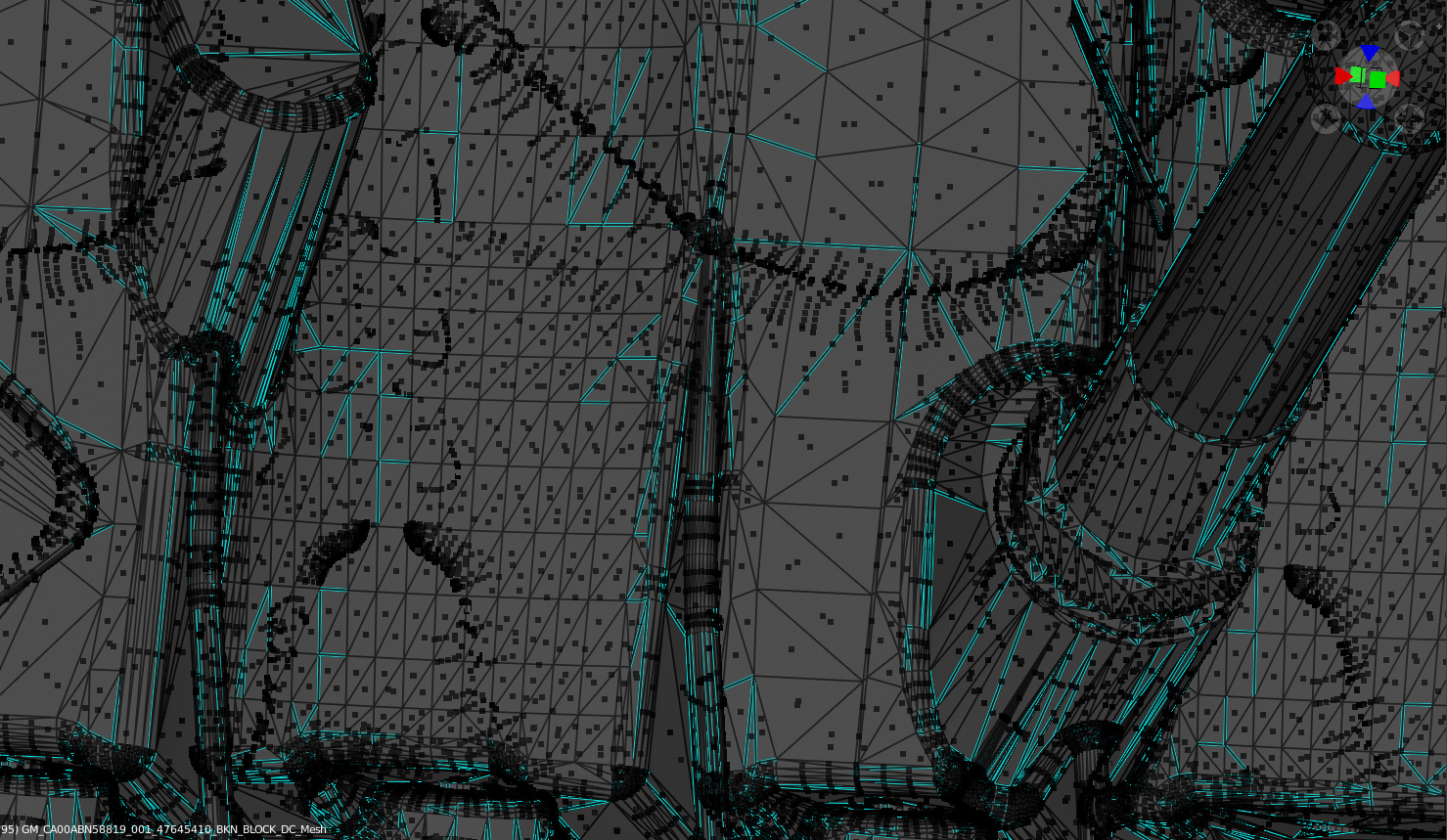
Oh and I had to double check… because it appeared to be showing more faces that it was supposed to on 2.8 so I wondered if we were seeing faces behind faces on the 2.8 screenshot, but no, somehow its glitched and you can see not the faces themselves, but you see the little squares (face indicators) of faces behind other faces even on solid shadowing.
Which contributes to the whole thing becoming even more cluttered.
1 Like
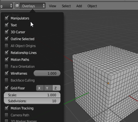
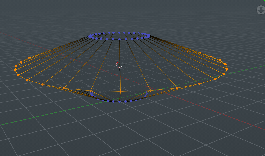
adjust the number of wires displayed maybe should be like this:
3 Likes
Don’t forget the optimal display on subsurf, very handy to understand the original mesh’s topology while showing subdivided mesh. And awesome for portfolio wireframe renders. 
1 Like
I really hope the developers implement some of the old features because i use wire frame a lot when modeling
1 Like
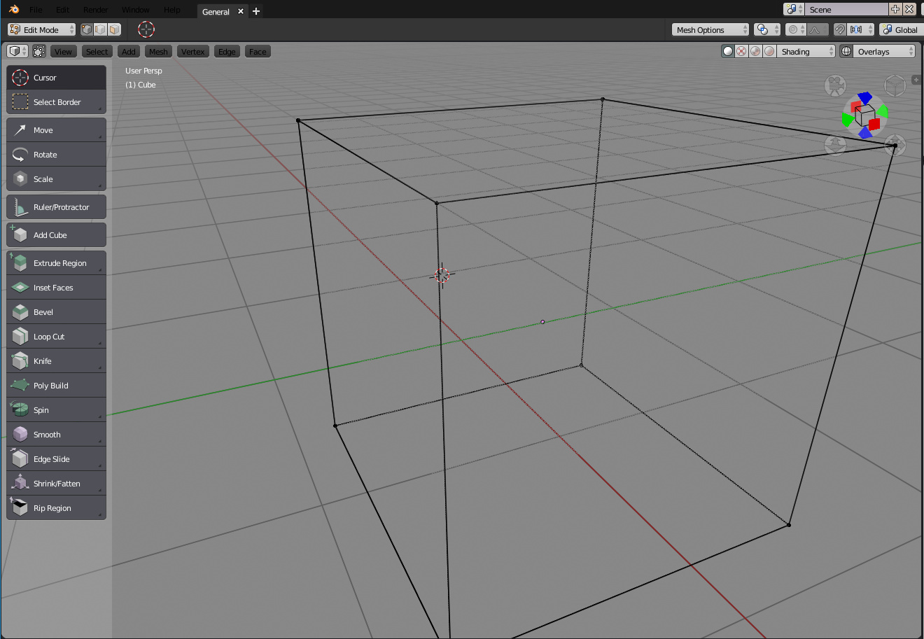
The new wireframe feature is nice in object mode but currently very strange in edit mode where it’s used mainly.
I searched in developer.blender.org for an task about that, but didn’t find something.
If I oversaw a task regarding that issue, sorry then ignore my post
In detail
- wireframes are not shown correctly in edit mode on newly generated edges, e.g. when using extrude. extruded edges are only visible in object mode, not (or only partially)
- wireframes are not drawn in just sculpted areas, need to switch to object mode and back to make’m visible
- visibilty in edit mode depends on orientation , even on symmetrical objects like the standard cube
( In each case: xray slider = 0 , wireframe slider = 1)
And now the most strange fact:
It seems to depend on the theme. And there’s only ONE theme (“blender 24X”) where wireframes are shown correctly in both object and edit mode !
I tried really all others
Look at the edge at far right corner. it disappears in edit mode, in object mode it’s visible
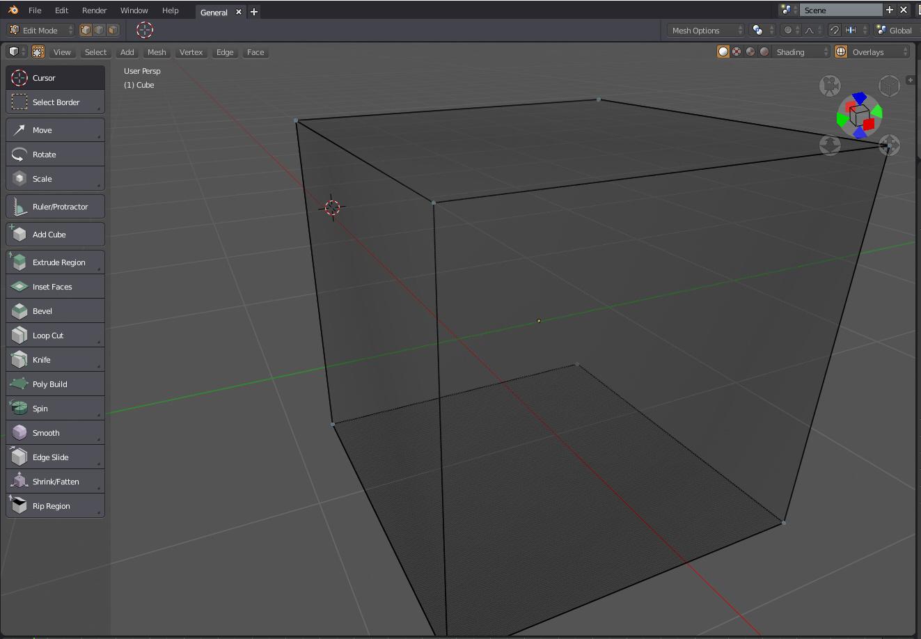
Most themes object mode
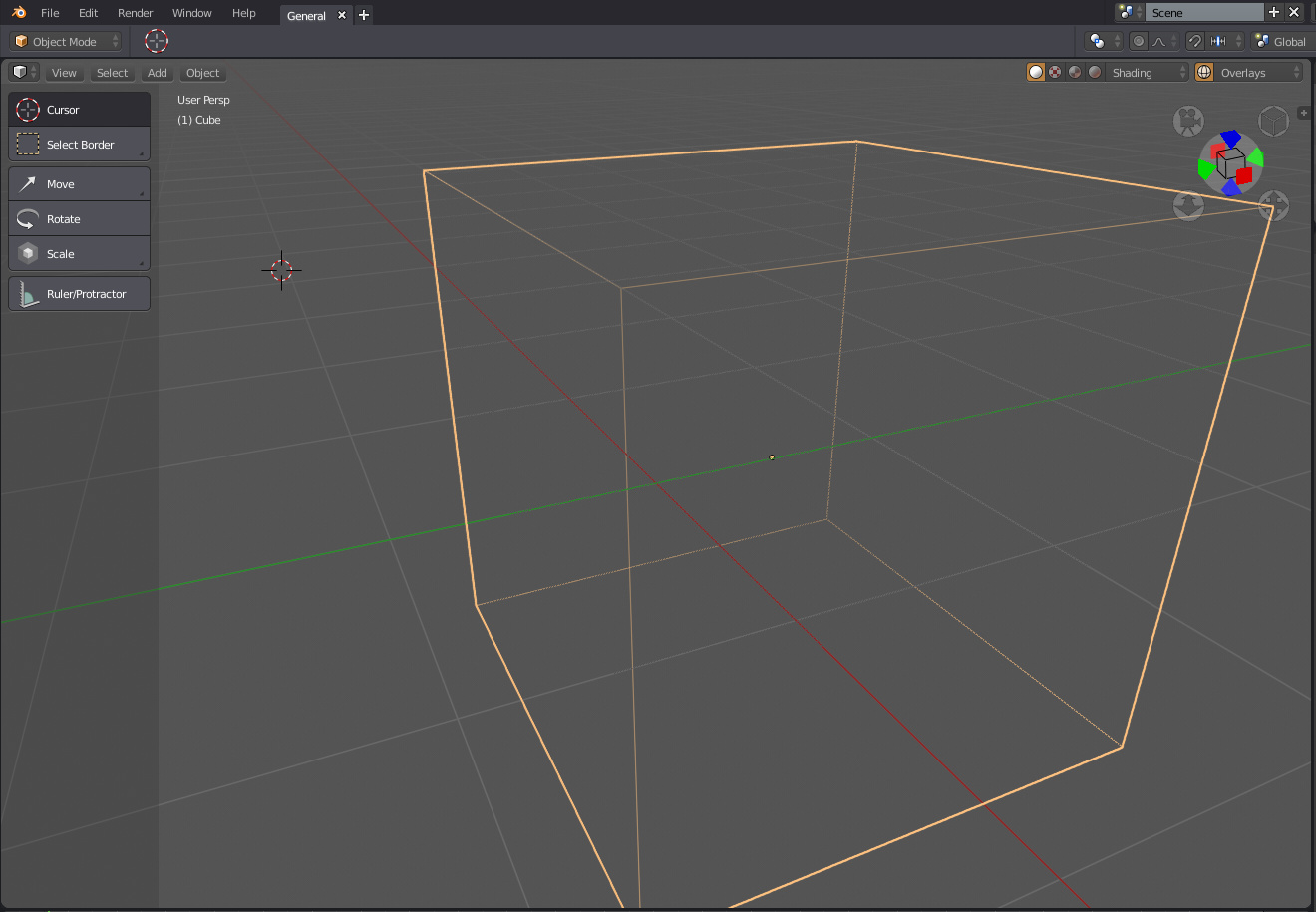
“blender 24X” theme edit mode
Another interesting effect: It depends on view angle .Most themes view from above show this:
Most themes view from below (more, but not all edges visible)

“blender 24X” theme edit mode view from above (all edges visible)
And no it’s not only on bright themes, I tried the most white one, the same issue as on dark ones
Is’nt that strange ?
…I’d really like to get a reply from someone …
1 Like
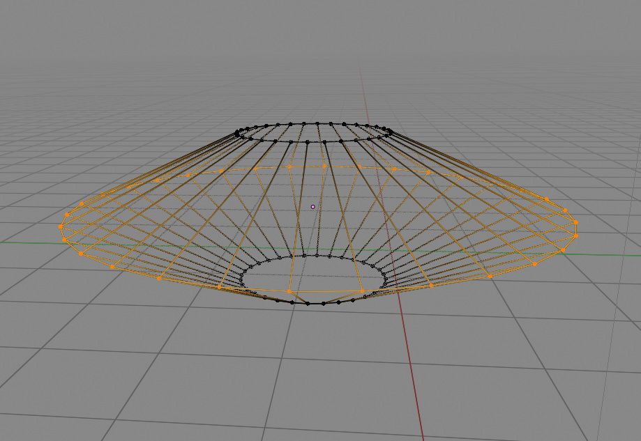
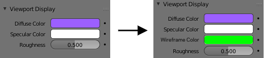
Not quite, as the wireframes stay the same color. Something more like this:
5 Likes
That could work well with the random color feature in 2.8
Good news wireframe edit mode bug is fixed now !
Guys you are great !
Maybe it’s something personal, but I find the effect of dithering on the selected faces dizzying, it doesn’t make my head ache, but it makes me uncomfortable to look.
edit: I have talked with other users and have the same problem.
5 Likes
Yes it could work nice indeed with the random color feature. There also seems like there is a nice place for the wireframe color to live: all the way on the bottom of the material properties in the viewport display tab.
Here is a quick mockup:
7 Likes
This is something we tried to give an illusion of partial coverage for the Xray mode. Since pretty much every overlay is alpha blended, we cannot do alpha blending and must resort to some dithering to let you see through the mesh.
The other (viable) options are:
- no occlusion : all overlays are 100% visible through the scene meshes. This is really not workable with huge rigs with lots of controllers (one of our use case).
- full occlusion : all overlays are display like in standard solid mode. You loose the purpose of Xray mode to be able to see through objects surface.
Remember that overlays include wireframe, edit mesh cage, empties, bones, lattices… etc.
We could try to make a special case for Xray where the Xray pass is done last or we use some compositing tricks that would slow things further and will really add complexity to the code.
That said, I arbitrarily set the maximum opacity (it depends on the Xray alpha value) of this dithering to 75%. It could be tweaked to be 100% (if Xray opacity is 0) if that’s what you desire.
It would be nice to try this 100% dithering thing when Xray is at 0. It would solve the problem for me, but I’m not so sure if it’s a viable general solution for all users. In the other hand, Can’t give the user the option of what kind of occlusion? I think it’s options that users might want (I’ve seen users requesting that full occlusion and no occlusion would be the same as the old wireframe mode, which would also be nice to see back for many users).
Well, I don’t want any particular solution. The problem is that if I have felt uncomfortable just entering wireframe mode in less than ten seconds… It’s not something viable when you work with the program all day long, and as I said it’s something that happened to two of my acquaintances when I asked them if it was the same, because I thought it might be some kind of motion sickness.
I already had some similar problem when I simply put myself in Xray to see the overlays in complex models. But, well, I considered them more exceptional display modes.
1 Like
Because when you hit the z now it’s not xray anymore?
I don’t want to differentiate objects, I know what objects I have in my scene.
The semi transparencies make it difficult for me to see the facedots and dirty the visibility in general.
This problem is further accentuated by using the flatty dark theme.
I’d appreciate if you wouldn’t treat blender users like babies. Users must learn and train themselves, the blender should not be a toy only because of the beginner users. It has to be a professional, serious and powerful tool if it is to be taken into account by other professionals.
3 Likes
and i think the developers would appreciate if you don’t treat them like babies either, they are, in fact, professionals and have much more use cases and things to consider than you are able to see from your pov. Blender 2.8 is not even in beta so everything is WIP.
4 Likes
No one doubts that the developers of blender are professionals. Are you offended by my words? Don’t you accept self-criticism? let’s be content with everything then? Even when we believe that mistakes are being made, then we must be silent.
1 Like
If we should trust the blender team at least we should know how are we benefit from such changes, honestly I dont get benefit from ANY 2.8 feature except eevee If there a 2.79 interface with eevee would be prefect.
Lets go by parts.
Eevee: Amazing.
Collections: meh who cares, we have H and Alt+H and 1234… back…
Topbar: I dont get how it helps, it only takes space.
Tabs: Meh, only takes space, looks cool though.
Switch tools: Noob assist feature. We must incentivate the use of shortcuts.
Tab pie menu: Amazing, I already wrote an addon for it in 2.79 tho.
Locked status bar on bottom: BAAD, TAKES SPACE.
Meged timeline with outliner: meh good, I dont animate tho.
3 Likes
I don’t want to mix some feedback, more or less critical, with being disrespectful to the work and professionalism of the developers.
In the same way that I am clear when I criticize some solutions of blender2.8… I am also clear about the positive things, and there are a lot of them. The developers of blender do an incredible job, already in itself, but if we consider the context of your project it is even more incredible. I don’t say it often because I don’t like to compliment anyone on a regular basis.
Even William, who has undoubtedly been the developer I have been able to annoy the most with my reviews, seems to me to have done very good things in blender2.8.
Yes, I don’t like the topbar and statusbar as they have been raised, nor do I like to remove the t-shelf. But Blender2.8 brings a lot of improvements that deserve the respect and applause of all users, even those of us who don’t use those improvements and tools. Multi-object editing, depsgraph, collections, bevel shader, future of animation nodes, eevee, cycle improvements, udim, popovers, active tools, workspaces, workbench… It really is a spectacular job from any point of view.
With this I want to make it clear that some users may be giving feedback, which can be annoying, but we do it thinking of the best for all users and bearing in mind the professionalism of the developers. That they put up with us stoically.
6 Likes
Good improvements apart, Blender has a rather annoying set of changes, which include the lack of viewport space and the loss of importance given to shortcuts by the developers. And yeah we are pretty much only annoying @billrey (William) but if he doesn’t want to receive criticisms on his proposals he should care more about all those years of tutorials and people who already learned blender in the 2.6/7x way.
Most of the UI changes are just conflicting with the blender’s philosophy. Editors are now not the main build blocks of the interface since there are UI elements that are STUCK in place. Shortcuts were changed and if were not our criticism it would likely be destroyed interface.
If developers think will attract new users that way. I have only a phrase to say:
We, experienced users, users who love blender’s fast workflow, shortcuts and clean interface that recommend blender to other people, the ones who will struggle to re learn blender are the ones who make tutorials…
I think simple solutions are usually the best. I would be glad if something like that were implemented.
Well proposed, Dimitar