You can use any theme you like for modeling/coding/rigging, but when it comes to editing materials, textures or lighting, these themes will affect the outcome negatively due to their lack of neutrality.
1 Like
Since my eyes are my eyes… But I dont think I am so different from other people tho.
If is hard to find a gray square is because the other colors are molesting you. I don’t see the utility of the test
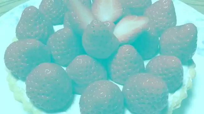
did you find the gray square? I hope so.
The utility of the test is simple: If the theme is affecting your color perception, you will likely pick the wrong square as gray.
For example:
There is no red in this image, the blue is hijacking your brain:
1 Like
You’re missing the point, if your theme is as orange as it is, you will make your artwork with a blue tint to counter that.
We’re also going a bit off-topic here, this thread is meant for giving feedback regarding Blender 2.8’s interface, not an argument about themes.
1 Like
Themes aren’t interface related?
Anyway…
Screw the topbar! we need viewport space!!!
better?
Please try and be civil while stating your opinions, it’s hard to take them seriously otherwise.
There are plans to allow users to remove the topbar, they are written down here: https://developer.blender.org/T55386
+1
because it also stains the image of people who defend similar things but want to be taken seriously. For example, I don’t like the topbar either for several reasons, but instead of asking for it to be removed I simply propose ways to implement it that don’t affect the user who doesn’t want it or the 2.79 blender interface concept.
I was just kidding, thats why you couldn’t take me seriously.
Anyway I know the topbar is going to be optional but I’m still afraid of the changes.
No solution proposed, I know there’s no way to a developer listen to a single user…
I like these themes. Nice work.
The current top toolbar has a big problem on the monitors with 34inch as myself or even 27inch.
I think the top bar needs to be customizable as in my case and other people who have bigger monitors.
Is unhealthy for your eyes to look up and also a stress after a while.
So the solution is customization, and not to be stuck with the menu on top where now is your most important tools, and to be able to put it on the bottom as well.
Blender was always customizable, but with 2.8 this change goes in the other direction…
1 Like
+1 agreed with everything.
Brecht told that maybe they do the topbar a new area. I think that all new parts of blender interface must be areas, specially topbar and statusbar.
I made a proposal about that. But they have change a few the topbar toolbar utility since then.
https://devtalk.blender.org/uploads/default/original/1X/f44610ee07e5e62ea468c4c4f705fd7ccdc1228f.jpg
@brecht?
@ideasman42?
@billrey?
@pablovazquez?
@anyone ?
Any thoughts about making topbar and status bar as independent editors? Possibly merging both.
I agree that the theme should be clear and simple. Maybe make a survey about what the default theme should be. This might mean to have a pair of default themes - light and dark.
I personally hate playing with themes. I also think that most of the time the professionally developed themes are the best.A lot of software contain a bunch of useless themes - for example who needs a pink theme with pink letters - this is bad for the human eyes. Most of the user made themes are of this quality.
BTW. I think that the Cinama4D above looks the best and is the most clean. I am not biased as I have never used that software.
Unclickable bones should be click-through
So I’ve noticed that if a bone is set in the outliner so it can’t be selected, I also can’t click through it to grab
another bone. I think this would be useful during animating in case you don’t want to hide the bones.
Thank you
1 Like
One more reason why top toolbar needs to be customizable as in a scenario where an artist wants to sculpt in a window and have something else in another window, he will be constrained to move with the mouse on top just to change the settings for his brush, so will become an unnecessary effort.
And you can’t force him to sculpt on top side because in this way the windows customization will become useless.
5 Likes
Just watched the recent video by Pablo which is awesome.
But - and I replied that there as well - in my opinion the redo panel is a step back from the amazing viewport work and the ui vision in general.
It takes a good part of the viewport, which I think (and to my understanding that’s the vision) is disrupting the workflow and can confuse the user with settings and toggles overlapping the main work area.
I mean it does contributes to discoverability, but I think the cost is too big.
One of the main issues, is that it is still displaying many irrelevant options. For example, with a simple move transform, you get the option to constrain to X, Y or Z. This is not needed, as the X, Y and Z controls are per definition constraining to axes already.
There are also options for Proportional Editing, even if you didn’t initiate the transform with it enabled. All this makes the panel about three times larger than it needs to be for simple operations such as Move, Rotate, Scale and Extrude.
On the todo list is to go ahead and remove those unnecessary options when not needed, but this requires extra work, so hasn’t been done yet.
Lastly, when an operation only has few settings, we want to use a more compact design, as described here: https://developer.blender.org/T55039