There seems to be some overlap between this thread and the paper cuts thread, so…
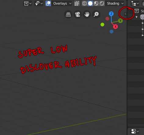
There was a huge discussion about the top bar in here earlier, and perhaps someone already mentioned it, but I couldn’t see someone pointing out this particular issue I have with it:
Also, I think this deserves its own thread, but it is really disappointing the way that add-ons now are very hidden by default. And, if you look at blenderartists discussions, some add-ons want floating dialogue windows so badly that they roll their own, which doesn’t feel very consistent.
Did you see the 404 maxon.net page? I guess it’s a attempt of pressure on unconscious. Or just a declaration of something. Something like “we see blender rollin’, we hatin’”.
not when it’s messy and inconsistent.
Like depending on scale some become 2 colums, some 3, some 1, some no matter what always stay being one.
So it makes keeping track of were stuff is very difficult, either do it right or dont do it.
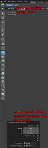
I think some places are not adapted to this layout yet, that’s why we’re not seeing them react at all. I agree that it’s inconsistent and I would like for instance, to see transform panel jump directly from one-column to three-columns without this intermediate step where only rotation tuple gets nudged to the right on its own.
the biggest problem I see with responsiveness is that everytime a feature gets coded an interface gets changed the responsiveness is going to have to be worked out, and honestly buttons jumping from place to place all the time really dont feel super useful, there was some idea that the panels could shift and become two columns, that’s much better I think because it will keep the integrity of the properties in each panel on their place but with the ability to make them after a certain size just be 2 even 3 columns, instead of just shifting theproperties inside each panel.
It’s definitely too late, but I wonder what’s up with bWidget the UI layer coded by @julianeisel, which if I remember correctly, could be layed out with CSS
When i have a large collection of objects in Outliner and if i want to move an object to different a Collection through dragging, the scrollview does not auto-scroll. So moving around objects to different collections is a real pain when we have a large number of objects and collections.