Since I’m not sure everyone here saw or will see William’s response to the question of having different topbars for different editors, I’m gonna paste it here:
We don’t normally use the bug tracker for feature requests or feedback. Anyway, here goes:
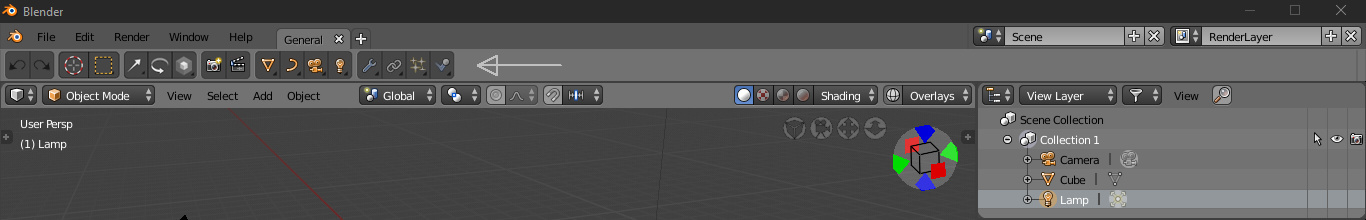
There seems to be some bugs related to switching the tools when you are using multiple editors. Currently it doesn’t always update correctly to show the correct tool properties if you switch between tools in the 3d view vs the UV Editor, for example.
As for your suggestion, we could do that, but those things are not per viewport. Also might be problems with fitting in things like the sculpting settings if it was put inside the viewport.
The top bar concept was mainly conceived of before I got on board for 2.8, but the idea was to move global things there that aren’t per viewport, such as the mode and other things like the commands adjustments (redo), which were previously inside the 3D View.
It ended up being paired back and things were removed from it, but it does serve as a consistent place to find tool settings.
I’m not really sure how the per-editor top bar would work in different scenarios, but you are of course welcome to make examples of how this would work and look and we can take a look at it.
If they have so clear that the topbar is of little use and does not work, they should remove it. Or put in only global controls or workspace dedicated tools
The top bar is so far the most difficult UI change to accept for me. It just makes little sense imho. I read that reply from @billrey before and, as good as I understand it, all my perplexities are confirmed.
ok bugs, they can eventually be sorted out, this can’t be a real motivation for UI design
If settings can’t fit in a viewport where can they fit? Toolbar and even the new properties panel dedicated tab are smaller!
So the current one is not the original design, right?
If that for some reason didn’t work, now things are even worse.
A quick example: object/edit mode is exposed only in 3dview, even if it’s global. In uv edit window you may be unable to tell if you are in edit mode if you have no face selected.
…So what is the use for a global topbar showing only local settings?
For me the worst thing about that message is what I see, that developers never look at the proposals that are made here.
Right, I have explained it in other occasions, the topbar was an idea with a poor design that was implemented and it was seen that nothing worked in it, everything was a step back. The oriignal idea was to have all redo-last settings (old F6). After much testing they have left the tool settings because there is simply nothing else that can be put there, or put there the settings of the active tool or they have to leave it empty.
There was never a functional design for the topbar, nor was it clear that it was going to do something right. What’s more, it was nothing short of being implemented, which would have saved us thousands of headaches.
I think the developers don’t want to accept that time wasted with the topbar and that it should be discarded and return to T-shelf with improvements like the ones proposed here.
And the next problem is that instead of accepting that the topbar didn’t work, it insisted on being implemented and not only that, but to eliminate the T-shelf in favor of the topbar. Which took the problem to new problems, in a giant snowball, that nobody wants to stop.
No, i know that this top bar with tool settings can be collapsed, but i didn’t know that “F6” palette is still there. Btw i also spoken somewhere in this topic about moving those tool setting into the side panel, it’s just more common place to be for those settings, pretty much most of 3d packages have tool settings inside of such side panels 3ds max with it’s Command panel, Zbrush, Cinema, Maya with history/channel editor.
As long as the toolbar was also inside the editor, in this case the 3dview, otherwise we would run into the same problems as with the fixed toolbar of today.
Why Lol? Why do you laugh so easily? (you know it’s not kind)
Of course I realize it’s a mockup, that’s pointless question.
I was noting that your mockup looks a lot like Cinema4D in a Blender way, perhaps because you have always been heavily sponsoring C4D UI
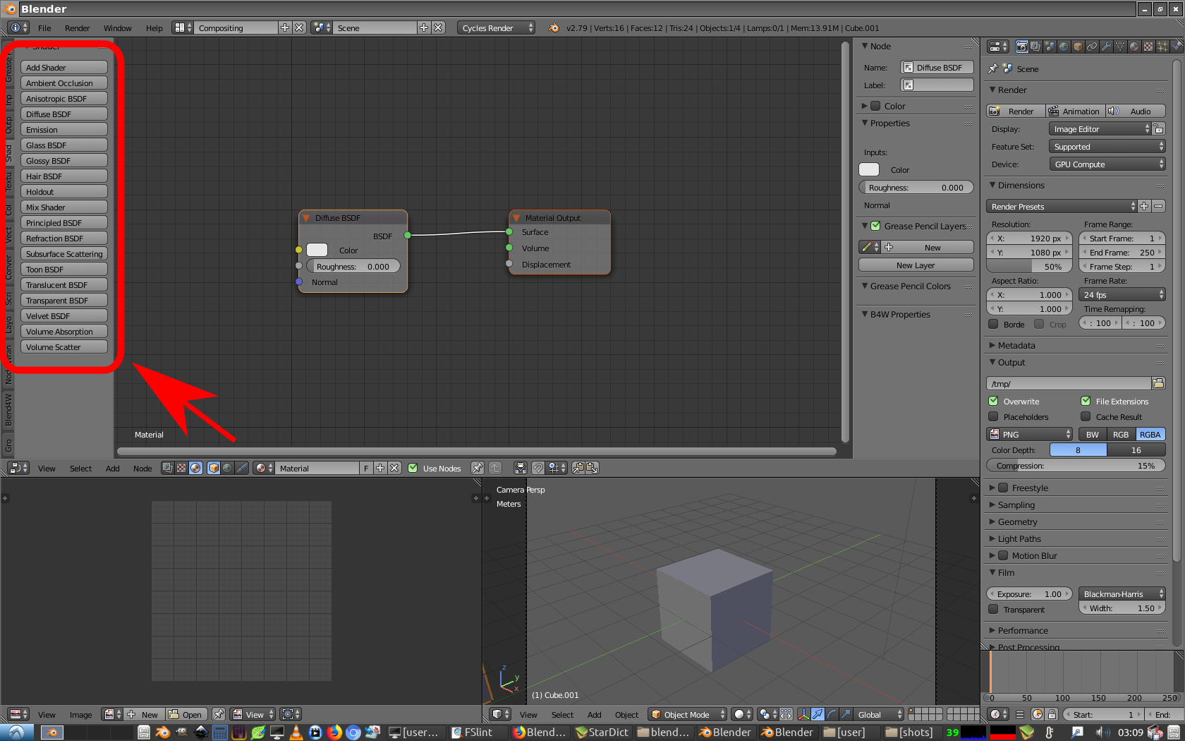
I know there is amitious goal of having somewhat shared nodes with Cycles and EEVEE.
afaik it wont be always compatibile so maybe there should be visual difference with not compatibile nodes?
afaik surface shaders and volume shaders are not interchangable excep add and lerp (maybe i’m wrong, i dont use them)
but they share green socket color, sholdn’t there be difference?
There used to be metalness shader node in EEVEE (with ao, transparency input). Why there is no more?
I know there is principled, but it don’t have eg. AO imput and do have unrelated to eevee inputs.
Wow, I was always able to make quasi Blender 2.8 GUI in Blender 2.66 and newer, in 7 clicks. I can even select items trough transparent Tool Shelf! such invention, much smoozy
Due this all I’ve got a tremendous idea. Lets leave the old GUI for the common users and move the new smoozy innovative GUI to Apple Store or something like that. As a paid addon. For the chosen only.
And what I think else is the amount of buttons in Blender 2.8 GUI is still too large. And buttons are too small. And due the worldwide smoozy trend even the current Blender 2.8 GUI needs some more functional degeneration. By degeneration I mean innovation of course.
Whee!!
So what are the plans for UV editor? Blender already had poor UV editor with some improvements in 2.79, but 2.80 basically downgraded everything back to nonexistence and since it’s beta it feels worrying…
The toolbar is just a small row of buttons in the 3D Viewport but in every 2D Editor it is an opaque block. Is this intentional? Seems like an opportunity to make the bar a little less obtrusive and consistent.

