I was wondering: now that we have a lot more space in the menu bar, could removing the OS top bar be a viable option for Blender 2.8, or is it too difficult / out of scope?
I would personally find something like this more elegant, and we would also re-gain the screen space lost with the introduction of the status bar.
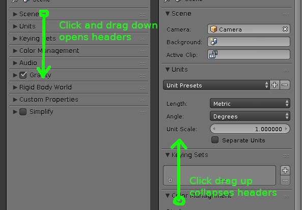
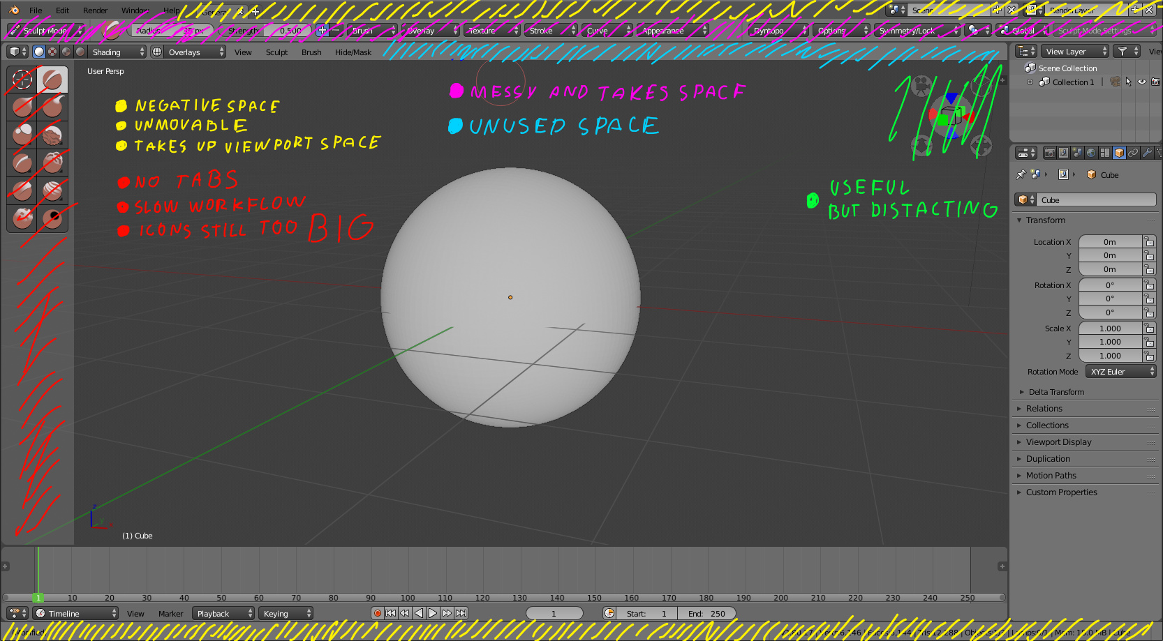
Clicking menu header holding left click and moving cursor up collapses that particular region. Similarly holding left click and moving cursor down opens headers. Check out Blender developers channel Pablo mentions that and pointed out that not many users know about that feature. I think that its way faster to have all headers closed and open with one swipe. Having grid like that defeats that feature. It also crams lot of unnecessary UI in front of you which is not really needed.
i tried the very first version with change of the controls and immediatly had to post, even if i had to create an account. now a few days later there‘s still many concerns about the new concept. i am using blender for hobby only, and it is important enough to write this, but if it was my regular daily job at the moment then i would start looking for alternatives…
i am working mainly with my laptop, so i do not have the number block. and even on the pc i don‘t like it - because these keys are to far away from everything else. beside the fact that i‘d have to mentaly switch two different keymaps.
how often do i need to switch the view - always, for every scene. and mousemove is not option for this!
the side side of my screen hold the outliner and the main properties. with the new version 2.8 the props are prepared to „work“ in smaller mode, but… it doesn‘t come to life because of the additional features that are contained in the outliner. talking about a lot of free space? for me it is a massive loss of space.
how to improve?
for the outliner thing about a recycling-option like shortcuts in the statusbar to quickly toggle the visibility, i‘d say 90% of all (at least casual) users could save the space of the outliner. maybe reuse the former layer buttons
for the views you should consider to replace the function keys.
important for me is always a vanilla-blender version so i don‘t have to adjust a million different setting every time. and i think i am not the only one who works/hobbies like this
Is option to have mouse scroll wheel controlling next-previous tab planed for release? It would be much appreciated.
Also usage of middle mouse button to add and remove tab could be useful feature. I know it clashes with existing functionality which is moving list of tabs. Idea came from the way internet browser tabs behave. MMB Clicking on browser tab in top-bar closes that tab while clicking on any link opens new tab.
Overall I think the new UI design is a big step forward. But I am on the fence with the single column design. The problem is that is used in area that there is very little reason to resize because it already contains areas that are GUI busy.
I think also the bars on top seem to waste a lot of GUI space.
But when I take into account how much the GUI has improved , I could not be happier. This is a bigger step forward that 2.5.
In my opinion Blender 2.7 UI in general strong and beautiful. There definitely lot of things that could be improved and just be better (mainly consistency), and no need to rethink from the ground how UI in 2.8 must work, because fundamentals are unique and strong.
– I really like new Dark theme
– love Tabs for workspace layouts
– love unified Status bar — brings overall consistency to where to look for performed transform action, also beginners will benefit the most from not been lost in app if there will displayed tips for navigation in current viewport, and essential shortcuts. *to feel how it is to be beginner just switch keymap and navigation preset to different from a current one).
— Also I hope that developers will return ability to reach Logs like in 2.7 (by default or through User preferences)
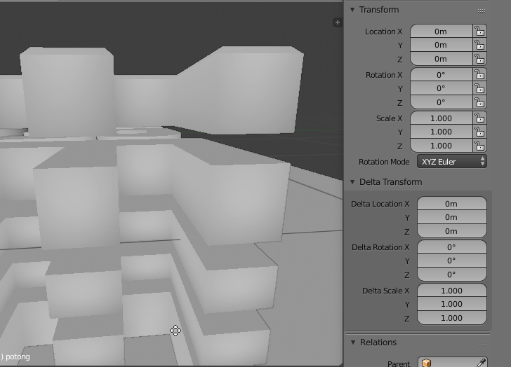
— Common Tool Settings system – hard to tell right now, but as of now it breaks overall UI hierarchy (Editor mode dropdown mast belong to appropriate Editor area) *more detailed with pictures will respond later. But again well implemented I imagine it could work for anybody without desire to hide it).
— Hotkey changes — as long as there is possibility to assign own shortcuts not that crucial for me.
But also few thoughts: 1. for brand new virgin 3d artist it not that important which keymap to use, 2. for experienced user from another 3d software it is very helpful to be able to use familiar navigation and shortcuts through presets (imagine you work in modo/maya/max and concept artist sends you blender file), same for existing Blender users, so Blender legacy preset is necessary.
— Toolbar — maybe could work quite well as addition to but not as replacement of Tool Shelf.
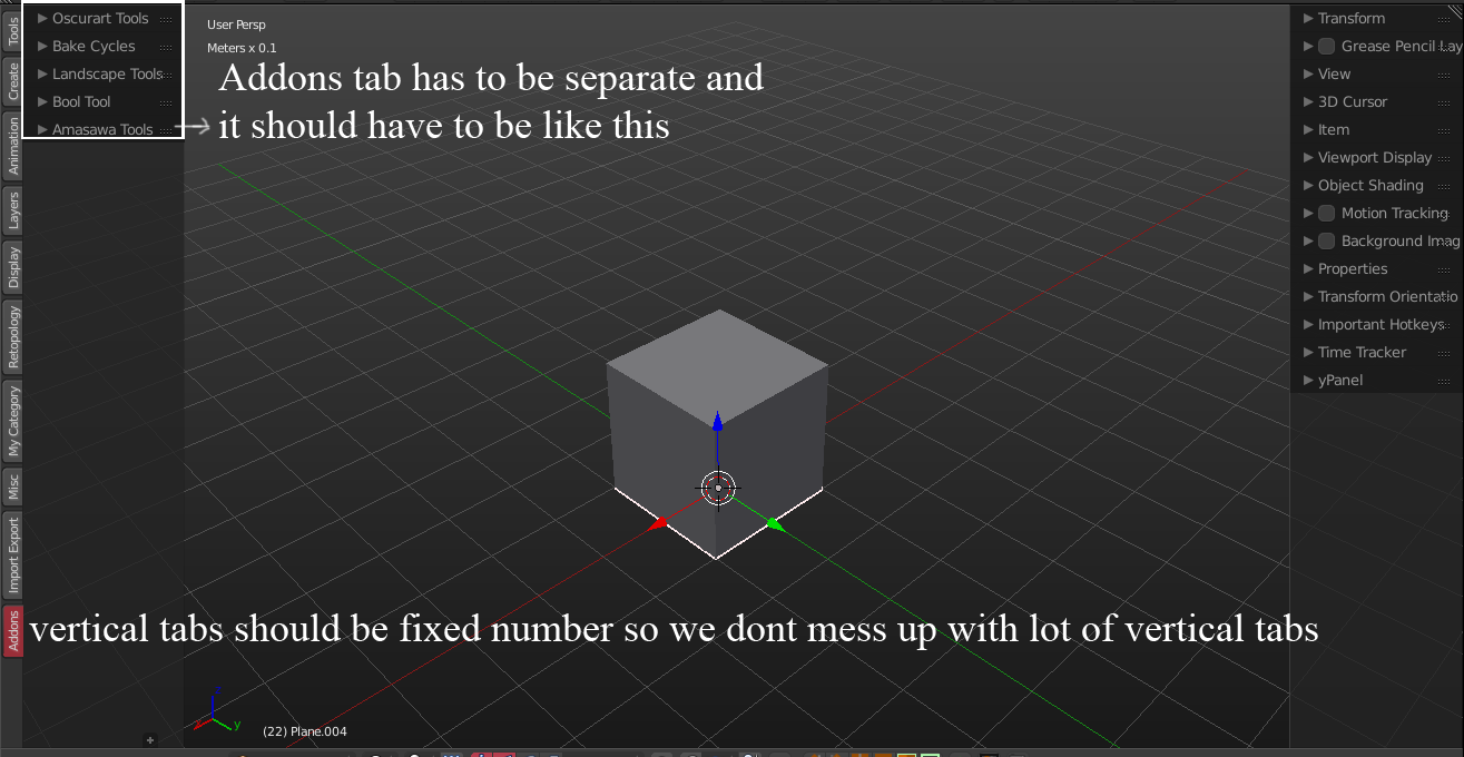
— Tool Shelf — really don’t like vertical tabs as design solution in general. Autocollapse nested menus like in video from Pablo Vazquez (starts from 62 minute) https://youtu.be/t-EKbCJagqI?t=1h2m11s with introduction of adaptive column layout will do the job right.
— Properties Shelf — same as Tool Shelf, no need to abandon it.
— Data Properties Editor — love single column layout, love autocollapse, hope for nice realization of adaptive column layout as well.
— Outliner — Collections are great but per object visibility needed like in 2.7
— Tool Properties Editor — nice, can see benefits from it, but again, not as replacement but as addition.
— Viewport manipulator — nice for beginners, option to hide for others.
— Other new technologies and features like Eevee, wireframes etc — just WOW!
Thank you guys for what you do, love and support to you. Cheers
I would like to see Tpanel single column icons on Top bar . i think its much more accessible on top because now a days we use wide screen monitors and we have more space horizontally i personally don’t like vertically laid out icons so i created some mockups
we all are used to read and write left to right so its looks much readable for me at least
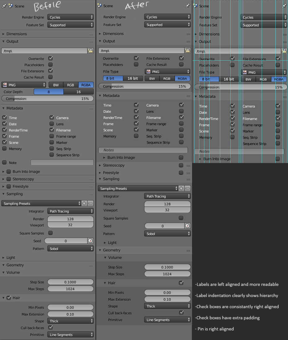
Hi all, I wanted to give the properties alignment a new shot, since it’s been bugging me in recent builds.
Right aligned text is hard to scan
Checkbox location is inconsistent
The hierarchy of the sub-panels is not very clear
To fix that, I’ve left aligned all labels, indented them to show hierarchy (along with color instead of div lines), and aligned all check boxes (with extra padding).
==================================================
idea
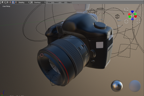
it would be nice if header always show in full screen mode:
user can change shading and overlay
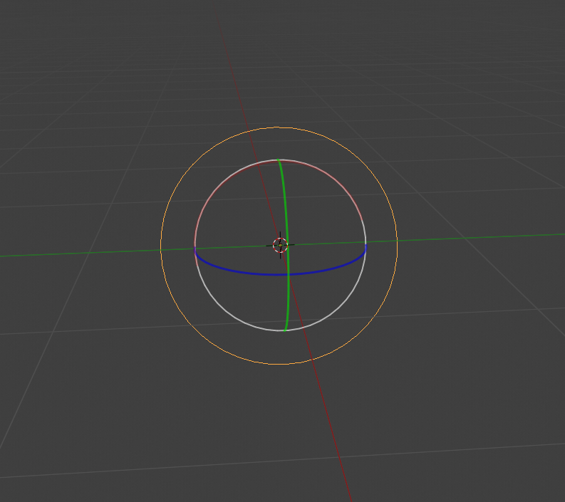
How about making the white circle of the manipulator not overlap with the other circles? For example it could have a larger diameter like the yellow circle.
I don’t see the point of the current design.