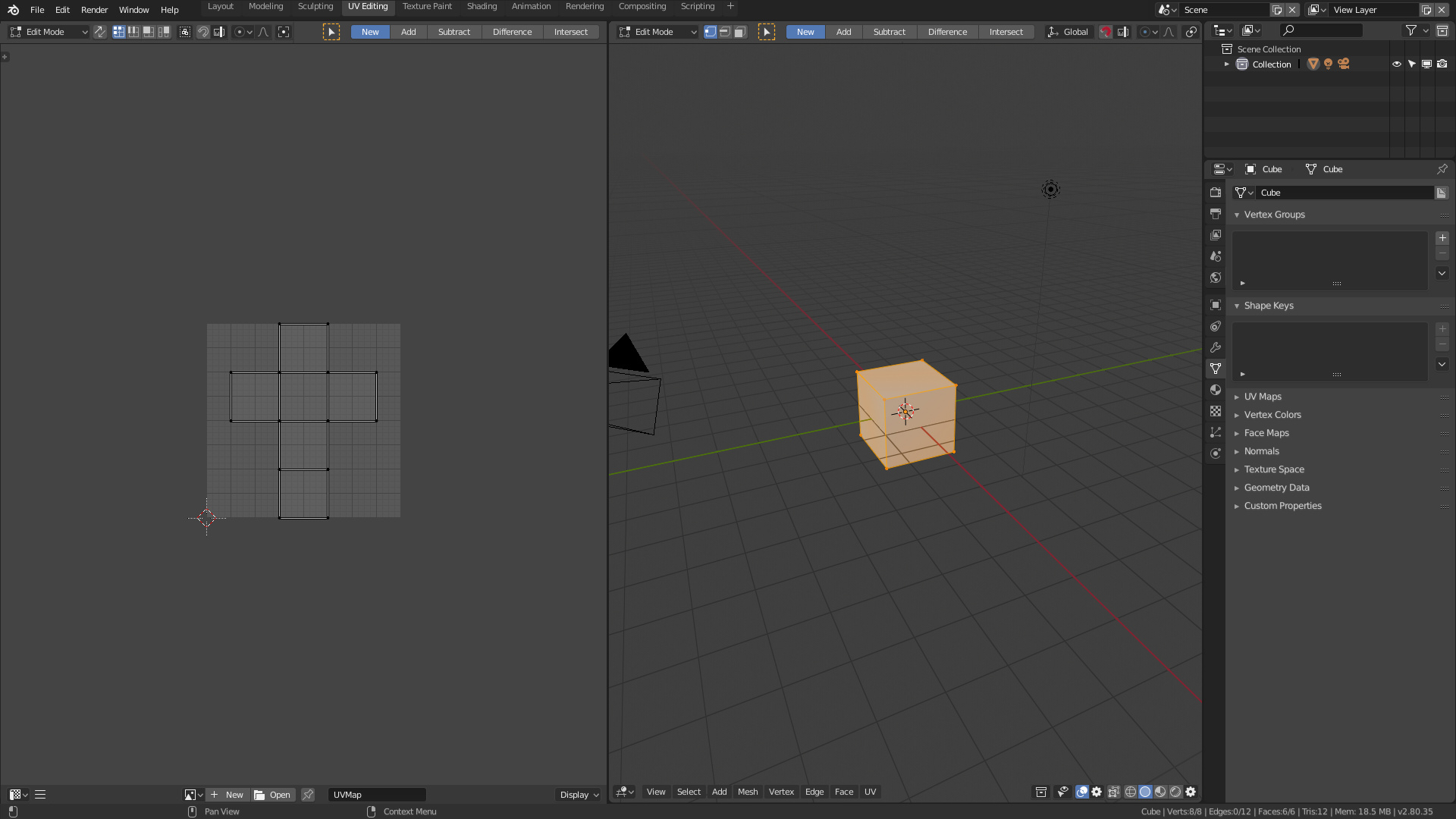
Other example of the idea with a UVeditor layout. Other good thing of this solution is that allow to separate viewport setting header of actual edit mode settings/tools.
Anyway I still asking for the tool tab in the sidebar. For complex controls. The idea could be that tabs in sidebar don’t have name, have an Icon, and if addon developers don’t create an icon the Tab only have one or two letters to identify.
As someone suggested, having toolbar into editors (only those who need it btw) could allow to send the toolbar content horizontally up there, and all the tools properties back to their 2.7x position on the left column
IMO, as long as the topbar contains editor specific content, it should be in said editor, or change according to the active editor + have a way to lock on a set (i.e. like the pin button). Otherwise, let the user choose manually what is in the topbar.
Other softwares already does that, and it works. And it’s another way to have an easy access addon widgets area.
When working on shading a scene, it’s pretty slow to switch between editing the world material and editing the object’s materials. @pablovazquez recently mentioned bringing back the buttons to save a click.
What if the shader editor automatically switched to the world when nothing is selected? It makes logical sense given the hierarchy of scene data, we wouldn’t need multiple modes for that editor, and would save us clicks.
I don’t know why devs simply won’t make dockable toolbars like everywhere else - photoshop, cinema, maya, 3ds max, substance. currently the ui lacks flexibility, i’m haytin it every time when i need to quickly rearrange my working area. Although i don’t personally like horizontal toolbars because they eat precious vertical space(in the modern days of ultra ultra wide curved monitors i’m ready to kill for every 10 pixels of vertical space taken from me) but it would be great to have an ability to deal with those editors and windows and placing or docking them where you need with a simple and straight forward drag’n’drop thing.
I know it may be too late, but we were asking this since before the beta, its a mistake to make a global topbar, I really wish you could get a bit more overhaul on that before the final release, If tools are per-editor, topbar(s) also have to be inside each editor, just like a header, otherwise, you know, this is really limitating to the fexibility of the interface.
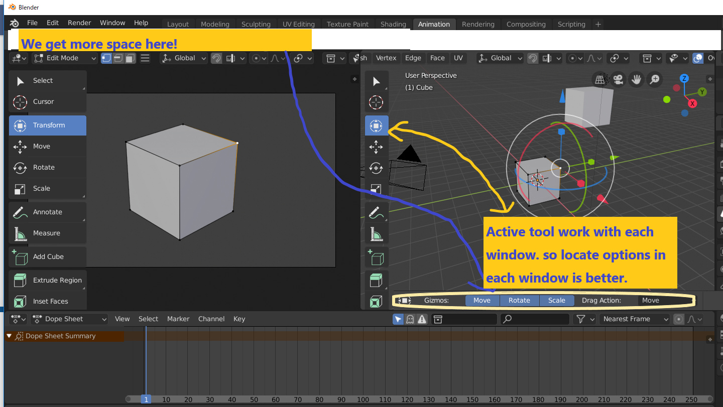
Active tool is one of main concept of 2.8. but to work it as designed, at least I do not think, current “topbar location” is good. This problem may be more clear, when developer gather feedback about each workspace and current status.
How developer think, these options will pop up, as Top (or bottom) “sub” menu?
of course user can still choose locatiton. Top or bottom as same as main top menu.
current status , it is somehow strange, when we use active tool in right side or bottom etc, those option are only shown in Top left side. (or developer hope to use property > tool? it use huge space,and I seldom set
as tool (the property we need to change more detail about each properties, not set it as tool just change active tool options,I feel)
The same space stealed in a viewport is gained by removing current topbar. Unless you have two editors one above the other, this layout uses (or wastes) the same vertical space
Man… i’m totaly agree with you!!!
Its too bad that most casual modeler asking dev-team to add such unnoing and useles thing like go up and click+go down and clik… its like a crow with no brain in head ))) and waiting from a programm like Blender the magic button “Do everything for me” ))
I’m strongly against those long horizontal lines with tool properties no matter where on top or at the bottom of the screen they will be placed. I don’t know why developers can’t just place those in a pallet inside N sidebar, it’s plenty of horizontal space and you can easily toggle it on and off when you need it.
Ok I understand your view. my mock up is just example what I think. If you like your way, I do not against it.
But As for me, "Vetical or horizon " is not matter.
because most of case I open many window pararell. I like to play character animation and character render. with blender. Then I often modify many with posing, set keys, edit material , edit complex driver too. Though I do not like modeling as same as yours ,but I need to use blender as my purpose. then for me, if top option menu move to curernt N icon space, it after all lost space . I do not care, even though there are another small
menu vertically…
Then I read your topics , and I think it is reasonable. but my main subject is these option need to be located near the tool. it was my first view about new option menu.
then if we can use layer window, (and move them as we like) it is best option. but unfortunately I think it seems more difficult for dveloper than move option menu as vertical menu in each window.
You seems have offered many mockups about active tool otpioon menu, so I apreciate your view.
but please do not say me steal something from you in public forum.
I used word “stealing” figuratively. Honestly i wish i could just collapse the top bar and call F6 palette for tool properties, but i’m not sure if it will return.
I see. do not mind. I just hope at least there will be some improvement about the top option menu.
and hope yours serious users request will be taken into .
Though I do not know, if I get used to current option menus, as same as I get used to right click select.
10 yeas ago.
@billrey@pablovazquez
As someone suggested: wouldn’t it be worth it, to switch properties and tools? The latter take little space since they are squared icons and can be stacked easily in the little horizontal topbar. Properties on the other hand can take a lot of space, and in the good old T-panel they could find all the room needed.*
(A plus benefit: for the sake of industry standardness, tools would rest horizontally on top, as in many big and estabilished 3d pro package.)
A screenshot to better understand: