Any updates on how and when this is going to be fixed?
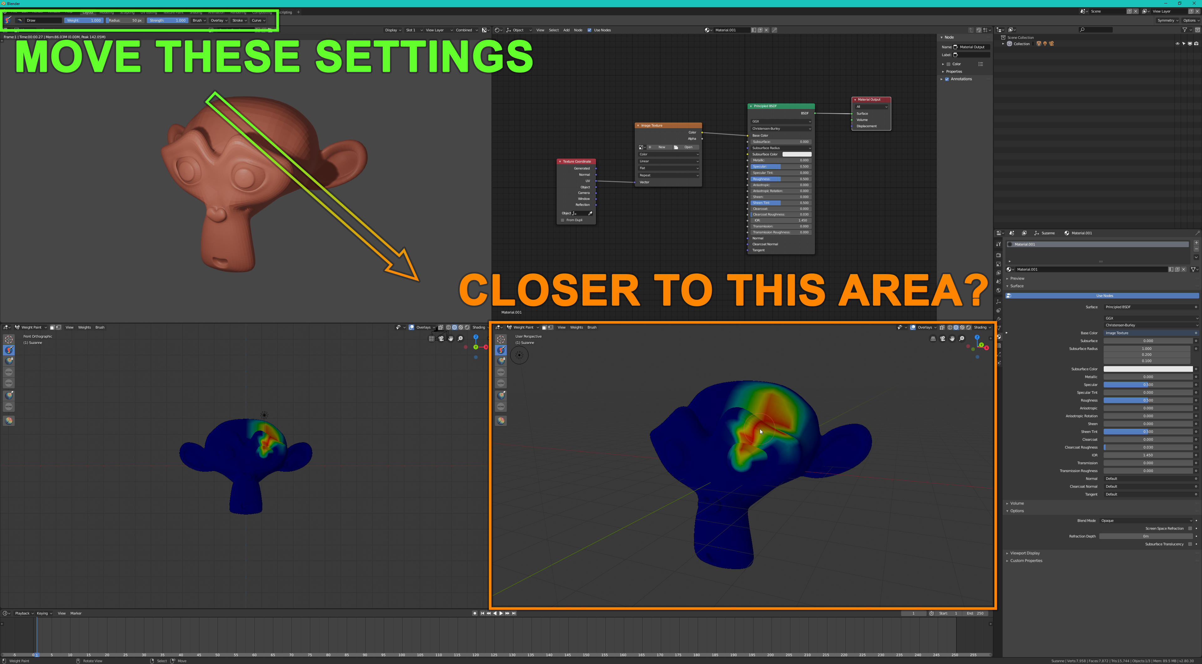
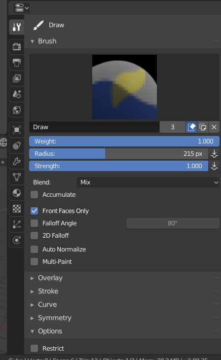
When using a brush, all the brush settings are too far away from my preferred working area.
This is a huge problem for users who like to split their viewport.
The topbar will be always useless, is a bad site to put a lot of things and only allow few changes. Few things, like brush controls or shorcuts like maya, can work in it.
Yes I know that and it helps a little but not much. It’s more like a workaround than a solution.
The brush settings are still not where I need them.
Also that increases the amount of clicking required when changing the tab.
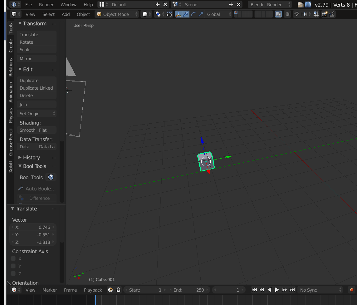
In 2.79 I was able use paint tools in any viewport I wanted without any problems.
But now I have much worse options.
I can either use a viewport that is close enough to the top bar or use a viewport that is close to the properties tool panel.
To use any other viewport, I first have to split the viewport and change the editor type to Properties (which requires much more clicking).
Why it has to be this complicated? Makes no sense.
Blender 2.8 have lost some of it’s flexibility because of this.
it’s not complicated it’s a new design that you have to get used to because the old one had many issues and inconsistency, it’s a sacrifice that it had to be made and i don’t think the devs will revert to old system.
OK, lets stop blickering, it was soo good so see that everyone agreed on something on a thread in this site.
lets talk more about why top bar is bad and how to fix, so maybe devs listen to us.
i don’t have time to make a huge list of flaws but here is a simple and stupid one, u see how awkward that is…your object moves away while your cursor is in a different place not only that you can’t do anything while in the move mode while the new one you can.
and i have nothing against the top-bar…it’s working as expected.
my answer wasn’t to you but to @anon18120698 who asked for flaws…and like you said now it’s solved this awkward behavior which has to do with user experience…so -1 for you not understanding that.