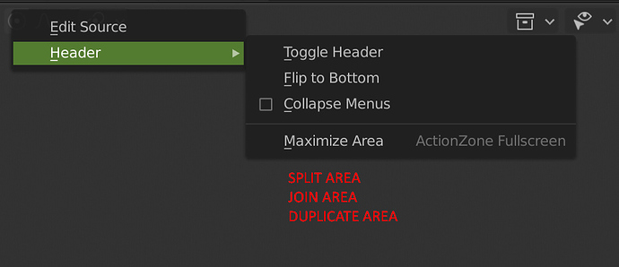
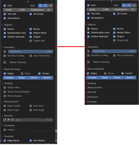
Yes reasonable. This may go along with treating user view as a special camera that l you can use to render too, or just turn into a real camera.
Hello to @pablovazquez @billrey
first of all thanks to all of you guys for your work on Blender. In this post I point out to a few things that I find annoying but also what the current stage of the UI does well.
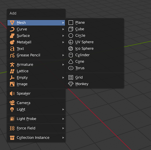
The “add”-menu
These flat orange icons are unpleasing to the eye and also not very quick to read/decipher. I wondered why I perceive it like this and it seems that the little bit of depth & shadow that the icons in 2.79 have adds a lot to the readability. Or maybe they could simply be replaced by better looking flat orange icons …
The “add”-submenu
The same applies for the submenu where these completely flat icons imo reduce the readability. I have the feeling that I really need to read the description instead of first seeing the icon, getting a sense of what it means and only after that having to maybe read the name to be fully sure and be able to place the object I want.
Additionally I want to point out that by clicking an item in the submenu the object users place will be in 3D, the icon however is a flat 2D icon. For this fact alone bringing back a variation of the 3D icons from 2.79 could be nicer here.
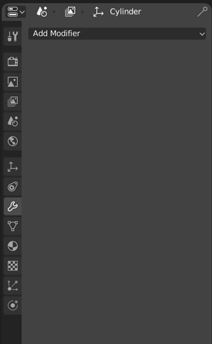
The properties panel
I don’t really understand why here again you decided to go with flat icons. Especially since the property icons do not have description text next to them. It makes it unnecessary hard to read and to remember what icon means what exactly. I have the feeling that flat icons do not work for everything but mostly work for things that are commonly known (where people have already an image in mind). I don’t think that having that much flat icons for a professional 3D programm (where a lot of things & function are a bit abstract) adds to the usability.
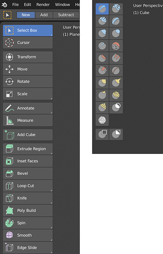
edit-menu & sculpt mode icons
I have to say that I really love the style of icons in the edit-menu and in sculpt mode. The color highlighting what the functionality actually does adds a lot of clarity to the UI and makes it quicker to read/understand these icons. Also giving different functionalities different colors makes a lot of sense and grouping them togehter in the panel also. Good work! If more of the UI moves in that direction I think it could look fantastic and actually more professional than a lot of the expensive 3D software out there.
Overall you rely a lot on flat icons throughout the interface – mabye too much. My suggestion here would be to use partially colored icon in the **style of the edit-menu icons** for icons that appear on a top level (hierarchy lvl 1). Icons that are hidden in the second level don’t really need color and could be flat with outline. (this is a bit contradictory to my suggestion for the add-menu, I know)
I’m wondering if you guys have an actual UI designer working with you? Who is doing the icons for you?
@pablovazquez are you doing the Blender UI & UX mostly on your own?
Don’t want to offend anyone btw, I am just curious.
Most of the icons are designed by @jendrzych. The icons in the toolbar were designed by Aslam Cader.
There was some consideration on making them fit together - they try and use the same general approach.
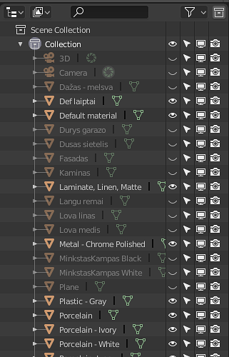
The main icon set (the small icons) are made to be themable. If you look in the Outliner, you can see this. I still think we can add more color categories for use in other places, such as perhaps the Properties header, for example. The colors themselves would be defined in the theme.
The icons in the toolbar are technically different. They are actually drawn as vectors using meshes, which is why you can enlarge the toolbar to be huge, while the icons stay sharp. The different colored areas in those icons are different materials, and so are designed to be themable, but it hasn’t been hooked up yet, so in practice this doesn’t work. I hope we can add that, so that themes can define these colors.
just a question.
a unification, once the icons of jendrzych have been completed would be something complicated to do?
like turning all the icons into the Aslam Cader method (right for greater flexibility) also for use in alternative interfaces, in the perspective of a “blender 101” for “simplified or specific” uses
Is there a way to scale the icons in the properties panel?
Since they are not colored anymore I think it would be easier to me to separate them from one another if they were bigger.
Display scale seems to scale the icons but it scales everything in Blender and I don’t want that.
I have not been following these threads lately so I would like to ask that is there any plans to add color in properties panel icons?
I don’t like the current black&white silhouette look. Since almost everything is now black&white I think it’s very difficult to find what you are looking for. Having colored icons would make remembering and finding things easier.
Someone might think the new black&white style looks cooler than the old style but Blender is a TOOL so in my opinion the usability should be the priority number 1.
This has been brought up multiple times actually. The orange icons are too thick, and probably could convey the same idea not looking so displeasingly thick. Or maybe should be redesigned, period. As they stand now, they seem to be the only icons that really irk me and others.
Is this hard to implement?
Why not?
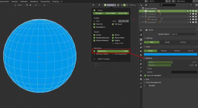
Add the wireframe option to allow simple and fast render like this.
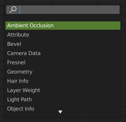
I would love to have a direct search on tab in the node editor
Right now, we have to press Shift + A + search and then search.
I don’t know if all people have seen this proposal in RCS, but it’s a really good idea to improve the UX in blender.
Could be great if a future update in the interface have something like this and the famous tabbed areas.
@brecht Are these changes possible in blender2.8 or does the api make this type of change in the UI very difficult?
I was thinking about this, and maybe for editing the node groups it could be something like Houdini “i” to jump into the groups, and “u” to get out (but maybe it couldn’t work with “i” already being for setting animation keys  )
)
I would prefer using pie menu for that, U and I are on the rught of the keyboard ^^
Smooth/Flat Shading and Mark/Clear Seams, Unwrap UV as Icons
Hi @billrey,
Is there any plan to add mark/clear seams, Unwrap UV, smooth and flat shading options as icons?
It would be helpful and quick for the users to just select the edge/object with just one click "Mark/Clear Seams, Smooth/Flat Shading, Unwrap UV. Right now we have to go through in the menu to find them.
as a workaround, you can assign any of those action to the quick favorite menu
Just a reminder
If you want better manipulation with UVs, upvote this https://blender.community/c/rightclickselect/6ccbbc/
Its for extrude, move (not slide), rotate, scale, etc with UV correction
Hey, guys!
Couldn’t find a thread for general keymaps-only, so here we go:
How about changing the search shortcut to “Enter”?
It might sound weird at a first glance, but it’s been working brilliantly for me since I’ve set it a year ago.
It’s really fast and it makes a lot of sense: Enter > Search > Enter. Instead of the current F3 > Search > Enter or the old Space > Search > Enter.
Here’s a quick demo:
Oh, I’d also like to cast my vote for Spacebar for playback, as well.
I know Pablo have been talking about it for a while, and I’ve been using Space for playback for a year now and I find it great, especially because I often work with other video editing and compositing software and the consistency makes it less confusing when jumping into Blender to do some animation.
Cheers!
Right now, having some of the mesh editing tools as a two step process seems slow. As it is now, you have to select a face first and then extrude it. It would be great if you could drag over any face and extrude it without having to select it first.
- Click on an unselected face -> Select that face
- Drag an unselected face -> Current selection is cleared, face is selected, face is extruded
- Drag a selected face -> Current selection is extruded.
The same should apply for bevel and inset, verts and edges. This will speed up the work with these tools and make them feel more congruent with the Loop Cut and Knife tools where you can immediately start clicking and dragging to add geometry.
edit: I also want to point out that it would be great if the Knife tool was active instantly. You can place points instantly, but there is no preview of where your click will land and no way of snapping your first click to the midpoint of an edge or vertex.
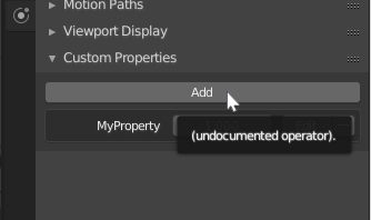
The tool tips for Custom Properties panels are broken. If you hover over the Add button, the tooltip reads “(undocumented operator).” The same for the Edit button once a property has been added. The minus sign next to the Edit button has the tooltip “Internal use (edit a property data_path).” instead of informing the user that it removes the custom property.
